
 30 Minute Redesign: Week 44 Vote
 30 Minute Redesign #99: CAMFO Medics
Have every post delivered to your inbox and get access to hundreds of useful design freebies.
This week I will be redesigning: 86 Inventory.

In the space of 5 minutes I can identify some of the key strengths and weaknesses of this design, and sketch out a mockup.
As always, I was limited by the 30 minute time-frame, but I tried to improve upon several of 86 Inventory’s features, adding a few design flourishes and a clearer layout that promoted content over wasted space:
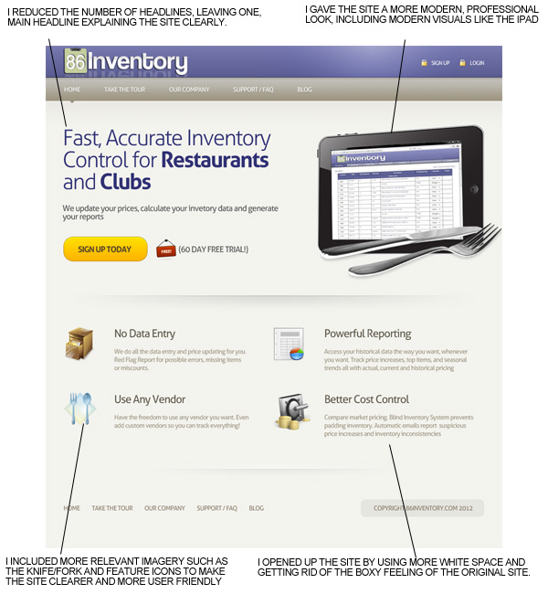
Here is a quick comparison between the original design and my 30 minute redesign. Sure, my design could be more polished, but I believe that a lot of the basic elements have been improved upon, creating a more pleasant browsing experience.

You can have the chance to have your website redesigned in next weeks post. All you need to do is leave a comment to this post with your website address and why you think it needs a redesign.
NOTE: I can only accept sites with English content, as foreign language websites are simply too hard for me to work with.
So please, leave a comment today for a chance to have your website redesigned next week!
Tom is the founder of PSDFAN. He loves writing tutorials, learning more about design and interacting with the community. On a more interesting note he can also play guitar hero drunk with his teeth.


Do you know the basic tools in Photoshop but feel that your work is still looking average? Join our creative community at FanExtra and get the direction you need to take your work to the next level.


Love reading your redesigns. I finally have our site up for our event planner app. We are launching a pr campaign and need to make sure we convert customers. We’re on a start up budget. It would be amazing to have you look at it and review it. Thank you so much for considering it.
The site is checkineasy.com
Justin
Thanks for the support Justin! Looking at your site it actually looks pretty good. Like all sites there are of course areas for improvement though. I’ll be sure to include it in this week’s poll.
Fantastic re-design. You took the landing page from bland and amateurish to totally polished and professional. BRAVO!
Thanks for all of your hard work. I tweeted this to all my followers.
Good Stuff!
Cheers Brenda . As I said in the redesign I think the main layout was pretty solid, it just needed some nice designer touches.
A nice redesign! I think that it makes it harder to redesign something when the starting point wasn’t all that bad! But I think that this has been done really well. Polishing the design and making sure all of it looks like it matches the website. For example the navigation is a lot better than it was before and this make a big difference as that is something people are instantly going to be using to navigate their way through your site.