
 30 Minute Redesign: Android Move
 30 Minute Redesign: PDF n Manual
 30 Minute Redesign: Cycling Maven
Have every post delivered to your inbox and get access to hundreds of useful design freebies.
This week I will be redesigning: Acupuncture in Exeter.
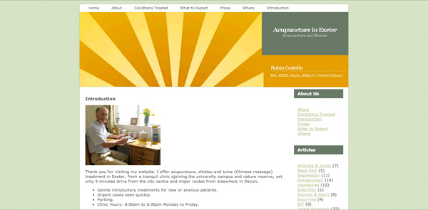
In the space of 5 minutes I can identify some of the key strengths and weaknesses of this design, and sketch out a mockup.
As always, I was limited by the 30 minute time-frame, but I tried to improve upon several of Acupuncture in Exeter’s features, adding a few design flourishes and a clearer layout that promoted content over wasted space:
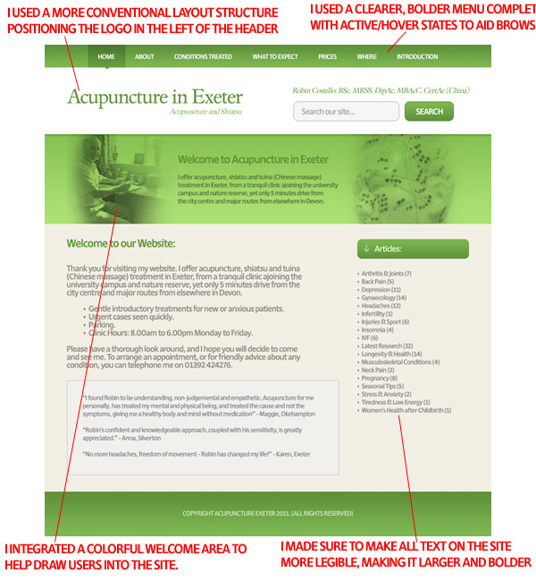
Here is a quick comparison between the original design and my 30 minute redesign. Sure, my design could be more polished, but I believe that a lot of the basic elements have been improved upon, creating a more pleasant browsing experience.

You can have the chance to have your website redesigned in next weeks post. All you need to do is leave a comment to this post with your website address and why you think it needs a redesign.
NOTE: I can only accept sites with English content, as foreign language websites are simply too hard for me to work with.
So please, leave a comment today for a chance to have your website redesigned next week!
Tom is the founder of PSDFAN. He loves writing tutorials, learning more about design and interacting with the community. On a more interesting note he can also play guitar hero drunk with his teeth.


Do you know the basic tools in Photoshop but feel that your work is still looking average? Join our creative community at FanExtra and get the direction you need to take your work to the next level.


Hi,
I have been following this series of article since the start and its be a great inspiration. It pains me a bit to say this but its the first time that I have something negative to say. It would have been nice if you could have integrated the original color pattern with the current look you created. I think that the over abundance of green is a bit annoying.
Other than that great job on this topic since the start!
Thanks for the support and constructive criticism Paqman. I definitely would have integrated more of the original colorscheme had I had more time, this is generally something I’ll tweak towards the end of my work flow. I hope that you continue to enjoy the series though .
.
A terrific redesign. Much easier to read.
*I want to Thank all of you here at PSDFAN. It’s a great site. I look forward to it weekly. Education and rewards.. I am just thrilled to have received a 2 wk membership at Depositphotos.com Turned me on to a very cool site too. What a surprise and highly appreciated. Thank you very much!
Hey Lj! I’m really glad that you’re enjoying the 30 minute redesign series. That’s great to hear that you’re enjoying your DepositPhotos membership also!
Wow, great redesign Tom! Simple and professional, just as i like.
Cheers Joe! I was trying for something nice and clean with this design.
Very well done! It looks much more clean and professional.
Thanks Chris! I think it’s an improvement .
.
I like the desing, except for the monocolor theme. Its probably lack of time, 30 min. is really short time to details. I think this same design with a little extra color details would be great.
Thanks Hugolatra! It was really the time constraints that limited my color palette. I tried to bring some yellow into the main background, but would have added more orange buttons/details had I had more time.
Awesome job Tom! This looks 100 times better than the original site.
Another top re-design and it gives Robin’s clinic a really professional website for visitors to come to and find out more. Very effective.
I’d echo the thoughts on there being ample ‘green-ness’ to be going on with, but you already know that.
Nice job for 30 mins. The original is typical of an amateur, but I guess I’d prefer to have them stick needles in than a web designer lol. Hope they took your advice
Great design (in 30 mins) but I think could have done with some complementary colour (red or orange) somewhere – maybe on your call to action buttons to add some extra dimension. Colours for me are slightly one-dimensional and ‘grey’ and needs a bit of zing and contrast. Maybe another box (in contrasting colour) aimed at getting people to main inside content. You’d have to find out from the client’s web stats what the most popular content was but at the moment there’s a missed opportunity to get people off the homepage to juicy content.
Hi Tom,
Sorry to not respond earlier, I’ve been away for a little. I love the redesign and it really is a 400% improvement on the original!!! I think we will definitely use a lot of this to do a new site and maybe try and get some different colours in there too!
would be grateful if you could send me the PSD so we can start working with what you have done!! Thanks again, this is such a brilliant feature!
Iain
Pretty boring design to be honest, very monotone. You need to add a secondary color
The original site design is based on a wordpress theme isn’t it? It seems unfair to compare a 4 year old wp theme to a custom theme. Having said that I’d like to see a redesign with more colour.