Week 59: CelebZine
This week I will be redesigning: CelebZine.
In the space of 5 minutes I can identify some of the key strengths and weaknesses of this design, and sketch out a mockup.
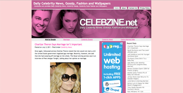
STRENGTHS:
- A really bold colorscheme, which seems to work well with the celebrity/glamourous theme of the site.
- The header is creative, and the photo montage is relevant and attractive.
- The visual hierarchy pretty good, with nice looking post titles/headlines. Color is used well to highlight links and important text areas.
- Featured posts are highlighted well using images. This helps draw people further into the site.
WEAKNESSES:
- The text at the top of the site header is a bit of a duplicate from the main header. It feels a little obsolete. The header is really sufficient.
- The navigation for the site is quite unclear. I wasn’t sure if the primary navigation was the top-right (home, about etc…) or the categories menu in the sidebar ‘celebrity news, music news etc…’. It doesn’t seem to make sense to have the main content categories outside of the top menu, as these are vital for browsing content.
- The featured post area is good, but it’s a little hidden away, as you need to scroll quite a lot to reach it. The ad unit above it pushes it down.
- The options for browsing content aren’t great, there is no search option for instance.
My Redesign
As always, I was limited by the 30 minute time-frame, but I tried to improve upon several of CelebZine’s features, adding a few design flourishes and a clearer layout that promoted content over wasted space:
MY AIMS FOR THE REDESIGN:
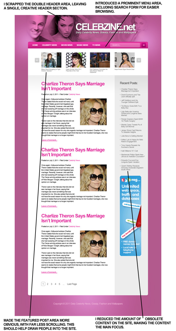
- I scrapped the repetition in the menu, just leaving the header, but in a way that was creatively integrated.
- I added a much more prominent menu area, including a search form to help with navigating content.
- I made the featured posts area more prominent, which doesn’t use as much scrolling.
- I reduced the amount of content on the page, as a lot of it didn’t seem to add much to the site. This simpler version allows more focus on the content and less distraction.
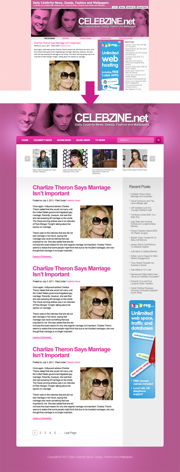
Before/After:
Here is a quick comparison between the original design and my 30 minute redesign. Sure, my design could be more polished, but I believe that a lot of the basic elements have been improved upon, creating a more pleasant browsing experience.
How and Why To Enter 30 Minute Redesigns
You can have the chance to have your website redesigned in next weeks post. All you need to do is leave a comment to this post with your website address and why you think it needs a redesign.
The Benefits of Getting Your Site Redesigned Include:
- Most obviously – a FREE redesign job!
- Your website gets exposure to PSDFAN’s thousands of readers
- You understand how to improve your website. This isn’t just a redesign, it’s a lesson in design principles.
- You will get emailed the .psd of your redesign and can do whatever you want with it!
NOTE: I can only accept sites with English content, as foreign language websites are simply too hard for me to work with.
So please, leave a comment today for a chance to have your website redesigned next week!

About the Author:
Tom is the founder of PSDFAN. He loves writing tutorials, learning more about design and interacting with the community. On a more interesting note he can also play guitar hero drunk with his teeth.
Related Posts

 30 Minute Redesign – Suggestions Needed!
 30 Minute Redesign: Eric Vasquez
 30 Minute Redesign: Vestiaire.ca


I love the after redesign header. Look more professional
Thanks a lot! I think it’s definitely a bit more lively and eye-catching .
.
Nice job. The site has more range and the content is definitely more prominent and consumable. The experience is definitely softer and makes the user want to spend more time on the site.
Great redesign, the simple changes really made the site look a lot cleaner and more professional! Good work.
I really like this redesign. The merged header and extended bold colour scheme definately improves the overall flow of the site. The visual heirarchy is much better too, and with the removal of unecessary items, it’s much easier viewing for the reader.
As an aspiring designer I’m looking forward to when I can create such good designs in just 30 minutes.
Id like to submit my site for a redesign. http://www.littlemissscarlet.co.uk because I’d really like to know an expert opinion of the site. It was required to be very fancy for a luxurious overall feel, but i want to improve and simplify the site while maintaining a luxurios feel, and it would be great to see how an experienced designer could achieve this.
Really, is a great work, clean and beautiful…
very good!!
=D
Hi tom, thanks for your great redesign of my site, very lovely, thanks to point our weaknesses, i’ll try to fix it
Greetings, thank you for providing these helpful tips. We are looking to redesign our website; it is for Midwest Young Artists (www.mya.org) a non-profit music school near Chicago. Would love to see what sort of observations you have!
Nice redesign Tom. One thing i would like to point out is ad placement. The old design is probably generating more revenue because the ad is at the top of the fold. Just something to thing about