
 I’ll Redesign Your Website – For Free!
 30 Minute Redesign #78: Chiagu
 30 Minute Redesign: Artis Lane
Have every post delivered to your inbox and get access to hundreds of useful design freebies.
This week I will be redesigning: MS Association of Realtors.

In the space of 5 minutes I can identify some of the key strengths and weaknesses of this design, and sketch out a mockup.
As always, I was limited by the 30 minute time-frame, but I tried to improve upon several of MS Association of Realtor’s features, adding a few design flourishes and a clearer layout that promoted content over wasted space:
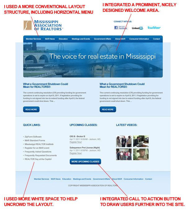
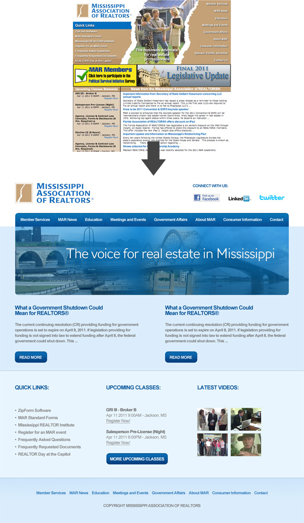
Here is a quick comparison between the original design and my 30 minute redesign. Sure, my design could be more polished, but I believe that a lot of the basic elements have been improved upon, creating a more pleasant browsing experience.
You can have the chance to have your website redesigned in next weeks post. All you need to do is leave a comment to this post with your website address and why you think it needs a redesign.
NOTE: I can only accept sites with English content, as foreign language websites are simply too hard for me to work with.
So please, leave a comment today for a chance to have your website redesigned next week!
Tom is the founder of PSDFAN. He loves writing tutorials, learning more about design and interacting with the community. On a more interesting note he can also play guitar hero drunk with his teeth.


Do you know the basic tools in Photoshop but feel that your work is still looking average? Join our creative community at FanExtra and get the direction you need to take your work to the next level.


Nice job on this one Tom! Once again, a fantastic redesign. The original MS Association of Realtors Site is just so chaotic and there is so much information you don’t know where to go first.
I like how you have not only established a clear hierarchy, but have also used a grid and given the whole site a much needed facelift.
My only suggestion is that it may be nice to re-introduce the original tan colors in some way. It may not look very good to have tan colored buttons, but perhaps the faded blue in the footer area or under the masthead could be a low opacity tan color?
Thanks Eric! Yeah, my primary aim with this design was to make the whole site feel less chaotic. I totally agree about the tan colorscheme. If I’d had more time I would have trying introduce some subtle tan colored elements, as I think this could work well.
Wow, great job Tom! I love how you used the call to action buttons to limit the amount of information on the front page (which was keeping it so cluttered) and really draw visitors further into the site. The layout is very clean and modern, which is definately what I was hoping for, but really, it turned out far better than I expected! Thank you very much!
Thanks Chris, I’m really glad you liked my redesign . I hope that you get a chance to implement it.
I’m sure we’ll implement it. I can’t wait to see the full size and play around with the PSD. Thanks again Tom!
Fantastic redesign. Such a big change and so much clear.
Would like to try again for redesign this website. Thank you!.
Your redesign is a 100% improvement. The original, I probably wouldn’t have bothered with because of all the clutter. The redesign makes everything easier to read and a much cleaner view. Great job.
I would LOVE a redesign of my site. My logo is my header and I like that, I like the content – I made the items, but the whole set-up is leaving me kind of … hmph. I need a shopping cart link at the top of the page, and haven’t figured that out yet. Any help you can give me or advice would be greatly appreciated. Thanks.
Hello, i’m from Brazil, this post is very very good.
Fantastic redesign, you do this for funny?!
Congratulations..
You’re a great profissional.
In thirty minutes this is a great redesign and a vast improvement to what was currently there. I think there is still some work that needs to be done on it. like you mentioned adding back in some tan elements so that the logo doesn’t look so on its own in a blue design. After the banner I feel the grid layout doesn’t really work though and rather than the 3 columns I would have added a forth to everything fits nicely in together as at the moment the spacing in my opinion doesn’t quite work. A vast improvement though and well on its way!