
 Design a Cool Textured Portfolio Website
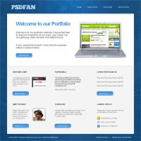 Design a Sleek Textured Portfolio Design
 Design a Super Clean Blue Portfolio Website
Have every post delivered to your inbox and get access to hundreds of useful design freebies.
As part of our FanExtra Network launch, we will be publishing one tutorial every day for our launch week. We hope that you enjoy them.
You can also sign up for your FanExtra membership for just $1 for the first month (offer ends Friday 22nd, October). This will give you access to our hundreds of tutorial source files, members only tutorials, hundreds of textures/vectors/icons, and great design discounts! Sign Up Today.
FanExtra Launch Week:
DAY 1:
FanExtra Network Launch
Create a Google Docs Icon
DAY 2:
30 Minute Redesign – GymDJ
Master a Professional Photo-Retouching Workflow
DAY 3:
Design a Textured Portfolio Website
DAY 4:
Members Area Tutorial: Digital Painting Lesson: Scarecrow’s Joyride
DAY 5:
Create a Stylized Photo Montage From Scratch
DAY 6:
Design a Grungy Rock & Roll Gig Poster
DAY 7
Design an Awesome Paint Splattered Dancer
As always, this is the final image that we’ll be creating:

Create a new document (1000X1000px). Then download a metallic texture:
Resize this texture and paste it into your document:

Now add an adjustment layer (hue/saturation). Reduce your saturation to -100, and your lightness to -85. This should make your texture a suitable background design.

Paste in this photo of smoke.
This photo has a white background, and we want it to have a black background. Go to image>adjustments>invert. This will invert the colors of your smoke image, making the background black, and your smoke green.


Now change your layer’s blend mode to ‘screen’. This will hide your black background. Then move your smoke to the top of your canvas, as this will help construct the background of your header.
Then go to image>adjustments>desaturate, in order to grayscale your smoke. For the right side of your smoke, use a soft eraser brush to blend it smoothly into your background texture.
Then reduce your layer’s opacity to 20%.


Now duplicate your smoke layer, and go to edit>transform>flip horizontal.
Then add in a further smoke image (smoke image). Repeat your previous technique to integrate this image into your design.

Create a new layer called ‘overlay lighting’. Select your radial gradient tool, and create a few radial gradients overs your smoke. Be sure to use neon colors.

Now change the blend mode of this layer to ‘overlay’. Reduce the layer opacity to 45%.
This should color your smoke, creating an attractive background design.

Now merge all of your smoke layers together (command+E to merge down your layers). Your merged layer will have an opacity of 100%. Reduce the layer opacity to 65%.

Go to view>new guide. Apply a vertical guide at 100px and 900px. Then apply vertical guides at 160px, 200px, 450px and 800px. These guides form the basis for your layout:

Now create a new layer called ‘menu’. Use your marquee selection tool to fill the top area defined by your guides. Fill your selection with white, and then reduce your layer’s opacity to 10%.

Now create a layer called ‘content area’. Fill the bottom area defined by your guides with 292929.

Now go to blending options for your ‘content area’ layer. Apply a stroke effect: Size: 1, color: ffffff, opacity: 20%.


Paste in this old paper texture.
Use your guides to cut out all of the areas of paper that goes outside of the area directly beneath your menu. Call this layer ‘old paper texture’.


Now apply an adjustment layer (hue/saturation). Reduce your saturation to -80, and increase your lightness to +60. This will effect your entire canvas, whereas you only want it to effect your paper texture area. To fix this, go to layer>apply clipping mask.

The background is a little distracting at the moment, so to tone it down create a new layer above all of your background layers, but beneath your menu and content area layers.
Fill your canvas with a linear gradient ranging from 000000 to 1e1e1e.
Reduce this layer’s opacity to 40%.


Create a new layer called ‘highlight’. Option+click on your dark gray ‘content area’ layer in your layer’s palette. This will automatically select this area.
With your selection in place, select your new ‘highlight’ layer in your layer’s palette.
Then use the radial gradient tool, to create a white-transparent gradient ranging from the top center of your ‘content area’. The fact that this area is enclosed by an active selection means that your radial gradient shouldn’t go beyond the edges of this area.


Create a new layer called ‘background highlight’. Create a white-transparent radial gradient ranging from the top-center of your canvas. Ensure that this layer is beneath your menu/content area layers, but above your other background layers.
Then change this layer’s blend mode to ‘overlay’.


Now apply some text over your menu. I made my font Arial, 14pt, -50 kerning, b4b4b4.

Create a new top layer called ‘menu active tab’. Use your polygon lasso tool to create an arrow shape. Fill it with 2e282f. This acts as your active menu link.

Now take a screen capture of an example of a website you’ve built. I went with our new network fanextra. Paste this into your document, and resize it to fit over your paper texture area.

Now apply a stroke blending option to your screengrab layer. Make your stroke 6px in size, black, with 15% opacity.


Now apply some heading text over your paper texture area.
I used AW Conqueror Slab font, 40pt, -50 kerning, 1e1e1e.

Now apply some more text underneath your header text. I chose Arial font, 18pt, -50 kerning, 737373.

Create a rounded rectangle (10px radius) beneath the words ‘learn more’. Apply a color overlay (262428). Then change the color of your ‘learn more’ text to b6b6b6 to make it stand out against this dark button.


Now type out some text at the top center of your canvas to act as your website’s logo. I made my text dbdbdb, in order to stand out against the dark header background.

Now we’re going to add some content to our bottom dark gray content area.
We want this area to have 3 columns, so it’s time to create some more guides!
Create vertical guides at 366px and 634px.

Download the great icons below, and paste them into the center of your 3 columns at the bottom of your design:

Now add some text beneath each icon, making sure to centrally align it in it’s respective icon.

Finally, add some footer text. I typed out my logo (using the same font specifications I used for my logo), and then typed out a copyright notice.
I made my font medium-gray in order to give it a faded look against my dark background. The color I used is: 535252.

I wasn’t happy with my left aligned menu, so I made my menu text central. Remember to move your active menu tab arrow also.
You can view the final outcome below. I hope that you enjoyed this tutorial and would love to hear your feedback on the techniques and outcome:

Tom is the founder of PSDFAN. He loves writing tutorials, learning more about design and interacting with the community. On a more interesting note he can also play guitar hero drunk with his teeth.


Do you know the basic tools in Photoshop but feel that your work is still looking average? Join our creative community at FanExtra and get the direction you need to take your work to the next level.


Like the idea at the bottom of the design, great tutorial.
Thanks Jarod! It’s a reasonably simple layout, but very functional, and could fit a variety of websites.
Nice temp Tom
I like the background:-)
I really like the different textures you used to add more depth to the site, especially the background with the different coloured smoke. Some really nice techniques that I could try on my next design to help it stand out. Thanks!
Great Website layout tutorial. Love the outcome
Simple, Clean, I like it.
thx rly gonna use this but is it eny tutorial to code this in html/css? if not can u make a tutorial?
it is great,l like it
Hi
nice template
Thanks for the tutorial. This is really cool.
I enjoyed this tutorial ,great work!..