 Members Area Tutorial: Photo Manipulate a Complex Space Station Scene
 Create a Surreal Photo Manip
 Photo Manipulate a Surreal Underground Scene with a Sleeping, Frozen Beauty
Have every post delivered to your inbox and get access to hundreds of useful design freebies.
The following images were used in the creation of this piece:
Woman Photo
Typewriter Photo
Old Paper Texture
Sunburst Graphic
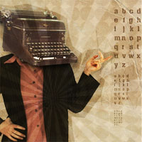
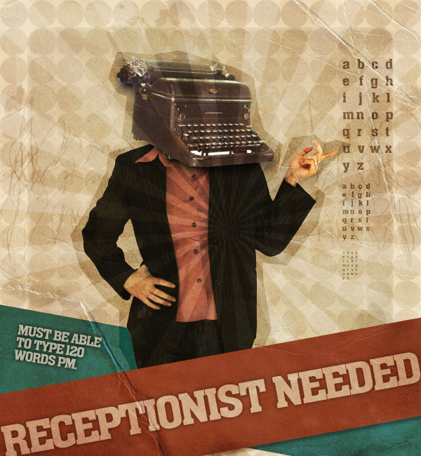
This is the final image we’ll be creating:
Open up a new document (600X650px) and fill your canvas with a light cream color (EBE2D3).

Now paste in a photo of an old paper texture, and set this layer’s blend mode to ‘overlay’, reducing it’s opacity to 70%.


Create a new document (40X40px) and create a new layer called ‘circle’. Then create a black circle, the size of your entire canvas. Hide your original background layer and then go to edit>define pattern and define your pattern as ‘circlepattern’. Then return to your original document and select your ‘cream background’ layer. Go to blending options and apply your new pattern as part of a pattern overlay. Be sure to reduce your pattern overlay’s opacity to around 7%, to give a subtle retro background effect.


Now create a new layer called ‘inner rectangle’. Use your rectangular selection tool to create a black rectangle in the center of your canvas. Then go to filter>artistic>underpainting. Apply the settings shown below in order to give your rectangle rough, retro edges. Then reduce this layer’s opacity to 10%.


Create a new layer called ‘grunge marks’. Select a large watercolor brush set and apply random brush strokes of black/white all over your canvas. Then reduce this layer’s opacity to around 10%. This should complete your grungy retro canvas, giving the impression of dirty marks.


Paste in an image of a woman into the center of your canvas. Remember to keep all of your layer’s beneath your ‘paper texture’ layer, as this layer then gives texture to all parts of your post, keeping the elements consistent with each other. To better blend your photo with the retro background, reduce it’s opacity to 90%, and go to image>adjustments>hue/saturation – and then reduce the saturation of your photo to -50. This should give your woman a nice washed out look.

Now to start bringing together our main composition. Paste in an image of an old typewriter, and resize/rotate it to fit nicely over the woman’s head. Also reduce the saturation and increase the lightness slightly.

Duplicate your typewriter layer and rename the duplicate ‘typewriter shadow’. Then move the duplicate beneath the original. Then go to blending options and apply a color overlay (black). Then go to filter>blur>gaussian blur and apply a 5.5 strength gaussian blur.

The point of using this gaussian blur effect is so that you can have more control over your shadows. Use a large, soft eraser brush at around 30% to erase away parts of the black blur effect, until you are left with a nice looking shadow. You want to aim to leave the gaussian blur looking most prominent where it overlaps the woman’s suit.

Now select your eraser brush, and set brush type to a watercolor brush set. Then reduce your eraser’s opacity to around 5%. Then carefully erase over parts of your woman and typewriter, to give the impression of your photos bleeding into your background very slightly.

Now I grab a sunburst graphic from my Free Sunbursts Set and paste it onto a new layer above my typewriter layer. Then I set the layer blend mode to ‘overlay’ and reduce it’s opacity to around 25%.


Now create a new layer beneath your woman photo layer called ‘woman outline’. Use your lasso tool to create a really rough selection around your woman and typewriter (going about 10px distance from the images at all times). Then fill your selection with black, and reduce this layer’s opacity to 20%.


Now create a layer above this (so still beneath your woman photo layer), called ‘messy lines’. Draw extremely messy handdrawn lines using a 1px black paintbrush. Make your lines go from one edge of your canvas to the other, going across your woman image, and getting smaller and closer together near the center. Duplicate your ‘messy lines’ layer 3 times to make your lines more pronounced, and then merge the 3 layers together.

Then transform your lines shape, making it about 1/4 of it’s original height. Also reduce this layer’s opacity to 50%. Then repeat this technique to create a few more sets of random lines. Then merge all of your messy lines layers together and reduce the merged layer’s opacity to around 40%.

Now create a long rectangle spanning across the bottom of your canvas, using your shape tool. Make sure that this shape is above all layers EXCEPT for your paper texture layer. Also, for the color of the rectangle, use your eye dropper tool, and select the red of the woman’s shirt. Once you have created your rectangle go to edit>transform>rotate and rotate it until it looks good. The idea is to cover the legs of your woman. The paper texture layer should really become prominent over the top of this bold shape, and become the focal point for your poster.

Now duplicate your rectangle layer and move the duplicate below the original. Then go to edit>transform>flip horizontal. Then go to image>adjustments>hue/saturation and increase the hue to +180.

You want the woman’s figure to cut in front of the green rectangle, but not the red one. To achieve this, option+click on your woman photo layer to select the woman’s shape. Then select your green rectangle layer and hit delete.

To make your front rectangle pop give it a drop shadow effect (settings below):

Now create some white text on a new layer above your rectangle layers (but below your sunburst layer). Be sure to rotate it to fit with your rectangle, and reduce the layer opacity to 50% to fit with the dulled, retro look. Finally apply a black outer glow effect (settings below):

I add some more text to my green rectangle, and to give it the same outer glow effect as the larger text I right click on the first text layer and press ‘copy layer styles’, then right click on the smaller text layer and click ‘paste layer styles’. I also notice that the rough, dark outline around the woman does not extend to my green rectangle, and is ruining the effect of the woman being in front of this shape. To fix this I option+click on my rough outline layer and return to my green rectangle layer. Rather than hitting delete (and this technique wouldn’t work with the low opacity outline layer), I go to image>adjustments>brightness/contrast and reduce the brightness of this selection to -25. This way I have effectively extended the rough outline to cover my rectangle.

I type out some letters to the right of my woman, and reduce this text layer’s opacity to 50%. Then I duplicate the layer and reduce the font size to about half. I repeat this step again.

Now the piece looks pretty finished. The only thing bothering me is that the hand pointing to the alphabet should be more prominent, as it’s really a focal point of the poster. To do this, I duplicate my woman photo layer and call the duplicate ‘bold hand’. Then I set this layer’s blend mode to ‘hard light’ and increase the layer opacity to 100%. Then I select all parts of my woman EXCEPT this hand using the lasso tool and hit delete. This just leaves one bold hand left on this layer, and makes the hand in the overall image much bolder. To finish this section I use a soft eraser brush to erase away the part of the hand nearer the woman’s wrist, as this gives the impression of the hand getting slightly bolder as it moves towards the alphabet, and thus draws the viewers eye even more.
You can see the final image below:
I hope that you enjoyed this tutorial, and would love to hear your comments on it.

Tom is the founder of PSDFAN. He loves writing tutorials, learning more about design and interacting with the community. On a more interesting note he can also play guitar hero drunk with his teeth.


Do you know the basic tools in Photoshop but feel that your work is still looking average? Join our creative community at FanExtra and get the direction you need to take your work to the next level.


thanx amazing tutorial …
thanks for the kind words moih60
Simple and amazing tut…
Thanks Salmen! I decided to aim for a slightly simpler tut after a couple of requests.
A great tutorial.
It’s good to see you writing good quality tutorials again unlike the last two you did.
This is what people want to see.
Excellent work Tom!
Cheers Devon. Sorry you didn’t enjoy the previous two. I really appreciate it when my readers let me know what kinds of tuts they want to see. If you could elaborate on this I’d be happy to try and cater for what you (and others) want to learn about.
Thanks for getting back to me. I do think it’s important to try new things, as some of my best tutorials have been crazy ideas I’ve had. However, I’ll definitely plan out some more traditional style tutorials.
Wonderful tutorial!:)
I was wondering what font did you use…?
Thanks Iva! I used AkaChen, a wonderful free font: http://www.fontspace.com/akatype/akachen
nice poster tut. thanks..
No problem Joyage
Great work, Tom. I am impressed. I have been working with Photoshop for almost a year. I have no problem following instructions on projects other people have done, but to come up with an idea on my own, like you do, is something i can’t seem to manage. How do you start your project? Do you just start on a blank canvas and then just go with the flow or do you like actually think about what you want to do and have a clear vision of where you are headed on a particular project?
Thanks for the kind words Mohammad. I generally come up with an idea or theme, and then try to sketch it down on paper before writing the tutorial. Generally I’m able to work out the techniques and steps required to create it before actually writing it all out, but sometimes things will crop up as I’m writing. I agree though, it can be really tough trying to come up with fresh concepts.
Great tut, but I would use the sunburst behind the woman….
I have to disagree; one of the strong reasons I like this tutorial was the fact that the second burst was over the woman. That and the huge crease (and the fact that there is a typewriter over her head) make the poster really stand out among competition.
Thanks Maria, I’m really glad that you enjoyed this tutorial .
.
I like this piece a lot. Nice use of textures.
Thanks guys, I’m glad you liked it
Bjooern: yeah I agree that may look better. I’m glad you liked the outcome anyway though.
Whoahh! Sweet tutorial. Doing it right now even though I’m tired as hell Thanks for posting. Agree with Bjooern as well though.
Wow, great tutorial, thanks!
Great tutorial mate
Amazing tut! Big thanks
No problem, I’m glad you enjoyed it.
very helpful and inspiring! thanks!
awesome
Great tut
Thanks guys!
I’m late because the computer was kinda broken, but thanks for the font tip. I’ll give this another go, using that font, to see if it’ll look any different.
loved the tutorial very creative thnx
Just finished doing this and i think it is pretty awesome!
Thanks all good practice for moi!
Thanks Telf, I’m glad you enjoyed it
gee this one rocks. i’ll try this immediately
A great looking retro poster result. I really love coming to this site-full of inspiration!
Amazing tutorial! Very well written, and easy to follow, replicate, and tweak! I was able to make artistic alterations to it without throwing off the whole process.
Thank you for posting it.
Thanks Deborah, I’m glad you enjoyed it
really amazing tutls, smashingmagazine dugg it, so great
nice one!
hi..im want to research about film poster..what kind of film poster which is good film poster…
what must have in film poster..relate to the principle of design
[...] Create a Mock-Retro Poster Concept [...]
Great Tutorial, some great simple effects that can be used in so many different projects
Man thanx alot just learning the basics right now and its pretty good to start with
wow cool. I’ve tried it and how awesome I can do it. Thank you for sharing this great tutorial. I love it
Hi !
Really cool design tutorial.
dude this tutorial is helpful. and its funny. double wammy.
Hi there, it’s very nice tutorial and well written, but I just got one question/problem:
Step 15: “Make sure that this shape is above all layers EXCEPT for your paper texture layer”
How can shape layer be above all layers except paper texture if paper texture is second layer from bottom? If you put shape above paper texture all the effects from top layers also effect the shape.
Maybe I’m just no getting something obvious:)
Tnx for answer
Great tutorial!
I used it to make myself a flyer too remind myself to get inspired
You can find the result here: http://ladysweetlimepresents.wordpress.com/2011/01/14/inspiration-wanted/
great tutorial!
Great tutorial thanks
Amazing Tutorial! Easy to follow and I added my own spin which resulted in a fantastic poster. Thank you for posting this! You totally rock.
Nice, Thanks,
here’s my own version:
https://picasaweb.google.com/117412043964777949124/24Mrt2011#
My brother suggested I might like this websiteHe was entirely rightThis post actually made my dayYou can not imagine simply how much time I had spent for this info! Thanks!
Thanks a lot!really helpfull!
i have a question! i don’t understand step 17. Every time i alt+click nothing happens and when i delete the rectangle it deletes everything. :\
awesome. thanks!
Awesome tutorial!! Used it for a poster
Step 15, Make sure that this shape is above all layers EXCEPT for your paper texture layer. Could sb explain please how to do it? Clueless…