
 Mastering the Apply Image Tool in Photoshop
 Members Area Tutorial: How to Create a Graphics Tablet in Photoshop
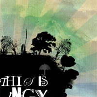 Design a Grungy Floating Island
Have every post delivered to your inbox and get access to hundreds of useful design freebies.
Here is the final image that we’ll be creating!

Open up an image of a person, try to select a photo of a head and torso only. My photo was black and white to begin with (http://www.sxc.hu/photo/462639), but if yours isn’t then go to image>adjustments>desaturate.

Now create a new layer called ‘clothes and accessories’. Use your lasso tool to select the man’s waistcoat, tie and glasses, and then fill these areas with black. I chose to fill in the glasses totally with black to create sunglasses.

Now create some largish text on a new layer. I chose to use arial, size 30 font and to make my text ‘MRCOOL’. Then go to layer>rasterize>layer. Then with your text object selected go to edit>define brush preset. Name your brush something unique, I chose ‘MRCOOL’. You may need to hide your other layers, leaving just your text layer as a few times my photo layers were included in the brush creation.

Now go to your list of brushes and ‘MRCOOL’ should be at the bottom of the list. Select this brush and then delete your original text layer. Create a new layer called ‘face dark details’. Then go to window>brushes and apply the settings below. For the second diagram, you will need to double click on ‘scattering’ to access the settings for this particular option.


Now with your MRCOOL brush selected, reduce the brush size to 10, and keep the opacity at 100%. Carefully paint over the dark parts of the face that are particularly detailed – things like the eyebrows, nostrils, lips etc… This may look a little rough at first, but that’s OK. The images below show the piece so far with the original photo layer visible and then hidden.


Create a new top layer called ‘face medium details’. Up the size of your brush to 30 and reduce it’s opacity to 40%. Paint in the medium shaded areas of the guy’s face and shirt. Again, it’s going to look a little rough, but don’t worry. The images below show the results with photo layer visible and then hidden.


What next? You guess it, create a new top layer called ‘face light details’. Repeat the same steps as before but up the brush size to 60 and reduce it’s opacity to 20%. Paint in the lighter areas of the face/clothes.


Now create a new top layer called ‘hair small’. Up your brush size to 100 and the opacity to 100%. Also go back to your brushes window and add ‘shape dynamics’ as well as ‘scattering’ in your options. Apply the settings shown below:

Now paint in the edge of the hair closest to the face. Try not to overlap the areas of the face that you have already painted in.

Go back to your brush options and for shape dynamics up the angle jitter to 35%.

Now create a new layer called ‘hair medium’. Up your brush size to 175, and keep the opacity at 100%. Paint in the rest of your guy’s hair, but spread the brush to the edges of the page. Your result should be a kind of text explosion out of the back of his head. I had to use my rectangular marquee tool to cut off an excess bit of text that was cutting into the back of his neck.

There is a gap below his ear where hair should be, so I go back to a 100 size brush with no shape dynamics and quickly fill this in. I use my ‘hair small’ layer. However, this also cuts into my guy’s neck/head too much, so I use my lasso tool and cut away the excess text.


Now hide your original photo layer and copy it. Paste your photo onto a new top layer, above all your text layers and set it’s blend mode to ‘vivid light’. The effect should be something like the image below:

Now resize your canvas so that you have more space to the right and above your current image. I increased the width and height of my image to 1500px.

Now go below your new photo layer and create a new layer called ‘hair large’. Repeat the same technique of painting in the hair as before, making sure that ‘shape dynamics’ is checked. Increase your brush size to 250, opacity to 100% and color black. Paint around your current hair, and make sure that you get rid of the harsh edges created by expanding our canvas size.

Create a new layer and write some text in the top right of your image, using Arial font, size 100, black.

Select your MRCOOL brush again and create a new layer called ‘text small’. Reduce your brush size to 100, and paint around the edges of your text. Don’t completely engulf your text, but instead try to brush mainly along the bottom of the text, so that the words appear to be emerging from the brush marks.

Now repeat your MRCOOL brush on new layers ‘text medium’ and ‘text large’, getting larger as the brush marks get further from your main text, and closer to meeting the brush marks from your original photo. Remember to use brush size 175 for medium, and 250 for large.

Now create a new layer called ‘jacket curve’. Select your path tool, and draw a path curving up from the edge of the guy’s jacket, then make sure to bring your path right around to join up with this original point. Now right click on your path and click ‘make selection’. Fill your resulting selection with black. Move this new layer beneath all of your text large-small and hair large-small layers.


Now create a new layer above all of these layers called ‘excess text’. The aim here is to use your brush just a little to create words of text that have broken away from the main mass that we’ve created. I tried to imagine the large black curve as a wave of water, with the excess brush marks being splashes of water colliding with it, and rising from it. Use varied brush stroke sizes and just keep going until things look right to you.

Now use your magic wand tool to select the shape in your ‘jacket curve’ layer. With this area selected go on any layer where you have used your MRCOOL brush and go to image>adjustments>invert. The result of this is that any text that overlaps with your large black curve will become white, creating a nice effect. You may get a warning that the selected area is empty, but just move onto the next layer. For me only the ‘hair large’ and ‘excess text’ layers actually had any text overlapping into this area, but it’s worth trying all of your brush layers.

My main text at the top right of my image was looking a little small, so I increased the text size from 100 to 150. Then I used the same technique that I used on the ‘jacket curve’ layer, whereby I selected each letter of text, and then with my selection in place went on my ‘text small’ layer and inverted.

I grab one of my sunburst images from my freebie sunburst set that I posted a short while ago (link needed) and paste it onto a new layer below all of my other layers. I grayscale the image, and reduce it’s brightness to -100 and up the contrast to 100 to create a fully black sunburst.

Now I select my sunburst rays using the magic wand tool. With my selection in place I go to the layer ‘hair large’ and then go to image>adjustments>invert. I then do the same for the layer ‘text medium’.

Now with my sunburst layer selected I go to layer>add layer mask>reveal all. I select a radial gradient ranging from black to transparent and drag it outwards from the center of the sunburst. This will fade the sunburst out at the edges, but leave some of it remaining in the center.

Paste in a paper texture image as a new background layer (so below all current layers). Go to image>adjustments>hue/saturation and then reduce the saturation to -50 and up the lightness by +15.
I hope that you enjoyed this tutorial. There is obviously a lot that can be done with this technique, but I just wanted to share some ideas that I’d had with creating your own brush sets and applying them in creative and interesting ways. Play around with it and let me know what you come up with.
(Click the image below to see the full sized version)


Tom is the founder of PSDFAN. He loves writing tutorials, learning more about design and interacting with the community. On a more interesting note he can also play guitar hero drunk with his teeth.


Do you know the basic tools in Photoshop but feel that your work is still looking average? Join our creative community at FanExtra and get the direction you need to take your work to the next level.


Wow, awesome tut. But after Step 7 you had should stop Looks awesome, also the final result but after step 7 its perfect
Thanks Kaistr! I’m really glad you enjoyed the tut, I hope that you’ll consider subscribing. And I could never just post a 7 step tut heh.
heh.
Cool tut, keep up the good work!
Cheers mate, I’m glad you liked it
Wow! a great one again. thanks
Thanks twopo And like I said in the post, no more delays for tutorials, I’ve got a bunch of great ones lined up!
Very nice. The outcome is awesome. The tutorial really shows what you can do with custom brushes. Keep it up!!
Cheers Lennart I’m keen to try another peice that’s completely different, but using the custom brush technique again.
well done Tom Thanx a lot for sharing another gr8 tutorial!
Thanks for the support Raj, I hope that you’ll continue to check my tutorials
My master did it again! You rock Tom! I like this tut dude! Continue to spread the magical works of “Master Tom”! Rock on dude! \m/o_O\m/
Haha thanks Mikel
Love the tut man!
Keep up the good work
Thanks James, appreciate it
great tutorial!
Cheers Alan
looks proper shit if you ask me,
but that´s really up to the individual to judge.
critical criticism is feedback, too
Sorry you didn’t like it Mike. I agree that critical feedback is feedback, but it’s not that constructive to just say it’s shit. I’m always open to comments suggesting how to improve my designs.
cool cool!
cool tut.Thanks a lot
Thanks guys
I found this tutorial quite enjoyable to make.
The only thing is that you did not mention to get rid of the grey background around the person which got my frustrated a little until I took it out.
Nevertheless, I would definitely enjoy another custom brush tutorial!
And as always, here’s my finished product, with a little animation of course!
http://www.mypicx.com/uploadimg/972386769_09162008_1.gif
[In browser at 1440x900 resolution, resize the image to 48% to see all of it!]
I can’t rasterize my layer! what to do? where did I go wrong so soon?
What version of Photoshop do you have Jolijn?
The tutorial shows where to go and such, did you read that whole paragraph over then go back and do it?
Hello admin, nice site you have!,
Nice Tutorial Dear… I leaned something new from them.. thanks…
Your site is very very cool !! I love it Respect !,
informative post, keep it up.,
Thanks for the kind words everyone!
I love this site so so so much Cool site!!,
It’s very clear tutorial.
Thanks
Good Job. Very unique tricks indeed.
Thanks for sharing. Keep up the good work.
waw, what a wonderfull tricky tutorial. tx
Nice Tutorial & very useful for beginners like me;p
Thank you a lot! I like the tut and the used techiques. Could be very useful to everyone (:
Looks great. thx for tut
where can you get a paper texture thats good and for some reason i make a layer put it to the lowest and paste in my texture but i can make it hue/saturation. why is this?
Thank you so much for this post. I want to let you know that I posted a link to your blog in CBH Digital Scrapbooking Freebies, under the Page 3 post on Aug. 25, 2011. Thanks again.
A really nice tutorial, I think that the textures are really nice and I like the idea of the layers and the grungy look. The only thing that I think lets this down slight is the clarity of the text. How crisp and clear it looks in comparison the rest of the artwork I think does let it fit together properly. This is something I would change but the overall impact of this piece is great and I think would take the techniques and apply them to my own designs