 Design a Unique Grungy Website Layout
 Create a Surreal, Scenic Photo Manipulation
 Members Area Tutorial: Learn How to Photo Manipulate a Realistic Fallen Angel Scene
Have every post delivered to your inbox and get access to hundreds of useful design freebies.
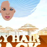
This is the final image that we’ll be creating:

Open up a new 600X600px document and paste in an image of a girl. I used the great photo taken by ‘binababy12′, you can see the original here: http://www.sxc.hu/photo/931368. Make sure that her face is fully showing and that her fringe is also there. Resize and move the image to be in about the size/position shown below. Call this layer ‘girl photo’.

Create a new layer called ‘girl face’ and use the lasso tool to select around the girls face and ears. Be sure to select around the hair and fringe (‘bangs’ for any American readers). Then use the eye dropper tool to select an average shade of her face and fill in your selection.

Now hide your face layer and create a new layer called ‘girl eyes’. Select around one of her eyes using the lasso tool and then fill it with black. Then turn your layer’s visibility off and with the original photo showing through select the white parts of her eye (including the tiny white dot of her pupil). Then make your layer visible again and hit delete to delete this part of your black ‘girl eyes’ layer. Then create a new layer behind this layer but above your ‘girl face’ layer called ‘girl eyes white’ and you guessed, it use the lasso selection/fill tools to fill in the whites of her eyes. You can see some of the stages of this below as well as the result with ‘girl face’ layer made visible.


Now repeat this same technique. First create a new layer called ‘girl nostrils’ and use the selection, eye dropper and fill tools to fill in her nostrils. Then create a new layer behind this layer called ‘girl nose shadows’ and fill in the darker parts of her nose’s structure. Using the eye dropper tool for the nose’s shadows made it look too dark, so I reduced the ‘girl nose shadows’ layer’s opacity to around 30%. Then to give the nose a little more definition I create a new layer called ‘girl nose define’ which I positioned between my nostrils and nose shadows layers. I simply hid my current nose layers and face layer and then select the defining lines of the nose from the original photo. You can see the stages of this below:


Then I repeated the same technique for the lips, adding base color, defining lines and then shadows and highlights. You can see the stages of their construction below:


Now I repeat the same technique and add eyebrows and lines between her face and ears. With the right eyebrow I’m careful to avoid where her hair line is, and simply select the parts of her eyebrow showing around it. I reduce the opacity of both eyebrow and face/ear line layers until it looks right.

Ok so great! The face is done, now time for some funky hair. I create a new layer called ‘girl hair’ below my face layer. I select the pen tool, and make sure that ‘paths’ is the setting. Then I create anchor points spanning out sideways from about the height of the girls nose. I aim for a nice wavy outline, and am sure to make my path go beyond the sides/top of my document. Then I go to my paths, and choose ‘load path as a selection’. Once I have my selection I fill it with a gradient ranging from 270F53 to A723D2. This looks pretty cool, but I’m not happy with the shape. So I select my path tool again and change the shape, cutting out some cool stray hair parts.


Now create a box at the bottom half of your screen and fill it with a gradient ranging from 7A3700 to C77E29.

Now add some large, chunky text. Make sure that it’s white and that you move it so that it goes into your white background a little:

Now duplicate your text layer and move the duplicate below the original. Rasterize it, and go to image>adjustments>brightness/contrast. Reduce the brightness to -100 and up the contrast to 100 to make the text black. Then using your keyboard cursors move the layer 1px down and 1px right. Duplicate this layer and move it 1px down, 1px right again. Repeat this until you have a kind of 3d effect moving downwards/right at a 45 degree angle. Now merge all of these duplicate black text layers. Then go to layer blending options and give this merged layer a gradient overlay ranging from 2F1500 to 5E2A00.


Now move your gradient box and text layers right beneath all layers containing parts of your vector girl illustration. Paste a new layer above these layers that contains some kind of summery imagery. Go to image>adjustments>brightness/contrast and up the brightness by 85% and the contrast by 25%.


Now paste in a large paper texture, position it over your summer image. Then set the blend mode to overlay and merge the two layers.


Now hide this merged layer and select your ‘crazy hair is back’ text layer (the text layer not the 3d shadow layer. Rasterize the layer. Then select around the text using the magic wand tool. DO NOT select the inside spaces of your letters. Fill your selection with an obvious color (I chose red). Then reduce the layer’s opacity so that you can see the gradient box below and select the area of red above the gradient box, then delete it.


Now with your magic wand select the red area, as well as the area between letters (but not the spaces within the letters – such as the two gaps within B or the gap within A). Then with this selection in place hide your red fill layer and select your summer image layer. Hit delete. This should leave you with some really cool text that has the fill of your summer image, including the cool paper texture overlay.


The gradient on the hair isn’t really going with the rest of the image, so I apply a gradient overlay to the layer, ranging the gradient from 99CCF3 to 62B2EF.

Now the gradients in the hair, text shadow 3d area and gradient box at the bottom are looking a little sleek when compared to the paper texture in the rest of the poster. I paste in my paper texture just above the ‘girl hair’ layer, making sure to duplicate the layer and hide the original. Then I make the layer invisible, select around the hair shape using my magic wand tool and then select my paper layer again and hit delete to leave a paper image in the shape of the girl’s hair. Then I set the layer blending mode to overlay and reduce it’s opacity to 40%. I repeat the same technique for the 3d text shadow and gradient box. Remember that you kept your original paper texture layer, so you can duplicate this again and use the original/duplicate for these other two areas.


Now I want to give the hair area one last final bit of texture. I paste in a free image of a sunburst that I found on a new layer above my ‘paper texture hair’ layer. Then I desaturate it and cut it out to fit the hair shape using the steps shown previously in this tutorial. Finally I set the layer’s blend mode to ‘overlay’.

Here is the finished design! I hope that you enjoyed this tutorial and would love to know your thoughts on it.

Tom is the founder of PSDFAN. He loves writing tutorials, learning more about design and interacting with the community. On a more interesting note he can also play guitar hero drunk with his teeth.


Do you know the basic tools in Photoshop but feel that your work is still looking average? Join our creative community at FanExtra and get the direction you need to take your work to the next level.


Thanks Tom.
haha – it’s like a 70′s band is making a reunion tour.
i like the illustrated effect it has.
Haha I see what you mean! I’m glad you liked the effect
Twopo: No problem, I hope you found it useful.
When i first saw the pic i thought it was totally illustrative… Tx for tutorial!
Nah I’m afraid I’m still fairly new to illustration, I’m glad you liked the tut though
Awesome tutorial! I followed it very well, and I liked that you brought the illustrator/vector aspect into it!
Thanks Randomness, I’m glad that it was easy to follow
Great post! I am glad to see you sharing your work on DesignBump, I hope my site can bring you a lot of new visitors. Keep up the great work!
- John
Cheers John, your site looks really great by the way, I’ll definitely keep posting my work there!
thanks alot . it is very great
Thanks mai!
Lubi? typow? dla tamtych lat kolorystyk?.
Thanks for great tut
Dope! Her face is screaming for a “Madonna-esque” beauty mark, but I’m loving the simplicity and effectiveness of vectorizing this girl’s face for this. I design flyers and this gives me a great idea!!!
Really great tutorial. Will be using it for future projects.
Hey tom thanks for sharing such a beautiful illustration and easy to follow. once again thanks
Inspired me for some reason, good job !
Hi Adrian, Black!, Dale, Moses and G. Thanks for commenting and visiting the site I really appreciate the kind comments and hope that you’ll check back soon for more tuts like this one. It’s great to know that I’m helping inspire other designers
[...] 21. Design a Retro Summer Poster Illustration [...]
Nice tutorial…I am a begginer and This ll help me a lot…
Photoshop’s is really a great tool having special vector capabilities.
AMAZING.
I saw the poster on another site, and I wanted to know how it was created. Thanks!
Very cool, I love coming here and learning from your tuts!!!
Thnx Tom:)
This site seems to get a good ammount of visitors. How do you advertise it? It gives a nice individual twist on things. I guess having something real or substantial to give info on is the most important factor.
Great tutorial thanks
Awesome tutorial
thankyou for sharing, would be very useful for me in designing.
Hey i am also doing Graphic Designing,this would help me out.
Thanks for Sharing
Thanks a lot for awesome tutorial…..I’m going to try it now…
Nice tutorial – is there an easier way to get the 3d effect on the text though? Had to duplicate the layers a million times