
 Awesome Grunge Text Effect
 Members Area Tutorial: Create the Emotive Photo Manipulation ‘Magical Rose’
 Blend Multiple Images Better With the Edging Technique
Have every post delivered to your inbox and get access to hundreds of useful design freebies.
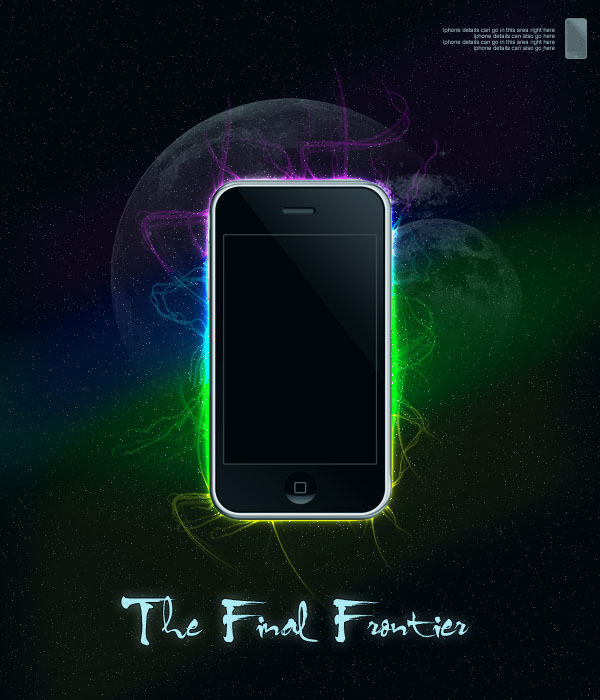
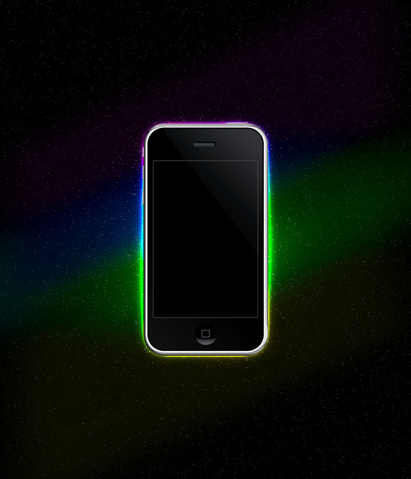
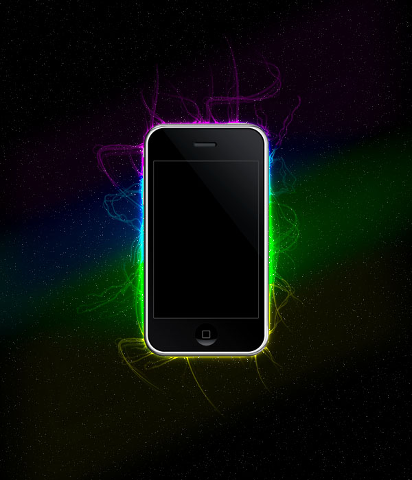
As always, this is the final image that we’ll be creating:
Create a new document (600X700px).
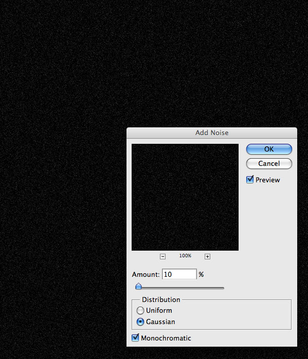
Create a new layer called ‘stars’ and fill your entire canvas with black:

Now go to filter>noise>add noise, and add 10% amount.
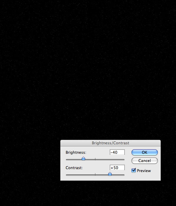
Go to image>adjustments>brightness/contrast and reduce your brightness to -40 and increase your contrast to +50. This should leave you with a stars background effect.
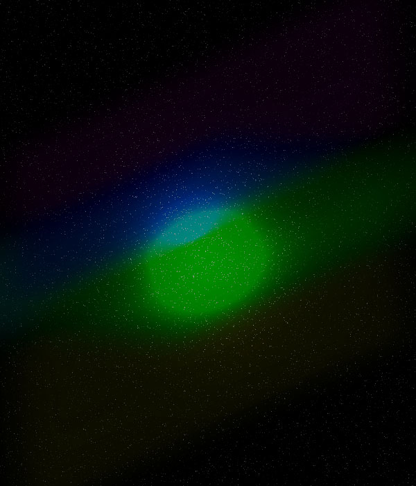
Using a large, soft paintbrush draw out a cross, consisting of four lines. Each line should be a different very bright color:
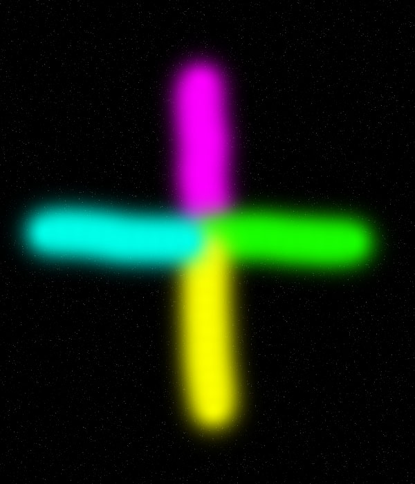
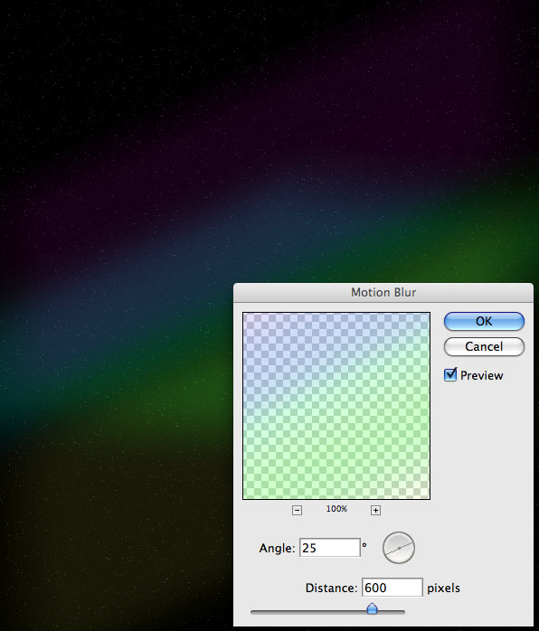
Go to filter>blur>motion blur. Apply a motion blur strength: 600, angle: 25 degrees.
Then change this layer’s blend mode to ‘hard light’ and reduce it’s opacity to 40%.

Use your radial gradient tool to create a white to transparent gradient in the center of your canvas. Create this gradient on a new layer called ‘light spot’.
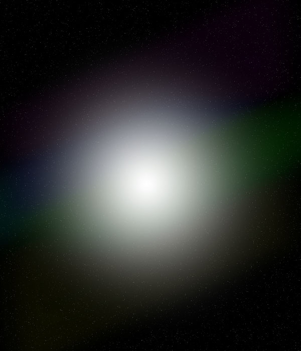
Then change this layer’s blend mode to ‘color dodge’ and reduce it’s opacity to 50%:
Paste a picture of an Iphone into the center of your document.
You can download the .psd for the Iphone image here: http://joelatlas.deviantart.com/art/iphone-3g-PSD-HD-94206586

Apply an outer glow blending option: mode: color dodge, opacity: 100%, size: 20.

Now create a layer beneath your Iphone layer called ‘wavy lines’. Download the brush set: Abstract Lines Vol 1. Apply many white brush strokes around the edges of your Iphone. Then change your layer mode to ‘color dodge’ and reduce your layer opacity to 30%.
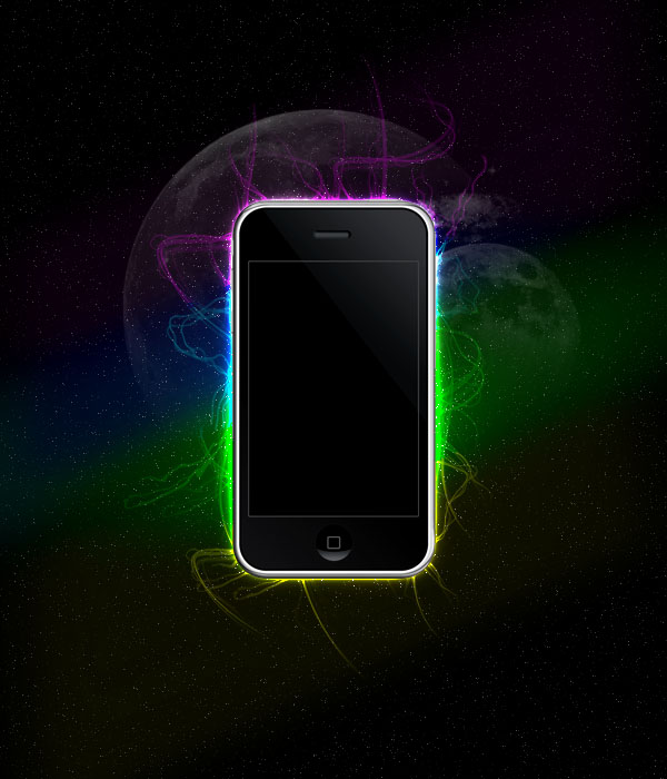
Now download this awesome moon brush set:
Make your brush color white, and apply several moons to your piece, each on a different layer. Make sure that your layers are below your Iphone layer, but above your ‘wavy lines’ layer.

Now reduce the opacity of your moon layers. Go to layer>add layer mask>reveal all. On each moon layer add a layer mask, and then drag a black to transparent gradient. This should fade away part of each moon.
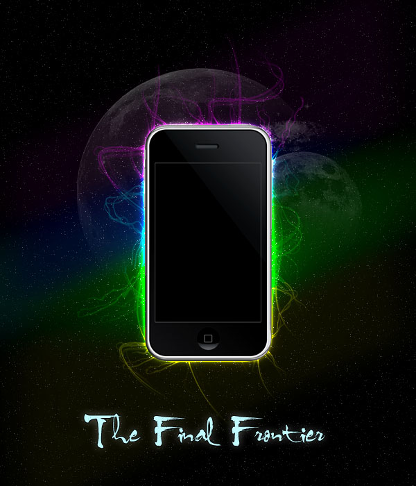
Add some text to the bottom center of your document. And apply the outer glow settings shown below:

Add an Iphone icon and some very small text to the top right of your advert.
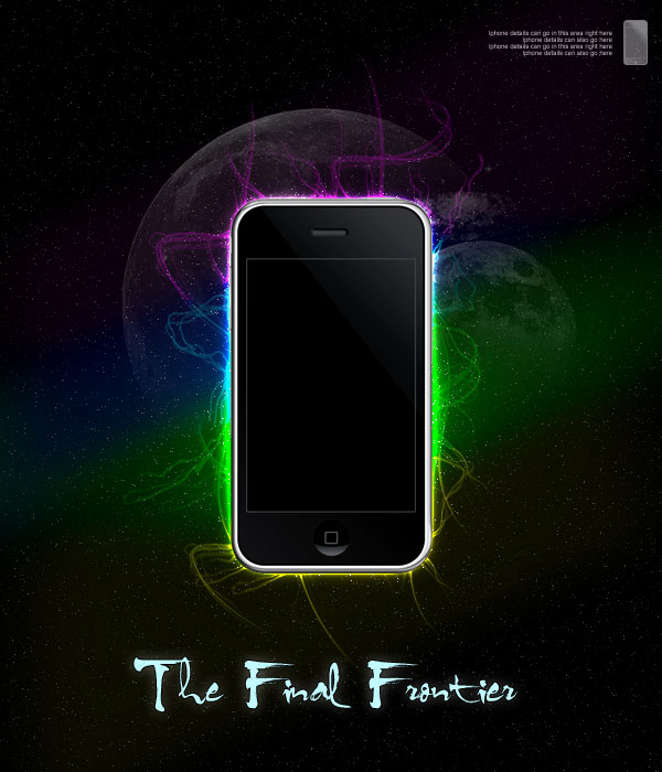
Go to layer>new adjustment layer, and apply a new top layer adjustment layer with a gradient map ranging from 004D79 to 00E4FF to 004D79. Reduce this layer’s opacity to 10%. This should give a subtle blue tint to your advert.
I really hope that you enjoyed this tutorial and would love to hear your feedback!
If you want to view the full sized final image, then click here:

Tom is the founder of PSDFAN. He loves writing tutorials, learning more about design and interacting with the community. On a more interesting note he can also play guitar hero drunk with his teeth.


Do you know the basic tools in Photoshop but feel that your work is still looking average? Join our creative community at FanExtra and get the direction you need to take your work to the next level.


good… tutorial…
I’m following your steps but when i’m supposed to set the gradient to color dodge, nothing happens.
Will: Did you create the radial gradient on it’s own layer? Also does it just stay looking like a white light spot for you?
Nice tutorial. Btw, there are some issue with blending modes. Color dodge not always fits quite right, and I think because of noise filter at space layer.
For everybody: just keep trying and found a blend, that looks good.
Wonderful and good
Thank you
Awesome tutorial. Thanks!
I did it and i’m very happy with the result, have alook at it and some of my other stuff http://www.facebook.com/album.php?aid=45280&id=1065186104&l=f18c59c1be
the albums not very big- ive only been shopping for like a week.
Dal: What kinds of issues are you having with color dodge? It seems to work fine for me.
Mitchell: I really like your result! Nice work
Looks good with Zune too
Great and very easy to follow tutorial. The end result looks really good and there are some nice techniques used to achieve the finished image. Can’t wait to try this out for myself. Thanks for sharing this with us.
Thanks guys!
Oliver: Please feel free to post here once you’ve tried the tutorial, I’d love to check out your outcome.
Wonderful tutorial.
Great tutorial, but i got some trabel finding the brushes after i downlode them. I ilke it and i will came back and finish it, later.
Fairly simple but really nice. I like this tutorial a lot.. Thanks!
funtastic ! it’s make me easy ! but i have diffrent with STEP 6 . why ?
This Tutorial is valuable Lesson. I like it !! Thanx for u !!!
I’ve tried this on multiple versions of Adobe, as well as multiple computer. Every time I get to the radial gradient step, and change to color dodge. All it looks like is an extremely crappy and pixelated white blob in the middle with the colors over it. It looks like it has a lot of noise going on. What is my problem?
nice site the best tutaral
Thanks for featuring my iPhone stock in this tutorial!!
Amazinly easy thats what you have made me to belive……Life gets better with your tutotials…I love it.
Good tutorial, helped me learn about photoshop a lot.
Check out my outcome!
http://www.facebook.com/photo.php?fbid=10150105966401683&set=a.10150105966356683.286852.635566682
The color dodge isn’t working. If tried with different blending modes but i dont get the result what you have.
This is the result that i get:
http://i585.photobucket.com/albums/ss291/Amoravel/Untitled-2.jpg
me always learn alot from your tutorials and now again here due to google search and got another professional idea. thanks for sharing
I think a lot of people are having problems with the light spot step and changing the blend mode to colour dodge, it comes out very pixelated, even though it was created on a different layer.
What I did was that I kept it on the same normal blend and reduced the opacity a bit and then moved the layer underneath the painted blurry cross.
Hope this helps
Thanks for helping with this issue Mariam.