 How to Create an Effective Coming Soon Page
 Create a Mock-Retro Poster Concept
 Create a Surreal Floating Landscape
Have every post delivered to your inbox and get access to hundreds of useful design freebies.
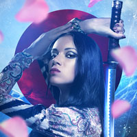
In this tutorial we will be creating a samurai inspired piece that combines stock photography with various textures and shapes to create a colorful and dynamic composition. We will also be covering lighting and coloring techniques as well as using Clipping Masks and Adjustment Layers along with a few other useful tricks. If you’re ready to get started then fire up Photoshop and let’s get to it!
Here is a preview of the image that we are going to be creating:

To start things off we are going to open the samurai image from the resources folder. Once you have opened the image, make a copy of the original layer by selecting the layer and then pressing Command/Ctrl + J. After making the copy, turn the visibility of your original layer off as shown below:

On your newly duplicated layer, we want to add a layer mask by clicking the “Add layer mask” button from the bottom of the Layers Palette.

Switch to your Brush Tool (B) and press F5 on your keyboard to bring up the Brush Palette. We want to select a hard round brush with 100% hardness and 0% spacing.

With your layer mask active, begin to paint with your brush using a solid black color. As you begin to do this you will notice that the area you paint will disappear from the image. Looking at your mask in the Layers Palette you can see that the part of the layer we have removed appears in black, while the part we want to keep is in white.

Continue to do this and work your way around the image so you get a nice clean selection. If you wish, you can use the Pen Tool (P) to zoom in and make selections around the samurai instead. The method you prefer is up to you, but take your time to ensure that an accurate selection is made around the model.
Once you have made the selection, hold down the Control Key and click on the layer mask thumbnail in the palette and a dropdown menu will appear. From the menu we want to select “Apply Layer Mask” to apply the mask and essentially merge it together with the layer.

You should now have an isolated image of your samurai warrior that can be placed into a new document. The image below shows the result:

Next, create a new document that is 7.5” x 11” and 300 dpi. We can leave the color set to RGB but in my opinion it is always better to start working in a larger format and to reduce the size later on in order to maintain the highest quality image.

With your new document open, drag the isolated image of the samurai over and then scale the image up so that it fills out most of the canvas. To do this, press Command/Ctrl + T to initiate a Free Transform and then hold the Shift Key while dragging outwards from any of the four corners of the image.

After scaling the image up, you should now have something like this:

Now that we have placed our model into the new document we are going to temporarily turn off the visibility of the layer. We will then open the mountain image from the resources folder and bring this image into the new document.
Using the same Free Transform Command from the previous step we will scale this image up so that it also fills the canvas. We are mainly concerned with the vertical placement of the image here since we want to make sure there is no space between the top and the bottom of the photo. The horizontal placement is up to you, but I have chosen to crop the background like this:

Toggle the visibility of your samurai layer on and off to see how the image looks with the mountains in different positions so you can get it just right.
Once you are happy with the placement of your background image we are going to zoom in and switch to our Pen Tool (P). What we are going to do from here is just make a selection going around the peaks of the mountains as shown below:

When you trace around and close the path, trace downwards so that you also select the land below the mountains rather than making the sky your selection. Once you close your path you will want to hold down the Control Key and click anywhere along the path itself to reveal a dropdown menu. From the menu we want to go with “Make Selection” as shown in the image:

When the dialog box below appears you can just press the Enter Key and bypass it since we don’t need to change anything here.

Now you should see the marching ants that indicate your selection around the image and you will see what I was saying before when I mentioned to include the bottom of the image in your selection.

While the selection is still active, press Command/Ctrl + J to duplicate this selection onto it’s own layer.

Now we can turn off the visibility of the original mountain image and work from our copy.
Next, create a new layer just above the background layer and switch to your Paint Bucket Tool (G). Choose a light blue color – I am using #95CBE4.

Fill your new layer with the color and then create one more new layer just above this one before change your color to #4CBDF2 as shown below.

Switch to your Gradient Tool (G) and choose a Linear Gradient that fades from the new blue color to completely transparent.

On your new layer, click and drag from the bottom left of the skyline and drag your mouse upwards and to the right. At first, this may look odd because it is a more vibrant shade of blue, but we are going to change the Blending Mode of this layer to Screen. Doing this will create a lighter and brighter blue that will create a distinct light source in the background.

If you turn the samurai layer back on you should now have something like the image shown below:

The reason we are creating our own background is so that we can remove the clouds and also to give us more control over the separate parts of the image. This leaves us the option to create new layer in between the sky and the mountains, as well as the mountains and the model, creating that much more depth and possibility.
Select your copied mountains layer from the Layers Palette and press Command/Ctrl + J to make a second copy of the layer as shown below:

With your new layer selected, go to the Filter Menu and choose Blue>Gaussian Blur.

Once the dialog box appears, change the setting to 11.5 pixels and press the Enter Key or click OK to apply the effect.

Change the Blending Mode of the blurred layer to Soft Light and reduce the opacity to 60% as shown here:

The result will create a more noticeable dramatic effect, which helps the samurai to stand out more from the background.

Next, make sure that your top mountain layer is selected – this should be the layer just below the samurai layer.

Select the Adjustment Layer icon from the bottom of the Layers Palette as indicated in the image above, and once the menu appears choose “Hue/Saturation” from the list.

From here we want to move the saturation slider all the way to the left.

Doing this will desaturate everything below the samurai warrior layer. The nice thing about applying the effect this way is that if we want to we can brush some color back in, so it’s a non-destructive method of manipulating the image. The image below is how the image should appear as a result of the Adjustment Layer.

At this point we have begun to work up a backdrop for our samurai but I feel like we need to add some texture to the area above the mountains. To do this we are going to bring in a new sky image and then work from there.
In the resources folder you will see a “Sky Stock Pack” where we will be using “Stock 011” as shown in the image below:

Bring this new sky image into your Photoshop document and place it below the Hue/Saturation Adjustment Layer, but also below the mountains. Once you have done that, change the Blending Mode of the layer to Overlay.

You can position the clouds however you would like, but this is just to bring some texture back into the image.

Next, we will open the grunge texture image from the resources folder and bring that into our document.

For this image, we want to place it just below the samurai layer before changing the Blending Mode to Screen as shown below:

Now we have created an edgier and more tactile background, which really helps to add something new to the image.

What is happening now is that the color of our samurai is too saturated compared to the background. In order to fix this I’m just going to make a quick copy of the samurai layer and then turn off the visibility of the original layer below.

From there, press Command/Ctrl + Alt/Option + U to bring up the Hue/Saturation Adjustment. Move the middle slider to the left so that the saturation is set to about -50.

I don’t want to completely desaturate the figure as it should still be the prominent focal point of the design, but the idea is to make it fit together and blend in a more natural way. Also, if we want to bring some color back into the model, all we will have to do is mask out some of the copied layer to reveal the original layer beneath.

You can see how in just a couple of steps we have taken the background and built a solid foundation that we can build from. It’s better than just using a single photograph because it makes your images that much more customized. It’s also good practice to experiment with the way that different textures can affect your image just by changing the Blending Modes.
Next we will open the nebula stock photo from the resources folder as shown below:

Drag this image into your document and move it to the top of your Layers Palette so that the only layer above it will be the samurai layer. You will most likely need to do a quick Free Transform (Command/Ctrl + T) to scale the image up and make sure that it covers the canvas. After doing that, change the Blending Mode of the layer to Overlay and reduce the opacity to about 76%.

The nice thing about bringing this image in is that it starts to introduce some color, but it’s very close to the same color that can be found in the decorative attire worn by our samurai.

From here we can build up some more colors and add light effects using a harmonious color palette that will unify our design even further.
We will continue to bring some new color and light into our design by creating a new layer just below the samurai layer and selecting your Gradient Tool (G). For the fill color we will be using a vibrant blue color (#0A1DF7).

From here, check your gradient settings and make sure that you have a Radial Gradient that fades from blue to transparent as shown below:

Begin by clicking and dragging outwards on your canvas to create your first gradient. You can quickly resize them by using the Free Transform (Command/Ctrl + T) and you can also make copies of the layer by pressing Command/Ctrl + J. You will notice here that I have created about 7 different gradients using this blue color. Each of these gradient layers also has a Blending Mode set to Screen.

Experiment with the size and placement of your gradients here, as it will help to give the image more of an electric glow.

Layering textures and colors in this way can create some interesting but often unexpected results. Before deciding on a color I like to use the Hue/Saturation Adjustment option to see how different colors fit into the composition.
Create another new layer at the top of the Layers Palette and create one additional Radial Gradient. Change the Blending Mode of this layer to Overlay and reduce the opacity to about 50%.

The result should look something like this:

This adds a bit of color to our samurai but also intensifies the blue colors used in the background of the design.
Next, we will create a new layer at the top of the Layers Palette and then switch to your Brush Tool (B). We want to make sure that we have a hard round brush at full opacity selected. Change the size of your brush to about 6-8 pixels in diameter.

After choosing your brush, switch to your Pen Tool (P) and trace along the inside curve of the samurai sword as shown here:

It may take a couple of tries or a bit of finessing to get the curve just right, but once you have a curve that you are happy with, hold down the Control Key and click anywhere along the path to reveal a dropdown menu. From the menu, choose “Stroke Path” as shown in the image below:

Once you do that, another dialog box will appear. Make sure that on this dialog box that “Simulate Pressure” is unchecked.

Now you should notice that your path has been stroked using the brush we selected at the beginning of this step. However, the path is also still appearing and to get rid of that we simply hold the Control Key and click along the path to once again reveal a dropdown menu. This time from the menu we want to select “Delete Path” and that will leave just the brush stroke without the path.

Double click on the stroked path layer at the top of your Layers Palette to bring up the Layer Styles. Check off the Outer Glow option and apply the following settings:

For the glow color we want to use #0F57EB.

Once you have done that, press the Enter Key or click OK to apply the changes. The result should look similar to the image below:

Next we are going to add another Hue/Saturation Adjustment Layer by first selecting the samurai layer to make sure that the adjustment will appear above the samurai. Click on the Adjustment Layer icon at the bottom of the Layers Palette and then choose “Hue/Saturation” from the menu that appears.

Apply the following settings to the sliders so that we have a slight shift in the hue as well as a saturation boost.

By doing this we can make the overall image pop and also bring some life back into the face of our samurai warrior. The image below shows you the before and after effect of the Hue/Saturation Adjustment Layer that has been applied.

We will now want to open up the image of the flower petals from the resources folder so that we can begin to bring some of these into our image.

Use your Lasso Tool (L) to make a quick selection around one of the flower petals as shown below:

Once you have made your selection and you have the marching ants indicating the active area, press Command/Ctrl + J to duplicate this selection onto a new layer. From here, you can simply drag the flower petal over into your working Photoshop document.

You may want to scale it up a bit depending on the size of the image, but the idea is to make it large enough so that it appears to be in front of the samurai warrior. After placing the petal in the upper left of the image, go to the Filter Menu and choose Blur>Gaussian Blur as shown here:

Once the dialog box appears, apply a Gaussian Blur of about 18 pixels.

The result will look something like this:

Using this technique will add a greater sense of depth to our image but it will also introduce some new colors as well.
Repeat this process to add more flower petals so they appear to be falling around the samurai warrior in a random, scattered sort of way. We will want to place a few of these petals behind her as well as in front, but the ones in the background don’t need such a strong blur. For the petals in the back, try a Gaussian Blur of about 4-8 pixels to mix things up. You can see below how I have placed these layers.

After playing around with the size, position, and blur of the different petals I have come up with a balanced composition that I am happy with. Your composition doesn’t have to look exactly like mine, but remember that the goal is to have enough petals where it creates a nice effect – you never see just one or two petals falling when a strong gust of wind blows them around. At the same time, we don’t want to clutter up the design so much that you can’t even see the model, which is still the focal point of this design.

Create a new layer at the top of your Layers Palette and switch over to your Gradient Tool (G). Choose a solid white color and set your settings to match the image below:

With your Radial Gradient set, click and drag outwards from the center of the image to create the gradient. Position the gradient over the bottom of the sword and change the Blending Mode to Overlay. This will create a highlight on the sword that will give it an extra shine since the steel is such a reflective surface.
The image below shows the gradient before and after the Overlay Blending Mode.

Next, create a new layer at the top of your palette and use your Marquee Tool (M) to create a large circular selection and fill it with the color #FF0000.
Once you have done that, return to the sky photos from the resources folder and open Sky Stock 10. Bring this image into your Photoshop file and place it on a layer above the circle layer and then change the Blending Mode of the top layer to Multiply.

Your layers should look like this:

With your top layer selected, hold down the Control Key and you will see a dropdown menu appear. We want to select “Create Clipping Mask” as shown below:

And after doing that you will notice that the top layer has an arrow next to it to indicate the Clipping Mask:

Press Command/Ctrl + E while your top layer is still selected and it will merge the two layers together. After you have merged the layer you will then want to move it so that it’s just below the samurai layer as shown here:

As a result, your design will look something like this:

Create another new layer above all of the other layers and switch to your Brush Tool (B). We want to use a solid white round brush, set to about 8 pixels.

Switch to your Pen Tool (P) and create a path that follows the curve of the sword. After you have done that, hold down the Control Key and click anywhere along the path to reveal the menu where you want to select “Stroke Path” as shown here:

When the next dialog box appears, make sure that “Simulate Pressure” is checked off as shown in the image.

After applying the stroke you will need to once again click along the path to reveal the menu and then select “Delete Path” to remove the original path.

We will continue to use this same process to further embellish the sword and create streaks that convey motion.
Vary the size of your brush a bit and repeat the previous step to create one or two more light streaks that follow the curvature of the sword. Once you have done that and removed the path, you can apply the same glow effect by selecting the first light streak layer and clicking on it while holding down the Control Key. From the menu, we want to choose “Copy Layer Style” as shown below:

Next, click on your newly created stroke layer and hold down the Control Key before once again clicking to reveal the same menu. This time we want to choose “Paste Layer Style” from the menu. Doing this will apply the same glow effect that we have used earlier rather than recreating a new one.

Double click on the newly created light streak layer to bring up the Layer Styles dialog box. On the Outer Glow settings we just want to make a few adjustments to the spread and size as shown here:

Now that we have reduced those two settings we have a slightly more subtle effect than the original glow. The result will look similar to this:

By adding these streaks of light we are bringing more focus and motion to the sword while simultaneously making the image more dynamic.
From here we are going to add another Adjustment Layer to the design. In order to do this we just need to make sure that our top layer in the Layers Palette is highlighted and then click on the Adjustment Layer icon along the bottom row of icons and choose “Curves” from the menu as shown in the image below:

I have added three points to the curve, and in each of the images you can see the Input and Output settings that I have used.

After you have set your curves, just reduce the opacity of the layer to about 50% so that we have a more subtle effect. We don’t want the image to get too dark or too light, but if we boost the contrast slightly it creates a nice effect.

Create a new layer just above the top flower petal layer and switch to your Gradient Tool (G). Select a vibrant blue color such as #065CFA and make sure that you have a Radial Gradient that fades from solid blue to transparent.

Create your gradient by clicking and dragging the mouse outwards. Once you have done that, change the Blending Mode to Screen and position it over the samurai. Duplicate this layer by pressing Command/Ctrl + J and experiment with the different Blending Modes. I have a few layers set to Linear Dodge (Add) as well as a few set to Screen and Color.

Continue to place Radial Gradients throughout the design, layering them and varying the opacities of your layers.

After you experiment and are pleased with the composition, select all of your gradient layers and press Command/Ctrl + G to put them into a Group Folder. Doing this allows you to then control the opacity of the contents of the entire folder. Notice where the Blending Modes would normally appear how it says “Pass Through” and I have reduced the opacity of the entire folder to about 80%.

Adding these extra layers of color is something that brings the setting to life and really unifies the image.
Next, go to the Filter Menu and choose Filter>Unsharp Mask and apply the following settings to your image:

Once you have made that final adjustment, be sure to save your work! If you have gotten to this point then you can pat yourself on the back and take a look at the design that we have created today:
Thank you guys for following along and I hope you have learned a few new tricks along the way. Happy Photoshopping!
You can view the final outcome below. I hope that you enjoyed this tutorial and would love to hear your feedback on the techniques and outcome.

Eric is a Graphic Designer, specializing in Print and Web Design. He's a graduate of the New England Institute of Art in Boston and has over 4 years of professional and freelance work experience. He lives in Brooklyn, New York working as a Graphic Designer and he has been featured in Advanced Photoshop Magazine, The Art of Fashion Art Exhibit and Artists In The Station Art Exhibit. Visit Eric's portfolio at ericvasquez.net.


Do you know the basic tools in Photoshop but feel that your work is still looking average? Join our creative community at FanExtra and get the direction you need to take your work to the next level.


Great tutorial. nice light
Eric man..
Thank sharing!!
Yeah, I love the lighting in this piece, great outcome!
Great article but it didn’t have evryehtnig-I didn’t find the kitchen sink!
Wow beautiful work!
Thanks guys! I appreciate your kind words.
No problem Eric, this is one of my favorite outcomes of yours! Can’t wait to see your next piece.
Thank you for this great tutorial!!
I of course tried to recreate the poster, but I couldn’t get the lighting quite right. Did give it a small spin and ended up with a great result
Wow! Love your result, you really made the tutorial your own .
.
Thank you!! I really had lots of fun creating the poster.
Great work there! I really like the color and tone of the overall piece, and the photo is pretty sweet!
Thank you for the very nice compliment!! I really have to thank you, cause the tutorial is super. Just had to find the images and put the tutorial into practice
I like this work of yours! Reminds me of the movie “Sucker Punch”.
The blue filter was imo too bright and you should have varied the petals(like not using the same image twice).
Thanks for your comments! I see what you are saying about the flower petals – I wanted to vary them as much as possible and see where I have repeated the same one twice. The image used had probably 10-12 different petals, but some of them just looked flat so I favored the petals that have a bit of a fold to them.
The blue lighting was created by using a series of blue gradients set to different Blending Modes and wasn’t actually a photo filter. Although it created a similar effect, I felt that by using this lighting technique it would unify the whole scene and have a more unique look.
Interesting piece although I feel that more work could be done here. And a lot of photo manipulation.
The sword needed to be with the sharp side the other way around. Also more touchups.
Keep them coming.
I appreciate your feedback and I agree with what you are saying about the sword – the sharp part of the blade was like this in the original photo but if the sword were in front of the samurai, this would actually be correct as the sharp part would be facing the inside of the body and not outside.
As for the photo manipulation, there were some techniques I had in mind to try out with the piece, but as I gain more experience I have learned that sometimes less is more, and you don’t always have to use every trick in every piece. With this particular image I wanted to try and just strike a balance between creating a realistic sort of atmosphere and something that is still visually interesting without going too far.
Thanks for commenting Constantin! It’s great to know that you’re a PSDFAN reader, I’ve loved your work for ages .
.
I don’t know what are you guys high about. First of all, the piece looks totally cliche. What I see here is a bad texture usage and blur overuse. The woman has a bad cut out and the only thing looking good is glow on her sword. The overall rating – unimpressed.
Great feedback. Thanks for your contribution to this conversation.
Let me start by just quickly apologizing for my sarcastic remark. I have nothing but the utmost respect and appreciation for PSDFan, Tom, and all of the readers. What I was trying to do with this piece was create a realistic depth of field which is where the blurred flower petals come in. Although to some this piece may look cliche, the purpose is to teach the techniques to some of those who might not yet know how to achieve this type of style in their design work. I will be the first to admit, not all of these techniques are brand new and cutting edge, but I hope that in some way they will come in handy for the readers. I appreciate the feedback, whether positive or negative, as it will only help me to improve, and to continue to try and deliver something that people can enjoy and learn from.
Eric you’re not bad and I don’t mean to be a hater. My point is that you should spend more time on (for instance) shading those petals, not on blurring them. This doesn’t lead anywhere. Obviosuly DOF is ok to use, even the greatest do it, but honestly in most cases this is something that ppl overuse when they have no idea how to finish thier illustrations.
Also I think you should be teaching something that you are more familiar with. I’m gonna give you several reasons why your DOF doesnt work here:
1. You can’t expect this to work with an abstract background, I mean what kind of DOF is this when your background has texture, mountains and geometric shape(?). This needs a better solution.
2. All those petals have no additional shading. They simply don’t work with the person (not to mention background). She is receiving light on her face from the top and from right side. Those petals should at least have a touch of that light.
3. DOF catches a certain _part_ of image, not selected spots (in your case only petals).
Cool tutorial, thanks for sharing.
aMs, you’re being a hater.
Eric is sharing knowledge, and it’s free.
I’ve been using photoshop for years now, and still its nice to see techniques like this, cliche or not, shared amongst enthusiasts and professionals alike.
Why go through the article in its entirety, then feel its necessary to nitpick at the petals and dof? The only thing you reveal is the fact that you are missing the point, and you are arrogant.
without a hint of sarcasm, i’d like to see your user name hyperlinked, like Eric’s, so I can possibly see your expertise and techniques in action. Through all the undertones of dislike in your posts, I can see that you have some knowledge and idea.