
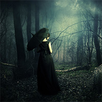
 Create a Dark, Mysterious Photo Manipulation
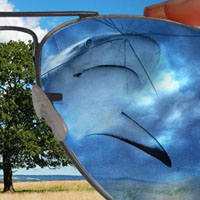 Create an Abstract Sea on Land Illusion
 Design a Sleek Diamond Poster Advert
Have every post delivered to your inbox and get access to hundreds of useful design freebies.
Here is a preview of the image that we are going to be creating:

Create a new document (1100px X 800px).
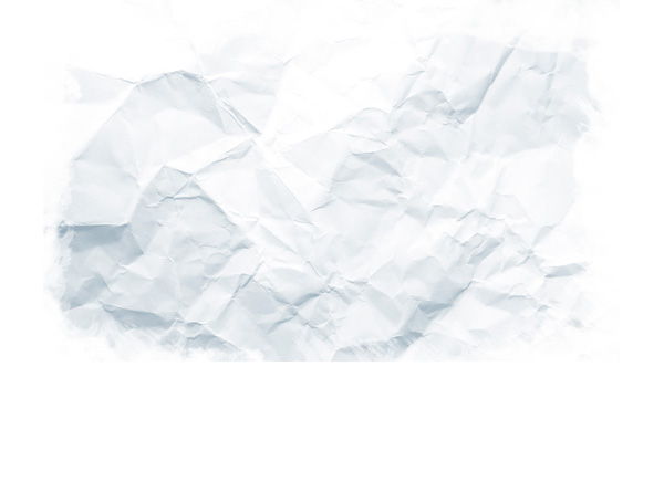
Paste your crumpled paper texture into the top-center of your canvas:

Reduce this layer’s opacity to 50%. Now apply a layer mask and use a grungy, black paintbrush to mask off the edges of your paper, blending it smoothly into the main white background.
Download the Bittbox watercolor brush set from the resources section for this tutorial. Apply several black brush strokes at a very low opacity over your paper texture area:

Download the ‘skatepark ramps’ photo from the resources section for this tutorial and paste it into your document:

Move the ramp image to the left part of your canvas and then apply a layer mask. Use a black paintbrush and brushes from your watercolor brush set to mask off the edges of this ramp area in a grungy way.

Apply a levels and color balance adjustment layer to your ramp layer (be sure to create a clipping mask for all your adjustment layers so that your adjustments only effect the underlying layer, not your entire canvas).
Levels Adjustment Layer Settings:
40 / 1.13 / 223
Color Balance Adjustment Layer Settings:
Highlights: -6 / 0 / +9
Midtones: -1 / +1 / +18
Shadows: -13 / 0 / +13


Repeat this technique, reapplying your skateboard ramp but to the right of the original:

Paste in the circle pit image from the resources section for this tutorial. Call this layer ‘circle ramp’.
Crop and position it to resemble the image below:

Create a layer mask for your ‘circle ramp’ layer, and then use a black paintbrush, and brushes from your watercolor brush set to mask off most of the image. You want to create a grungy effect by erasing large areas of your circle ramp, but leave the back in tact so as to add to the overall structure of your composition:

Apply a levels and color balance adjustment layer to your ‘circle ramp’ layer:
Levels Adjustment Layer Settings:
62 / 0.88 / 238
Color Balance Adjustment Layer Settings:
Highlights: -6 / -1 / +5
Midtones: -13 / +6 / +9
Shadows: -2 / 0 / +9


Paste in your ‘skatepark stairs’ image, positioning the stairs to the left of your ramps:

Using the same techniques as for your ramps, use a watercolor black paintbrush to mask off the edges of your stairs image:

Now apply a levels and color balance adjustment layer to your stairs layer:
Levels Adjustment Layer Settings:
15 / 0.95 / 252
Color Balance Adjustment Layer Settings:
Highlights: -9, 0, +6
Midtones: -32, -1, +12
Shadows: +6, +11, +13


Flip your stairs image and repeat step 4 to apply some stairs to the right part of your composition:

Paste your ‘skater jumping’ image into your document and position it roughly in the center of your canvas:

Use your preferred extraction tool to cut out the skater from his background. I used the lasso tool as this is a relatively simple object to cut out:

Apply a levels and color balance adjustment layer to your ‘skater jumping’ layer:
Levels Adjustment Layer Settings:
15 / 1.09 / 206
Color Balance Adjustment Layer Settings:
Highlights: -8 / +2 / +12
Midtones: -19 / +12 / +8
Shadows: +6 / +6 / -4


Open up your ‘skater on rail’ image from the resources for this tutorial. Extract the skater and the rail from their background and then paste this image into your main document.
Call this layer ‘skater right’:

Apply a layer mask to this layer. Then, using a black grungy paintbrush (one of your watercolor brushes) mask off the ends of your railing in a messy way:
This is a great way to add an abstract touch to your composition:

Now, you guessed it! Time to apply a levels and color balance adjustment layer to your ‘skater right’ layer!
Levels Adjustment Layer Settings:
17 / 1.24 / 235
Color Balance Adjustment Layer Settings:
Highlights: -22 / -5 / +11
Midtones: -32 / -1 / +5
Shadows: +9 / -8 / -11


Now duplicate your ‘skater right’ layer. The adjustment layers will now be applied to your duplicate.
Grab the original underlying layer and go to filter>convert for smart filters.
Then go to filter>blur>motion blur, applying a motion blur at 100 pixels distance and 18 degrees.

You’ll notice that the motion blur blurs out our image in both directions. We want to create the illusion of the skater sliding down the railing, not the entire railing being in motion.
To do this, apply a layer mask to your motion blur layer. Mask off all of your blurred image, apart from the area directly to the right of your skater. Basically mask off the blur that’s to the left of your skater/railing, and any blur coming off of the railing itself:

The skater is looking good, but I want the railing area to be a little more dark and intense.
Let’s look at how to achieve this in a non-destructive way.
Start by applying a new levels adjustment layer, but this time DON’T create a clipping mask.
Levels Adjustment Layer Settings:
57 / 1.00 / 233
By not applying a clipping mask your adjustments will effect your entire canvas.
However, we’re going to use specific masking to fix this!
Start by selecting your layer mask, and then filling your entire canvas with black. This will mask off your entire adjustment layer, masking your adjustments invisible.
Then simply use a white paintbrush to paint over your railing area, revealing your adjustment layer in this specific area only:
Voila! Non-destructive adjustments via specific masking!

Repeat the exact same techniques used for your ‘skater right’ to apply another skater in the left part of your composition:

It looks a little strange to have the railings floating in the air right now, even as part of an abstract grungy piece.
To fix this, select and copy/paste the support railing part from the ‘skatepark rail’ image in the resources section for this tutorial. Ensure that this layer is beneath your ‘skater right’ layers.

Currently the railing support isn’t angled correctly to fix underneath our railing image.
To fix this, simply go to edit>transform>distort and distort the support to fit. Also apply a layer mask and use a grungy black paintbrush to blend the bottoms of your supports into the main background:

Now apply a levels adjustment layer to your support railing, being sure to give your adjustment layer a clipping mask.
Levels Adjustment Layer Settings:
70 / 1.00 / 243

Repeat step 11, adding a support to your left railing as well:

Create a new layer called ‘watercolor marks’. Position this layer below your skater layers (including the right/left skaters), but above your background layers and ‘railing support’ layers.
Use your watercolor brush set to apply a range of different blue brush marks over your canvas:

Create a new layer called ‘dodge/burn’. Create a selection that covers all of your watercolor brush marks and fill this with 50% gray (edit>fill>50% gray).
Now change this layer’s blend mode to ‘overlay’. Then use your watercolor brush set and apply a series of white/black marks (using a low opacity brush). This effectively dodged/burns your image in a non-destructive way.
Below you can see the dodge/burn layer at ‘normal’ blend mode:

Now create a clipping mask for your ‘dodge/burn’ layer. This means that your dodge/burn marks will only be shown over your watercolor marks:

Now change your dodge/burn layer’s blend mode to ‘overlay’:

Select your watercolor marks layer and dodge/burn layer and hit option+g (control+g on a pc). This will group your two layers together into a layer folder.
Now apply a layer mask to your layer group folder (you can apply masks to layer folders, not just individual layers). This means that your layer mask will effect all layers within the folder.
Mask off your layer folder until it looks like the image below. The idea is just to tone down the blue marks, and blend them smoothly into your main background:

Create a new layer called ‘watercolor splatters’. Ensure that this new layer is outside of your layer folder from step 14.
Download the FanExtra detailed watercolor brush set from the resources for this tutorial.
Apply several of the splatter brushes from the set behind your skaters. You want to use the paint splatters to accentuate their movement and energy:

We want to add one more ramp structure to the front of our composition to try and complete it.
Paste in the top of a ramp area from one of your resources photos, positioning it at the front of your composition. Ensure that this layer is above all of your watercolor/splatter layers:

Apply a layer mask and mask off the bottom and sides of this new ramp area, blending it smoothly into the background:

Now apply a levels and color balance adjustment layer (giving each a clipping mask).
Levels Adjustment Layer Settings:
79 / 0.87 / 201
Color Balance Adjustment Layer Settings:
Highlights: -12 / 0 / -2
Midtones: -1 / -49 / +13
Shadows: -15 / -6 / -4


Create a new top layer called ‘dodge/burn’.
Use the same technique as your earlier dodge/burn layer. Fill your canvas with 50% gray (edit>fill>50% gray) and then change this layer’s blend mode to ‘overlay’.
Use a soft, low opacity black paintbrush to burn your image, and a soft, low opacity white paintbrush to dodge it.
The images below show your dodge/burn layer at ‘normal’ blend mode and then ‘overlay’ blend mode:


To finish your image, apply a final two adjustment layers. Be sure NOT to apply clipping masks to these layers, as you want your adjustments to effect your entire canvas:
Curves Adjustment Layer Settings:
Curves: (see below)
Layer opacity: 50%
Gradient Map Adjustment Layer Settings:
Gradient: default: black to white gradient
Layer opacity: 15%
Layer blend mode: Normal

You can view the final outcome below. I hope that you enjoyed this tutorial and would love to hear your feedback on the techniques and outcome.

Tom is the founder of PSDFAN. He loves writing tutorials, learning more about design and interacting with the community. On a more interesting note he can also play guitar hero drunk with his teeth.


Do you know the basic tools in Photoshop but feel that your work is still looking average? Join our creative community at FanExtra and get the direction you need to take your work to the next level.


This is the best tutorial I’ve seen in a long time. Your final image is creative and attractive. Your instructions were crisp and understandable. Nice work!
Awesome!! wow… great tutorial and detail information. Keep up the good work.
Percy O.
miami
adobetec.com