
 Create an Elaborate Photo Manipulation Around the Theme of Time
 Design a Bold and Vibrant Portfolio
 Members Area Tutorial: How to Create a Floppy Disk Illustration from Scratch in Photoshop
Have every post delivered to your inbox and get access to hundreds of useful design freebies.
This tutorial will walk you through the steps of how to create your very own futuristic artistic portrait. The great thing is that these techniques can be applied to virtually any portrait, meaning you can give yourself a creative self portrait, or even Photoshop the faces of your friends and family to surprise them!
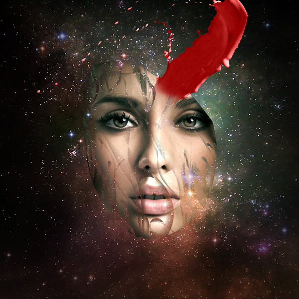
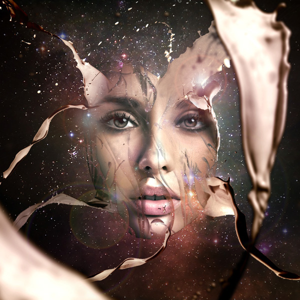
Here is a preview of the image that we are going to be creating:

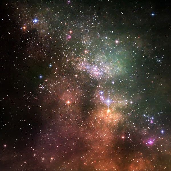
Start by creating a new document (800X800px). Paste in your nebula photo and position it to fit nicely within your canvas.

The nebula image is looking a little blurry, so go to filter>sharpen>unsharp mask. Apply the mask using the settings below:
Unsharp Mask Settings:
Amount: 70%
Radius: 1.5 pixels
Threshold: 0 levels

Now we want to add some light effects to our background.
Create a new layer called ‘center highlight’. Drag out a white to transparent radial gradient from the center of your canvas.

Now change this layer’s blend mode to ‘overlay’:

Now create a new layer called ‘white highlights’. Repeat the last step, creating a series of smaller white to transparent radial gradients:

Now create a new layer called ‘rainbow highlights’. Drag out a series of smaller white to transparent radial gradients. Then go to blending options for this layer and apply a gradient overlay, selecting the rainbow default gradient.

Ensure that your layer is set to ‘overlay’ blend mode:

Finally, reduce this layer’s opacity to 5%, giving a subtle light effect:
Now create a new layer called ‘vignette’. Use a large soft black paintbrush, set to 60% opacity. Now brush around the corners and edges of your canvas:

Roughly cut out your model face photo and paste it into your document:

Now apply a levels and color balance adjustment layer (apply a clipping mask for each, so that they only effect your underlying face layer, not your entire image):
Levels Adjustment Layer Settings:
17 / 1.00 / 233
Color Balance Adjustment Layer Settings:
Highlights: -9 / -11 / -19
Midtones: -29 / +1 / +6
Shadows: -18 / -4 / -8

Now using your pen tool cut around the edges of your models face, to get a smoother more curver selection. Once you’ve got your path in place, right click on the path in your paths palette and click ‘convert to selection’. Then return to your layer’s palette and hit the ‘create layer mask’ icon. This will automatically mask off the areas of your model’s face that are outside of your path selection.

Now with your layer mask in place, download the brush sets from the resources section for this tutorial. Using the brushes (ensuring that you use a black paintbrush) paint over various parts of your model’s face. This will create a cool vector style effect, whereby shards of your model’s face become masked off. With this step it’s important just to experiment with what you feel looks good. Remember, if you do something wrong you’re working non-destructively using a mask, so you can simply undo your mistake!

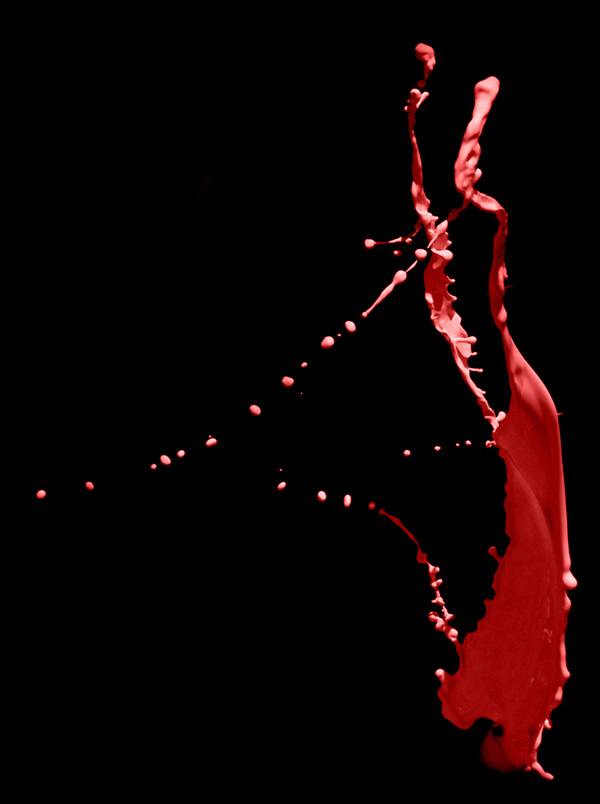
Now download your paint tossing images from the resources section for this tutorial.
Download the red image from the set and open it up in a new document:
Now we want to isolate our paint splatter from the black background. To do this, duplicate your paint splatter layer. Hide the duplicate layer and select the original. Go to image>adjustments>levels and use levels to really up the contrast of your image. The idea is to get the splatter looking as separate from it’s background as possible, so make the darks/midtones darker and make the highlights lighter:

Now go to select>color range. Use the color range eye dropper to click on the black background of your image. You can see in the image below that this creates a good selection of your background:

Hit ok and your background will be selected. Then go to select>inverse to invert your selection and select your paint splatter. Go to select>modify>contract and contract your selection by 2px (this gets rid of any messy edges).

Finally, unhide your duplicate paint splatter layer and select it in your layers palette (we want to use this layer after all, not our high contrast original splatter layer – this was just for getting a good selection). With your color range selection still in place, copy and paste your paint splatter into your original document:

Now go to edit>transform>warp and warp your splatter into a more fitting shape for your composition, making sure that the bottom of the splatter overlaps your woman’s face:

Now apply a layer mask to this layer, and use a medium sized, soft black paintbrush at around 20% opacity to smoothly blend your splatter into the woman’s face:
Now apply a hue/saturation, levels and color balance adjustment layer to this layer, ensuring that you create a clipping mask for each.
Hue/Saturation Adjustment Layer Settings:
Hue: 0
Saturation: -100
Lightness: +25
Levels Adjustment Layer Settings:
20 / 0.96 / 218
Color Balance Adjustment Layer Settings:
Highlight: +13 / -12 / -60
Midtones: +21 / -9 / -11
Shadows: -13 / +1 / +8


Now repeat step 7, applying several more paint splatters:

Now repeat steps 7 and 8, but leave a large splatter filling the right side of your canvas:

Now go to filter>blur>gaussian blur. Apply a 2.8px strength gaussian blur to your large paint splatter layer. This should help create the illusion of depth:
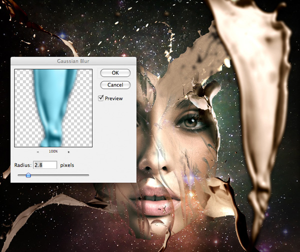
Repeat step 9, adding a larger paint splatter to the bottom left of your canvas. This time apply a gaussian blur of 7px strength, to add a further layer of depth to your composition:

Now create a new layer called ‘shadow detail’. Grab a 2px soft black paintbrush and carefully paint in shadows on all the cut out areas of your model’s face. You want to give the impression of depth here, so try to establish a light source when you’re painting.
It helps to zoom in whilst you’re doing this step as otherwise it can get very fiddly!
The images below show your shadows up close and then at 100%:

I reduced the opacity of this shadows layer to 70% just to make the effect somewhat more subtle:

Now create a new layer called ‘lens flare’. Fill your canvas with black and then change this layer’s blend mode to ‘screen’ to hide the black. This will allow you to work with a lens flare effect in a non-destructive way.
Go to filter>render>lens and apply a lens flare in the top right of your canvas. Then change this layer’s blend mode to 80%. The images below show the lens flare layer at normal blend mode and then screen blend mode:


Now apply another lens flare in the left area of your canvas (on a new layer of course):

Now create a new layer called ‘colored highlights’. Drag out a series of bright radial gradients, ranging from a neon color to transparent. Try to pick neon colors that compliment your overall composition:

Now change this layer’s blend mode to ‘overlay’ and reduce it’s opacity to 10%:
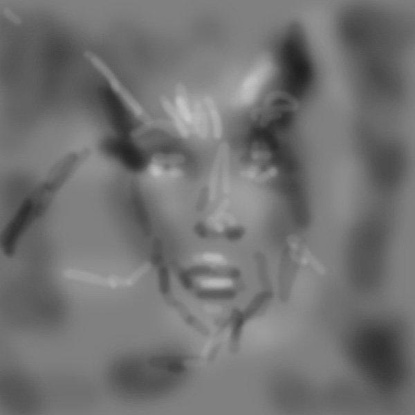
Now create a new layer called ‘dodge/burn’. Fill your canvas with 50% gray and then change this layer’s blend mode to ‘overlay’. This will let you non-destructively dodge/burn your image.
Use a soft black paintbrush for your shadows and a soft white paintbrush for your highlights. Use this stage not only to build up your shadows and highlights but to better blend together your various visual elements.
The images below show your dodge/burn layer at ‘normal’ blend mode and then ‘overlay’ blend mode:
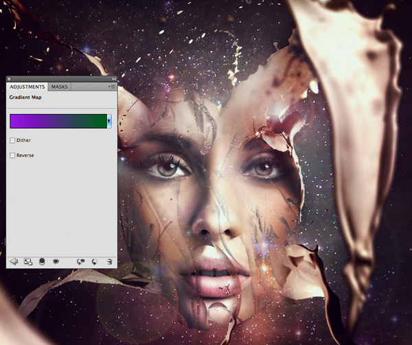
Finally, add a final gradient overlay adjustment layer (do not apply a clipping mask to this layer). Select a gradient overlay ranging from 9400e1 to 00601b. Reduce this layer’s opacity to 7%, for a subtle final tint:
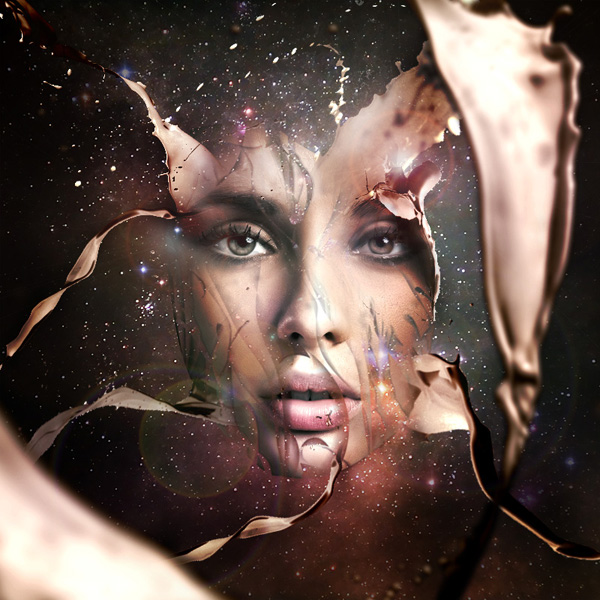
You can view the final outcome below. I hope that you enjoyed this tutorial and would love to hear your feedback on the techniques and outcome.

Tom is the founder of PSDFAN. He loves writing tutorials, learning more about design and interacting with the community. On a more interesting note he can also play guitar hero drunk with his teeth.


Do you know the basic tools in Photoshop but feel that your work is still looking average? Join our creative community at FanExtra and get the direction you need to take your work to the next level.


Nice tutorial Tom! Very easy to follow along with and I think that the final outcome looks good. I like how you have incorporated the splashes and adding some depth of field as well. The only thing I can say is that everything seems to be of the same brightness or intensity, maybe just adding some darker or lighter areas to push things back or pull them out further would help to ameliorate the design a little. There are definitely some useful techniques here though!
Thanks a lot Eric! I see what you mean about the brightness/intensity. I’d ideally like to draw people’s attention more towards the center of the piece, so perhaps integrating a vignette effect and then some further lighting effects could help achieve this.
what kind of photoshop do you use you are a genious
Hi men
i can’t give shadows to the paint splatter. I used warp to the splatter but is flat, your splatters have shadows.
You can say me how do for that the splatters have look more realistic with shadows or if I’m doing something wrong.
thanks
How were you able to get the paint splatter the same color as the model’s face?
By color balancing (it’s in the tutorial).
Perhaps I messed up in one of the steps.
Good tutorial though.
Thanks!
AMAZING,, SIMPLE AND EASY, THANKS
IT’S WONDFUL,LOVE IT ,THANKS
Simply fantastic!
Great tutorial Tom, really enjoyed it!!
Thanks
which software used in it???
Hi, im in school for graphic design and I really love this. I used my face as the model but was wondering if you could tell me a way i can get my own hues for my face . thanks
A hue/saturation adjustment layer should work for you.
how long did it take u to do this?
Thats great!!! but can u help me design the tossing paint in CS please?