
 Create a Fantasy Underwater Scene with Photoshop
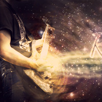 Design the Retro Futurism Photo Manipulation ‘Cosmic Rocker’
 Design a Sleek Real Estate Website
Have every post delivered to your inbox and get access to hundreds of useful design freebies.
As always, this is the final image that we’ll be creating:

Start by creating a document (800X500px).
Create a new layer called ‘background’. Fill your canvas with light gray (dcdcdc).

Paste in your rust texture onto a new layer and resize it to fit your canvas.

Now change this layer’s blend mode to ‘multiply’ and reduce it’s opacity to 80%.
Apply a hue/saturation adjustment layer.
Hue/Saturation Adjustment Layer Settings:
Hue: 0
Saturation: -100
Lightness: 0

Now create a new layer called ‘noise’. Go to edit>fill and fill your canvas with 50% gray.
Then go to filter>noise>add noise. Add 5% amount of noise, distribution: Gaussian, monochromatic.

Now create a new layer called ‘background highlights’. Drag out several white to transparent radial gradients in the areas shown below. Then change this layer’s blend mode to ‘overlay’:

Now create a new layer called ‘background shadows’.
Use a large, soft black paintbrush at around 40% to paint in a vignette type effect, painting shadows around the edges and corners of your canvas:

Now paste in your model photo, positioning it in the left of your canvas:

Now use your path tool to select the bottom of your model’s neck, cutting away the bottom in a smooth curve shape:

Now apply a hue/saturation and levels adjustment layer. With each adjustment layer apply a clipping mask so that the adjustments only effect the layer directly beneath them (in this case your model photo layer).
Hue/Saturation Adjustment Layer Settings:
Hue: 0
Saturation: -100
Lightness: 0
Levels Adjustment Layer Settings:
42 / 0.75 / 250

Now paste in one of the renders from the 3D render set in the resources for this tutorial. Resize the render to fit over your model’s face and then apply a clipping mask to this layer, so that it also crops to fit only onto your model’s face. Then reduce this layer’s opacity to 20%.

Now we want to start adding some color to our composition!
Create a couple of circles, filled with radial gradients ranging from fc528c to cc2f67.

Now cut out your ribbon photo and paste it into your composition:

Now apply a hue/saturation and levels adjustment layer, applying a clipping mask to each:
Hue/Saturation Adjustment Layer Settings:
Hue: -9
Saturation: +35
Lightness: 0
Levels Adjustment Layer Settings:
32 / 1.04 / 240


Now extract one of the paint splatters from the set in the resources for this tutorial and paste it into your composition:

Now apply a hue/saturation and levels adjustment layer, with each layer having a clipping mask:
Hue/Saturation Adjustment Layer Settings:
Hue: -33
Saturation: +11
Lightness: +8
Levels Adjustment Layer Settings:
23 / 1.12 / 238


Now paste in several more paint splatters, changing the blending with each so that they fit with your overall color palette of white, black and pink:

Paste in one of your 3D renders, positioning it over your splatters.

Now apply a hue/saturation and levels adjustment layer (with clipping masks):
Hue/Saturation Adjustment Layer Settings:
Hue: 0
Saturation: -100
Lightness: 0
Levels Adjustment Layer Settings:
14 / 1.08 / 227


Now paste in some more 3D renders:

Now cut out your Ace of Diamonds card and paste it into your composition. If necessary go to edit>transform>distort and warp your card to fit into your composition better:

Now paste apply a black ace of diamonds and back of a card as well, positioning/resizing each card to fit nicely into your composition:

Now paste in your 3 of hearts card, positioning it in the bottom right of your canvas.
Go to image>adjustments>hue/saturation and change the hue until your red becomes pink:
Also go to filter>blur>gaussian blur and apply a gaussian blur of 3.4px strength. This should give the illusion of depth, making the larger card appear closer to the viewer:

Now use the same technique to add a large ‘back of card’ to the bottom left of your canvas. Go to edit>transform>warp to warp your card into a more suitable shape for the corner of your canvas also:

You’ll see that the 3D closest to your model’s head isn’t blending into her all that well. To fix this create a new layer called ‘shadows’. Paint over this area with a soft, black paintbrush at a low opacity, just building up the shadow in this area:

Now we want to add some subtle highlights to our composition.
Drag out some pink to transparent radial gradients over your canvas:

Now reduce this layer’s opacity to 10%:

Now do the same technique but with some subtle blue highlights:

Now create a new layer called ‘dodge/burn’. Go to edit>fill and fill your canvas with 50% gray. Then change this layer’s blend mode to ‘overlay’. This will hide your 50% gray, but will allow you to paint onto your canvas using soft black/white paintbrushes to dodge/burn your image.
Go ahead and use a soft black paintbrush to paint in your shadows and a soft white paintbrush for your highlights.
The images below show this layer at ‘normal’ blend mode, and then ‘overlay’ blend mode:


Finally, add a levels adjustment layer, and then a gradient map adjustment layer:
Levels Adjustment Layer Settings:
3 / 1.14 / 249
Gradient Overlay Adjustment Layer Settings:
Gradient: Yellow, Violet, Orange, Blue (default gradient)
Layer Opacity: 5%

You can view the final outcome below. I hope that you enjoyed this tutorial and would love to hear your feedback on the techniques and outcome.

Tom is the founder of PSDFAN. He loves writing tutorials, learning more about design and interacting with the community. On a more interesting note he can also play guitar hero drunk with his teeth.


Do you know the basic tools in Photoshop but feel that your work is still looking average? Join our creative community at FanExtra and get the direction you need to take your work to the next level.


Ugh I wish tutorials would make sure all their sources are free.
For me the real joy of a tutorial is in the outcome, and obviously the techniques to be learned. Ideally yes I’d love to always only use free resources, but eventually after writing hundreds of tutorials you do start to run out of quality images to include. I’d rather use a high quality image to demonstrate the tips than a low quality image that’s seen everywhere. This way people can still learn the techniques, and if they don’t want to pay for the image can use a free alternative. That being said, almost all the images used in this tutorial (and all our tutorials) are free.
tanks
Very nice tutorial, it really gives me some ideas…Thanks!
Thanks Jenny! Glad you enjoyed it .
.
cheers, very helpful