
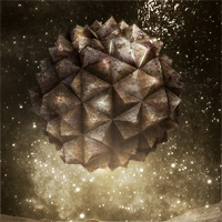
 Create a Surreal Floating Stone Structure Scene
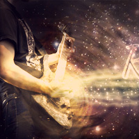 Design the Retro Futurism Photo Manipulation ‘Cosmic Rocker’
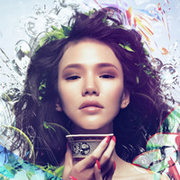 Learn How to Photo Manipulate the Colorful Portrait ‘Transcendental’
Have every post delivered to your inbox and get access to hundreds of useful design freebies.
As always, this is the final image that we’ll be creating:

Start by creating a new document (1000X1500px).
Paste in your background landscape image, positioning it until it looks like the image below:

Now we want to blur our background, as this will later act to create a depth of field effect.
To do this, go to filters>blur>gaussian blur. Apply a gaussian blur (5.0px strength).

Now apply a couple of adjustment layers. Get into the habit of applying a clipping mask to your adjustment layers, so that they effect only the layer directly beneath them.
In this case we need to apply a color balance and levels adjustment layer. (settings below):
Color Balance Adjustment Layer Settings:
Highlights: -15 / -4 / -15
Midtones: +6 / -4 / -30
Shadows: +8 / +13 / +1
Levels Adjustment Layer Settings:
23 / 0.94 / 243


Now paste in the photo of the girl reading from the resources to this tutorial.
Cut it out using your preferred extraction method (I used the lasso tool).

Now apply a color balance, hue/saturation and levels adjustment layer (settings below). Be sure to apply a clipping mask to each adjustment layer.
Color Balance Adjustment Layer Settings:
Highlights: -11 / -2 / -6
Midtones: +4 / +12 / -26
Shadows: -5 / +1 / -13
Hue/Saturation Adjustment Layer Settings:
Hue: 0
Saturation: +15
Lightness: 0
Levels Adjustment Layer Settings:
51 / 1.00 / 244


Now paste in the stones photo from the resources for this tutorial.
Position it beneath your girl so that she appears to be sitting on it.
Now duplicate your stone layer, hiding the duplicate.

Now apply a color balance and levels adjustment layer, each with a clipping mask.
Color Balance Adjustment Layer Settings:
Highlights: -4 / -1 / -26
Midtones: +6 / +9 / -28
Shadows: +4 / +5 / -4
Levels Adjustment Layer Settings:
29 / 0.90 / 215


Now make your duplicate stone layer visible again. This layer is sharper, as you haven’t applied a gaussian blur. Now duplicate your adjustment layers and apply these to your duplicate stone layer.
Now apply a layer mask, and use a soft black paintbrush to mask off the bottom of your duplicate stone layer. This will mean that your stones will fade from sharp at the top, to blurred at the bottom, as you expose your original blurred stone layer.

Now apply a new layer called ‘book main light’.
Drag out a radial gradient from the center of your book. Then reduce this layer’s opacity to 30% and apply a layer mask. Then use a soft black paintbrush to mask off the light which overlaps your book. This should give the impression that light is coming from the pages of your book, rather than overlapping your entire book.


Now paste in your hot air balloon image from the resources for this tutorial.
Rotate/resize it to fit in with your image like below:

Now apply a hue/saturation and color balance adjustment layer to your hot air balloon layer:
Hue/Saturation Adjustment Layer Settings:
Hue: 0
Saturation: -35
Lightness: 0
Color Balance Adjustment Layer Settings:
Highlights: +9 / +9 / -29
Midtones: -9 / +15 / -40
Shadows: +25 / +19 / +15


Now repeat step 6, but apply several more hot air balloons, color correcting each one:

Now open up your cloud photo from the resources to this tutorial. Crop it to look like the image below:

Now duplicate your cloud image layer. Now in the levels up the contrast of your clouds and go to select>color range. Use ‘sampled colors’ and click on the blue sky. Then hit ok.
Your selection should have most of your sky selected. Now go to select>inverse. This will invert your selection so that your clouds are selected.
Now return to your original cloud layer (the one which you haven’t upped the contrast on). Copy/paste your cloud selection back into your original document:


Now apply a layer mask, and use a medium, soft black paintbrush to mask off the edges of your cloud image:

Now resize and warp your clouds to fit into your book. If necessary apply some more masking to fit them neatly inside the book’s pages.

Now apply a hue/saturation and levels adjustment layer.
Hue/Saturation Adjustment Layer Settings:
Hue: 0
Saturation: -100
Lightness: +29
Levels Adjustment Layer Settings:
32 / 1.25 / 213


Now paste in your ‘firework 1′ image.

You’ll notice that it has a black background. To hide this, change your layer’s blend mode to ‘screen’. Use a layer mask to hide any extra edges or unnecessary details.

Apply a second firework image just to add more light:

Now cut out and paste in the image of a lizards tail:

Now resize and warp your lizard tail to appear like it’s coming out from the pages of your book:

Now use a similar technique to paste in your lizard claw, making it appear to be clawing it’s way out of the book. Adjust the hue and levels so that the image fits in correctly with your composition:

Now open up your jet stream photo. Use your color range technique to extract the smoke, and then copy and paste it back into your original document:

Apply a layer mask to mask off the right area of your jetstream:

Now apply a hue/saturation and levels adjustment layer to your jetstream layer:
Hue/Saturation Adjustment Layer Settings:
Hue: 0
Saturation: -100
Lightness: 0
Levels Adjustment Layer Settings:
39 / 0.69 / 151


Now select your jetstream layer and adjustment layers and hit option+g to put them in a group folder. Name this folder ‘jetstream’. Now duplicate the folder, and move the duplicate jetstream up a little way above the original. Reduce this folder’s opacity to 35%. This should create a nice twin jetstream.

Now paste in your plane image from the resources section for this tutorial. Scale and position the plane to fit so that the jetstreams appear to be trailing from it:

Now apply a color balance and levels adjustment layer:
Color Balance Adjustment Layer Settings:
Highlights: +22 / +19 / -18
Midtones: +26 / +19 / -15
Shadows: -13 / +9 / +6
Levels Adjustment Layer Settings:
22 / 1.00 / 229


Now it’s time to start working on the lighting of our piece.
You’ll notice that currently the girl isn’t casting any shadows on the stones she rests on. To fix this create a new layer called ‘shadows girl sitting’. Use a soft black paintbrush at a relatively low opacity to build up shadows underneath your girls legs.
Be sure to have this layer above your girl/stones layers, but below your jetstream and plane layers.

Now we want to add some lighting to the piece.
Create a new layer called ‘yellow lighting’.
Drag out several radial gradients ranging from fae305 to transparent.

Now change this layer’s blend mode to ‘overlay’ and reduce it’s opacity to 30%

Now repeat this technique but with a series of blue to transparent radial gradients and orange to transparent radial gradients.


Now create a new layer called ‘dodge/burn’. We want to dodge/burn our image in a non-destructive way. To do this, go to edit>fill>50% gray.
Then change your layer’s blend mode to ‘overlay’. This will allow you to paint black and white onto this layer in order to dodge/burn your image.
The images below show your dodge/burn layer at ‘normal’ blend mode and then ‘overlay’ blend mode. I also reduced my dodge/burn layer’s opacity to 70% to make the effect less intense.


Now create a new layer called ‘vignette’. Use a very large, soft black paintbrush at a low opacity to paint over the corners of your image. This should help frame your girl, and draw the viewers eye into the center of your composition:
You can view the final outcome below. I hope that you enjoyed this tutorial and would love to hear your feedback on the techniques and outcome.

Tom is the founder of PSDFAN. He loves writing tutorials, learning more about design and interacting with the community. On a more interesting note he can also play guitar hero drunk with his teeth.


Do you know the basic tools in Photoshop but feel that your work is still looking average? Join our creative community at FanExtra and get the direction you need to take your work to the next level.


Wow, this one turned out great. It looks like it could be the cover of a kids movie. Great tutorial, thanks.
Thanks Robby! I tried to put in some extra time and effort with this one . Glad you liked it.
dude its toooooo awesome thanx for sharing.
Whoa! This one knocked me out completely! Fortunately, I’ve just regained consciousness and can type this comment… : )
A truly epic tute, Tom, amazingly thorough with a wealth of helpful tips. I’m bookmarking this one for several dozen return visits and detailed study. Great job, thanks mucho-mucho!
Thanks so much Mark . I’m so glad you also liked this one. I tried to include plenty of techniques such as the color balance extraction, lighting effects and so on… All together it’s not a hard tutorial to follow, but can teach a cool outcome.
Amazing work, and very easy to follow!
Thanks Chris!
Really enjoyed this one Tom! The final outcome looks great and you can see all of the details were considered like the hand and tail coming onto the book. All of the elements feel very naturally put together.
Thanks a lot Eric! I really tried to pick out elements that I felt would work well together. It’s definitely a crucial part of any photo manip to spend time finding the right images to work with.
Amazing tutorial! Very nice, thanks for share!
Thanks!
Hello Tom,
It’s a really great tutorial. Thank you for sharing with us.
Greetings from Istanbul
Thanks TOM
Its really amazing tutorial,Thanks for share
wow,so nice tutorial,i m jst going 2 follow all tht techniques whch u used,great work,keep it up
Thanks a lot TOM, nice tutorial very easy to follow and very well-made. Muchas gracias!
Really Great Tutorial Thank you for sharing
Thanks Shane, I”m glad you liked it!
Nice Work…..I Like It…
Thanks For Every ones…
Every thing is done successfully but how do I apply gradient tool of yellow and sky blue colour?
Hi Zeeshta, you just need to use the gradient tool (which is in the tools panel, under the same tool as the paintbucket)
good work it will be help for me………..
Hello sir which version were you used……