
 Create A Unique Steampunk Photo Manipulation In Photoshop
 Members Area Tutorial: Create A Dark Photo Manipulation of A Devil Woman
 Design a Textured Portfolio Website
Have every post delivered to your inbox and get access to hundreds of useful design freebies.
This is the final image that we’ll be creating:
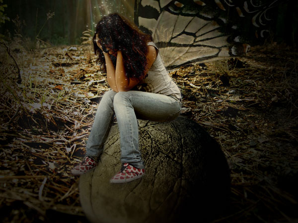
This following images will be used in this tutorial:
Woman Sitting
Backdrop
Butterfly
Rock
Open up a new document, and paste in your backdrop image, calling this layer ‘backdrop’. In this case I went for a close up of a forest floor. It’s important to work with a close up of an environment, as you want to give the impression of your fairy being very small.

Now I want to start adding in my other photos, in order to setup my composition, before I start blending. I paste in an image of a large rock, and cut it out using the lasso tool. I call this layer ‘rock’.

Now cutout and paste in a photo of a woman in a sitting position and place her on top of you rock. I’ve called this layer ‘woman’. It took quite a while to cut out the woman using the lasso tool (5-10 minutes), but it pays to take the time on a clean selection.

Now paste in the final element of your composition, some butterfly wings. Cut them out using the lasso tool, and move this layer beneath your woman layer, but above your rock and backdrop layers. Call this layer ‘wings’.

Now hide all layers apart from your backdrop layer, and duplicate this. Change your duplicate backdrop layer’s blend mode to ‘soft light’, and reduce the layer opacity to 50%. Then merge this down with the original layer. This should give your photo a little more contrast and sharpness.

Now repeat this step with your three other photo layers. This should give your image overall more atmosphere.

Now hide your other layer’s apart from your backdrop layer and go to image>adjustments>hue/saturation. Then reduce your saturation to -30.

It would be easy to simply apply a -30 saturation to all of my other photos, but each photos saturation is different, so this approach wouldn’t work. Instead, you must use your judgement to try and judge which settings are most realistic. I ended up reducing both my saturation and lightness on each of my photo layers.The settings I used are below:
Rock Layer: Saturation: -35 Lightness -10
Woman Layer: Saturation: -45 Lightness -15
Wings Layer: Saturation: -60 Lightness -15

Create a new layer above all of your other layers called ‘black edges’. Drag a radial gradient (transparent to black) from the center of your canvas to the edge. This should put the edges of your image into shadow. Then reduce this layer’s opacity to 80% to make it slightly less intense. This helps bring the different photos together, as they’re all effected by the same shadow.

Now if you notice the backdrop is blurred at the bottom of the image, due to the close up nature of the photo. We want our other photos to have a similar blurred effect, in order to fit with the backdrop, and give things a close-up feel.
Start by selecting and duplicating your rock layer. Then return to the original and go to filter>blur>gaussian blur. Apply a 2.0px gaussian blur effect. Now return to your duplicate rock layer, and apply a layer mask (layer>apply layer mask>reveal all). Drag up a gradient ranging from black to transparent, and the black part of your gradient should hide this part of your duplicate rock.
The end result is a rock with a blurred base, which gives the impression that it is much smaller than it first appeared.


Repeat this technique on the bottom of the woman’s feet, giving them a slight blurred effect.

Now select your top ‘woman’ layer (the duplicate with the layer mask). Go to image>adjustments>color balance. We want to manually adjust the woman photo’s colors to fit better with the rest of the image. Start by adjusting your midtone colors. Up you cyan/red to +10, your magenta/green to -5 and your yellow/blue to -25.
Then go to shadow color balance and keep your cyan/red at 0, your magenta/green at -10, and your yellow/blue at -35.
Finally, go to color highlights: cyan/red to +15, magenta/green to +10, and yellow/blue to -10.


Now do the same with your top rock layer. Again, use your judgement to see what looks best. I used the settings below:
MidTones:
Cyan/Red: -5
Magenta/Green: -10
Yellow/Blue: -20
Shadows:
Cyan/Red: -10
Magenta/Green: -5
Yellow/Blue: -5
Highlights:
Cyan/Red: -15
Magenta/Green: -10
Yellow/Blue: -20.
Also, you must be sure to apply these color balance settings to your original blurred rock/woman layers, in order to create a smooth transition between the two.

Now alter the color balance settings for your backdrop layer. I used the settings below:
Midtones:
Cyan/Red: 0
Magenta/Green: +5
Yellow/Blue: -30
Shadows:
Cyan/Red: +10
Magenta/Green: 0
Yellow/Blue: -30
Highlights:
Cyan/Red: +10
Magenta/Green: 0
Yellow/Blue: -20.

Now to work on the wings. They are looking a little blurry compared to the woman, so I go to filter>sharpen>sharpen mask. I set the amount to 100, the radius to 4.5, and the threshold to 0. Then, I reduce the layer opacity to 75%. This is great, as it gives them a semi-transparent appearance, not only simulating a fairy’s wings, but allowing the backdrop to partly show through. This is very important, as like I mentioned before, combining elements of your various photos really ties them together well.


Apply a final color balance to your wings layer. Settings below:
Midtones:
Cyan/Red: -5
Magenta/Green: 0
Yellow/Blue: -20
Shadows:
Cyan/Red: -30
Magenta/Green: -20
Yellow/Blue: -40
Highlights:
Cyan/Red: +20
Magenta/Green: 0
Yellow/Blue: -20
I also chose to reduce my wing layer’s opacity by 5% to 70%.

Select your top woman layer and go to image>adjustments>levels. Bring your first input level from 0 to 25, and level the other input fields the same. This should heighten the shadows in your woman photo.

Now apply the same level settings to all other photo levels.

Now create a new top layer called ‘shadows’. Take a soft black paint brush (10% opacity) and brush over areas that could use more shadowing. It helped to pay attention to the area where the woman is sat on the rock, and make it look more like she actually is on top of it, casting a shadow.

Now repeat the same step with a layer called ‘highlights’, but using a white brush to brush over a few lighter areas in your piece.

Now select a small white paintbrush, and impose the settings shown below in your brushes palette. Create a new top layer called ‘fairy dust’ and then brush some random dots over the head of your fairy woman.


Go to blending options for your fairy dust layer and apply an outer glow effect.

I really hope that you enjoyed this tutorial, and would appreciate your comments.

Tom is the founder of PSDFAN. He loves writing tutorials, learning more about design and interacting with the community. On a more interesting note he can also play guitar hero drunk with his teeth.


Do you know the basic tools in Photoshop but feel that your work is still looking average? Join our creative community at FanExtra and get the direction you need to take your work to the next level.


nice tutorial and the final image looks good
but i just thought those wings still look out of place
Hello, I like this very much,it is a very nice enty.
but imho , I think you forget the shadow of the girl on the rock, because the light is comming from above.
nice tutorial thanks..
Thanks guys, both good suggestions. Tbh, I could have done more with this piece, but I hope that it’s a good introduction for people on how to blend images nicely.
This is really one of the finest Photo-blending tuts I’ve seen on the net. Clear description and nice step by step guide.
Thanks J Mehmett! It’s comments like that, that make these tuts worth writing
Keep up the good work as always Tom=)
Great tutorial but i would have reangled the butterfly wings.
Thanks guys!
Nice ideas. However, how come the fairy does not cast a shadow at all on the stone she’s sitting on?
there’s no shadow where the woman sits..
This is amazing! I have been needing a tut like this because I have a great pic of my son sitting on a rock, but I wanted a very different look and feel to the photo – kind of like what you have here – and really had no idea where to start. Thank you so much!
excellent tutorial for lean about photo manipulations.
now I’ve been looking on this tutorial and I really wanna try making something simlar to that, or even try yours, but the “woman sitting” and “butterfly” images aren’t on the web any more, or well not onyour link.. any chance that I ca get these two images anywere else?
WOW, fantastic! Thanks so much =)
Just wanted to say that I think you did a great job…but I do agree about the shadow on the rock…you may have already thought of this…but a quick fix might be to flip the image of the rock so the shadowed part is underneath the fairy…then make adjustments to the lighting from that. Awesome job!!!
Thank you for the easy to follow instructions ! I just wish that I had your paint program!?
Just love fairies !!!!!!!!!!!!!!!!!!!!!!!!!!
Thank You,
Morgan
i like all the tutorial given by u and thanks alot for that.Its really nice.
Thank You for this wonderful tutorial! Here is the link to how mine came out if you wanted to see http://shaiyakat.deviantart.com/#/d3l48wu
Wow, really wonderful work Shaiya! I love the pose of the fairy, it fits perfectly with that rock (actually better than my original tutorial I think!). I would definitely recommend using a photo for your wings though, as they look pretty fake at the moment.
Nice tutorial, but the proportions seem a little strange. The girl sitting on the rock looks to be a few feet away, and the camara angle is at eye level. But looking at the needles in the background image, the camara looks very low to the ground, and very close up, making the photo manipulation look less realistic. I recommend using a different background image nest time
Thank you for such a great tutorial and easy instructions and after a lot of effort finally got the grip of gardient tool.