
 Design a Dark, Professional Website Layout
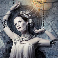 Convert a Portrait Into a Creepy Human Puppet for Halloween
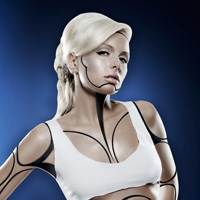 Members Area Tutorial: Create A Human/Robot Hybrid In Photoshop
Have every post delivered to your inbox and get access to hundreds of useful design freebies.
As always, this is the final image that we’ll be creating:

It’s always good to be inspired by the work of others. One of the main influences for this text effect was the packaging for 5Gum seen below:

Create a new document (600X300px).
Create a new layer called ‘background’ and fill your canvas with a gradient ranging from dark gray to black.

Create a new document (20X20px) and create the pattern shown below using your marquee tool and paintbucket tool. Try to recreate the colors and patterns as closely as you can.
The image below shows the pattern at full magnification.
Finally, go to edit>define pattern and save your pattern as ‘bars’.

Now create a new adjustment layer (pattern). Select your ‘bars’ pattern, and then change the opacity of your adjustment layer to 30% and it’s blend mode to ‘overlay’.

Now create a new layer called ‘radial gradient’. Fill your canvas with a radial gradient (white-transparent) ranging from the center of your canvas to the edge.
Then reduce this layer’s opacity to 8%.


Create some centered text (Airstream, 172pt, black). Then apply the layer styles shown below: inner glow, bevel emboss and gradient overlay:

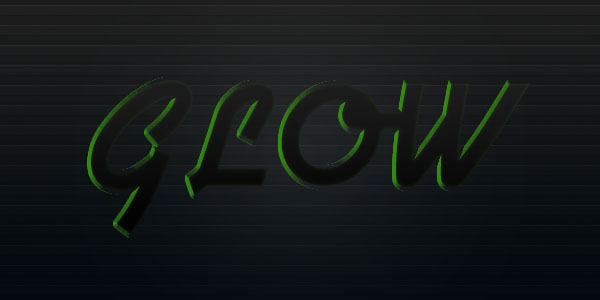
Now duplicate your text layer, moving the duplicate below the original. Go to layer>rasterize>type and rename the layer to ‘green type’. Set your foreground color to 61da0c and then option click on your ‘green type’ layer’s thumbnail to select only the data on this layer. Then go to edit>fill>foreground color and press OK.
Then deselect and use your keyboard cursor to shift your green text 10px to the right.

Duplicate your green type layer twice (so you have a total of 3 green type layers). Then select your bottom most one and apply a 20px gaussian blur (the image below has the 2 green type layers above this one hidden):

Reduce the opacity of your 20px gaussian blurred layer to 50%. Then use a large, soft eraser brush (100% opacity) to brush away the parts of the glow that are on the left sides of your text. You want to give the impression that the glow is coming only from the right of the letters:

Repeat the last 2 steps on your next ‘green type’ layer, this time giving it a gaussian blur of 10px. Remember to erase away relevant parts of your glow:

Now for your final top ‘green type’ layer apply a 2px gaussian blur. There is no need to erase any of this layer…

Set your foreground color to white and your background color to black. Then select the solid-transparent gradient option, and select a radial gradient. Then create a new layer called ‘glow circles’ and apply small radial gradients to the right of your letters.

Now change the ‘glow circles’ layer to ‘overlay’ and duplicate it, intensifying the glow effect.

Duplicate one of your ‘glow circles’ layers again, and using a very large brush + your smudge tool (50% strength) wipe from left to right across your canvas. This should provide a very subtle effect of the glow being blown across the your letters. However, it’s a little too faint so I duplicate this layer twice more to make it more intense.

I want to create a more green colored backdrop, so I return to my ‘green text’ layers, and select the bottom one. I duplicate it, and move the duplicate below the original, making it the bottom most ‘green text’ layer. Then I apply a 40px gaussian blur. This should give an overall large glow effect.

To finish, play around with erasing areas of the glow that you aren’t quite happy with.
I really hope that you enjoyed this tutorial and would love to hear your feedback!

Tom is the founder of PSDFAN. He loves writing tutorials, learning more about design and interacting with the community. On a more interesting note he can also play guitar hero drunk with his teeth.


Do you know the basic tools in Photoshop but feel that your work is still looking average? Join our creative community at FanExtra and get the direction you need to take your work to the next level.


Great Tutorial. Thanks for all the hard work!
awesome tutorial, i can see the resemblance between the Wrigley’s 5 gum and your final piece, good observation and result. Where did you get the airstream font from?
I love the effect
Thanks a lot guys, I’m glad you liked teh final result .
.
Awesome as always. I’d really enjoyed that one!
Great tutorial, would give any website header instant impact. Definitely one to bookmark for the future. Thanks!
good work dude
Hi,
thanx 4 giving us such a nice tutorials……
They all are just AWESOME…
thanku so much.
nice one! i will include this in my graphic design course.
This is a great tutorial. Thanks for sharing.
would be great to actually be able to down load the source file.
Hi Christopher, you can download all of our source files as a FanExtra member for just $9 per month.