 Design a Print Ready, Graph Inspired Brochure in Photoshop
 How To Create an Ultra-Realistic Cracked Head Effect
 Create a Surreal, Floating Landscape With a Fantasy Twist
Have every post delivered to your inbox and get access to hundreds of useful design freebies.
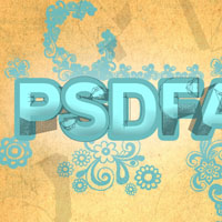
As always, this is the final image that we’ll be creating:

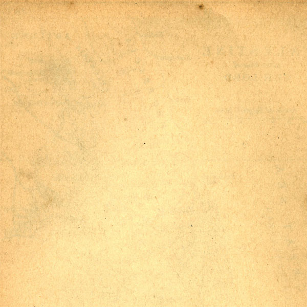
Creating a new document (600X600px) and paste in this torn paper texture:
Now with apply a gradient overlay blending option to your texture layer (settings below):


Now create some central text in your canvas. I used Arial, 132pt, -25 kerning, a1feff:

Now go to blending options for this layer and apply an outer glow, bevel and emboss and stroke effect:


Now create a new layer beneath your text layer called ‘brush effects’.
Download this Great Doodle Brush Set and then use your eye-dropper tool to start applying random brush marks that are the same color as your text’s stroke. The brush marks should appear to be an extension of the outside of your text:
NOTE: If you only click once using your brush tool the shape will appear way too faint. I clicked on the same spot about 15 times for each brush shape to make it nice and bold.

Type out some new text on a top layer, exactly the same as your original text, but black, and with no layer styles:

Now we get to the C5 goodness! This is a text effect that I’ve really come to appreciate.
Go to 3d>Repousse>Text Layer. Then a box will prompt you to rasterize your text layer. Hit yes.
In the Repousse settings box, under Repousse Shape Presets choose ‘bevel 3′. Then under render settings choose ‘wireframe’, and under mesh quality use ‘draft’.
This should create a really rough, grungy outline to your text that I’m a big fan of. You can view all Repousse settings below:


Now reduce the opacity of your Repousse text layer to around 35%. This should add a nice grungy, 3d quality to your text:

Now type out larger letters, positioning them around your canvas. Be sure to use your edit>transform>rotate tool to rotate each letter a little:

Now apply the same Repousse settings as before to each letter layer:

Reduce each letter layer’s opacity to 10% to create a subtle background detail:
You can view the final outcome below. I hope that you enjoyed this tutorial and would love to hear your feedback on the techniques and outcome:

Tom is the founder of PSDFAN. He loves writing tutorials, learning more about design and interacting with the community. On a more interesting note he can also play guitar hero drunk with his teeth.


Do you know the basic tools in Photoshop but feel that your work is still looking average? Join our creative community at FanExtra and get the direction you need to take your work to the next level.


Really nice tutorial. I’m always interested in typography tutorials
Wicked tutorial, I’ll give this a go sometime.
Great and easy to follow tutorial, I really like to see different typography tutorials that use different techniques. I just wish that I had CS5 so that I could try it out. When and if I do get CS5 I will have to come back and do the tutorial. Thanks.
Awesome tutorial, thanks a lot !
Very nice effect. Nevertheless, this tool I guess it’s available in CS5 Extended only?
That’s quite interesting with the 3D mesh being used as a texture. It’s a new take on the capabilities of 3D elements in typography design.
The result is wonderful
Thank you
Does not even work. My wireframe text turns into whole letters, regular ones, not cool stuff like on the image. Give more details!
my wireframe doesn’t work too. i’ve aready follow your instruction. is there something missing? so sad can’t finished it
That’s strange guys. Can you check – are you both using CS5 and the same font? It might not work as well with a thinner font (you may have to play with the wireframe settings).
Wonderful, I have applied to the logo of our website. But do not get an expected result.
Thanks again.
step 6- new layer or the previous text layer?