Have every post delivered to your inbox and get access to hundreds of useful design freebies.
Today I’m going to be redesigning Skill 7′s website. Skill 7 is a wonderful organization that hosts sports courses, training and events for young people.
It’s also awesome that this is the 100th 30 minute redesign! I can’t believe this series has been so successful and had such longevity. Thanks to all PSDFAN readers for the support. I have a bit of a confession… as this was the 100th redesign, and I was running out of time as there was SO much to fix I actually took 40 minutes on the redesign in total. Don’t judge me! ![]()
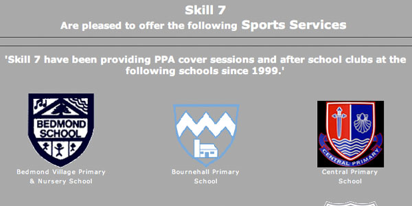
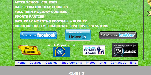
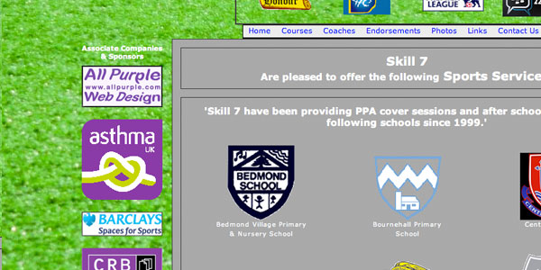
You can see the original site design below:
You can check out the original website here: Skill 7
Every site has some merits, and the good impressions I made here are these:
The background image on the current design may be fairly garish, but it’s at least relevant to the theme of the site (soccer training).
The bright grassy background is one of the few keys as to what this site is all about. Whilst it’s not a great design feature it does at least help people understand the organization a little better in the site’s current iteration.

One of the better points of this site was their logo. The hand-drawn illustration of the lion stood out as a nice design feature in a site that otherwise falls down in a lot of ways.
The logo is unique, relevant and not badly designed. Currently it helps act as a central point for the design, framing the surrounding content.

Whilst the purpose of the organization is far from clear enough, it’s encouraging to see at least an attempt at explaining what the website is all about.
The intro sentence: ‘Skill 7 have been providing PPA cover sessions and after school clubs at the following schools since 1999.’ is nothing if not helpful, and is definitely heading in the right direction.

Of course no website is perfect, and our site’s often make negative first impressions upon readers without us even realizing! Here are the negative first impressions I received from this site:
For me the biggest problem with this site is how disorganized the content is. It’s absolutely overwhelming, in a very bad way.
Not only is there a lot of content (I’ll get to this in my next point) but it’s not adhering to any sort of grid or structure. It seems almost randomly strewn over the page. You look one place and there are logos and badges, another place there seems to be multiple versions of the same menu, another place there is illustrations, graphs and photos.
Each piece of content is out of alignment with every other piece of content, and the result is very jarring and likely to push your visitors away from your site.
Not only this, but the content is not consistent. There is a huge variation in colors, fonts and general design throughout the layout, and this inconsistency only makes the site feel more shambolic and disorganized.

Another huge problem with this site is the sheer amount of content.
You’ll notice in a lot of my redesigns I’ll talk about reducing your content to the minimum of what’s needed. Anything extra detracts from this and will confuse and put off your visitors.
This site is one of the worst offenders I’ve ever seen for trying to put absolutely everything on their front page.
There are logos, sponsor badges, news, events, countless menus (why!?), prominent social media buttons that all clash, logos of schools and more. Not to mention all of this content clashes with a hideous grass texture background.
Remember – subpages exist for a reason! Put some of your key content on your subpages.
When designing your homepage think about what people want from your site? Your main purpose should be to explain what you’re about and to establish credibility. Then you can draw them into looking at your subpages for more relevant info.

Apart from the background image and that hidden away explanatory sentence there isn’t a lot clarifying what you do as an organization.
I shouldn’t have to search for this information, it should be immediately obvious.
Part of the problem is the huge amount of obsolete content on your homepage, but you also need a clear, informative headline area to explain your organization in a sentence or two for new visitors.

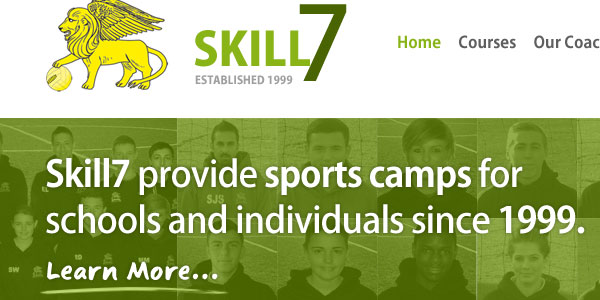
You can see my redesign proposal below:

Let’s look at some of my aims for the redesign:
My first job was to remove the huge mass of obsolete content from the homepage. This should either be scrapped or if essential moved to a relevant subpage.
Now I could focus on clarifying the key homepage content.
Not only this but no more disorganized page structure! I used a grid based system to ensure all content was well lined up and easier on the eye, rather than placed sporadically around the page. I also opted for consistent fonts, colors and styling.
The result is a more professional overall page that doesn’t push your viewer’s away.

In the original site it’s pretty hard to work out exactly what Skill 7 do.
I made a point of introducing a large welcome banner that explains the organization in a couple of clear, informative sentences for new visitors.
I realize this intro text may not be totally accurate, but I’ll leave it up to you guys to best explain your organization (you know best!).
I also added a nice personal touch by including photos of all the coaches and staff in the background for the banner, making them truly a part of the website.

Your website needs to be trustworthy, particularly for new visitors looking to learn more about your organization.
You’re entrusted with young people and physical training and need to appear as credible on your website as you are in the offline world.
In my redesign I achieved this through several methods:

You can have the chance to have your website redesigned in next weeks post. All you need to do is leave a comment to this post with your website address and why you think it needs a redesign.
The Rules for Submission:
Tom is the founder of PSDFAN. He loves writing tutorials, learning more about design and interacting with the community. On a more interesting note he can also play guitar hero drunk with his teeth.
Do you know the basic tools in Photoshop but feel that your work is still looking average? Join our creative community at FanExtra and get the direction you need to take your work to the next level.
nice
can you show your redesigns as they would look in any screen width? what would the background be?
That’s something I can consider doing in the future sure. In this case the green bar would likely just extend out to the page edges, and the layout would remain central.