Week 70: DC-Designz
This week I will be redesigning: DC-Designz.

In the space of 5 minutes I can identify some of the key strengths and weaknesses of this design, and sketch out a mockup.
STRENGTHS:
- The logo is really professional looking, and has a good slogan tagline.
- The welcome message is bold and legible, this provides a good introduction for the website.
- The homepage includes a featured work section which is good for drawing people further into the site and showing off the talents of the designer.
- There are some nice attempts at design details, such as background lighting, subtle texture/pattern application etc…
WEAKNESSES:
- The site feels very confused visually. The welcome area feels totally different from the style of the logo. Overall the site doesn’t have much cohesion, and feels like several sites/styles have been thrown together.
- The navigation has several issues. Personally I don’t think the vertical layout is working. Also it seems strange having the various services shown as different links. I would group ‘Website Design’ ‘Graphic Design’ etc… under one menu link such as ‘Services’.
- Whilst the featured work area does serve to draw people further into the site, there isn’t really a lot of direction for visitors. There is a lack of call to action buttons or usability to the site.
- Some of the areas of the site blend together in a bad way. For example the featured area feels more like a banner ad, rather than separate elements of content. Also the featured work thumbnails are too small, so you can’t really see anything.
My Redesign
As always, I was limited by the 30 minute time-frame, but I tried to improve upon several of DC-Designz’s features, adding a few design flourishes and a clearer layout that promoted content over wasted space:
MY AIMS FOR THE REDESIGN:
- I designed a clearer, more concise menu to fit well in the new header.
- I created a sleek new look, with muted color scheme to create a more cohesive web design overall, and fit better with the professional logo.
- I included a call to action button to draw people into the site and give them a little more direction.
- I made the featured work area more eye catching and unique by creating circles featuring each image, with a color overlay effect.

Before/After:
Here is a quick comparison between the original design and my 30 minute redesign. Sure, my design could be more polished, but I believe that a lot of the basic elements have been improved upon, creating a more pleasant browsing experience.

How and Why To Enter 30 Minute Redesigns
You can have the chance to have your website redesigned in next weeks post. All you need to do is leave a comment to this post with your website address and why you think it needs a redesign.
The Benefits of Getting Your Site Redesigned Include:
- Most obviously – a FREE redesign job!
- Your website gets exposure to PSDFAN’s thousands of readers
- You understand how to improve your website. This isn’t just a redesign, it’s a lesson in design principles.
- You will get emailed the .psd of your redesign and can do whatever you want with it!
NOTE: I can only accept sites with English content, as foreign language websites are simply too hard for me to work with.
So please, leave a comment today for a chance to have your website redesigned next week!

About the Author:
Tom is the founder of PSDFAN. He loves writing tutorials, learning more about design and interacting with the community. On a more interesting note he can also play guitar hero drunk with his teeth.
Related Posts

 30 Minute Redesign: Cathiegraphy
 30 Minute Redesign #98: James Willney
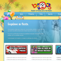 30 Minute Redesign: Bocotas


To be completely hones I’m not diggind this redesign.
Also is anyone else finding it sad that “webdesigner with vision and passion for perfection” submited his site to be redesigned by another webdesigner?
Hey Eric. I always appreciate constructive feedback. Is there anything in particular that you’re not feeling about the redesign?
I agree with Eric. How can you provide a service for others, yet need assistance providing that own service for yourself?
I’ve heard this debate many times over the years. Whilst I see where you guys are coming from, it has to be said that it is notoriously difficult to design for yourself, as many designers are perfectionists. This is why some designers even design each others personal sites.
A redesign in 30 Minutes is very quick, respect!
Thanks Sava, I try
A really nice redesign there, I think that this is a vast improvement and this really does sell what the website does the moment that you look at it which I don’t feel the original website did. I prefer keeping the colours simple as I don’t think the gradient like blue with the black logo. The nice thing about the original design is that the logo is a nice thing to work as a starting point for the website.
Thanks a lot Stephanie! I do think a monochromatic color palette works better for this site, as the varying colors were a little distracting before. The logo seemed fine in my eyes though, so why change it.
Always enjoy your redesigns. Gives me ideas and inspiration. I would like for you to redesign our site as it needs desperate life. I feel our site is hurting our business and not getting the volume we are looking for. Please help… don’t want to keep this on life support.
Thanks!