Week 6: The Flag Company
The Flag Company is the largest online provider of flags and flagpoles:
The Flag Company.

In the space of 5 minutes I can identify some of the key strengths and weaknesses of this design, and sketch out a mockup.
STRENGTHS:
- Lists all available products clearly on the homepage
- Clear and prominent phone number for getting in touch
- Readable menu
WEAKNESSES:
- Very 90s feeling design, colors are clashing and the layout feels untidy and squashed
- The menu has too many menu items, some of which are unnecessary within the main menu. This means that the menu appears overcrowded and is confusing.
- The page is overloaded with ads and special offers, detracting from the main product index.
- The about/introductory text is pushed right down the page, and is littered with too many links.
- MOST IMPORTANTLY: The erratic colors, layout and content means that there is no flow information down the page. The viewers eye does not know where to go.
- The layout feels very confined and closed in. There is hardly any use of white space.
My Redesign
As always, I was limited by the 30 minute time-frame, but I tried to improve upon several of Motel Cisne’s features, adding a few design flourishes and a clearer layout that promoted content over wasted space:
WHAT I TRIED TO DO:
- Give the layout room to breathe by introducing some white space, padding etc…
- Simplify the menu down to the key items, making the site easier to browse.
- Create a sleek, professional header to give credibility to the site, updating it to 2010, taking it out of the 90s!
- Provide an area near the top of site allowing users to easily browse products, edit their shopping cart or get in touch via phone. This simplifies the entire browsing/buying process and should promote more sales.
- Simplify page content, pushing attention onto the products rather than endless offers. Products are promoted more elegantly via a ‘featured products’ section.
- Create a visual hierarchy to the page, via use of headlines, typography and a clear visual path for the viewers eye to follow.
- Give the website a clear, consistent color-scheme.

Comparing the 2 Designs:
Here is a quick comparison between the original design and my 30 minute redesign. Sure, my design could be more polished, but I believe that a lot of the basic elements have been improved upon, creating a more pleasant browsing experience.

How and Why To Enter Redesign Saturdays
You can have the chance to have your website redesigned in next weeks post. All you need to do is leave a comment to this post with your website address and why you think it needs a redesign.
The Benefits of Getting Your Site Redesigned Include:
- Most obviously – a FREE redesign job!
- Your website gets exposure to PSDFAN’s thousands of readers
- You understand how to improve your website. This isn’t just a redesign, it’s a lesson in design.
- You will get emailed the .psd of your redesign and can do whatever you want with it!
So please, leave a comment today for a chance to have your website redesigned next week!

About the Author:
Tom is the founder of PSDFAN. He loves writing tutorials, learning more about design and interacting with the community. On a more interesting note he can also play guitar hero drunk with his teeth.
Related Posts

 30 Minute Redesign – Suggestions Needed!
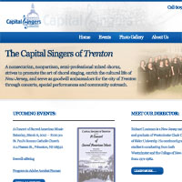 30 Minute Redesign: The Capital Singers of Trenton


I liked the original better !
Flagspiring fanks!
@Martin, really? Anyone loving the original design of “The Flag Company” must have ZERO knowledge about design at all.
@Tom, that site was probably designed in 1997 and beyond and may be the owners did not give care about their online identity.
Sometimes I wish a wizard goes across the internet and do a favour to online communities by removing all those ugly websites.
I forgot to say, thanks for giving us a view of how important its to give much care on the user interface.
Sorry for flooding your comments sections.
Jamal: Thanks! And no worries, you weren’t flooding the comments at all . I admit that the redesign is reasonably simple, but simple can often be an improvement on a cluttered website.
Let’s make everything simple. It’s horrible seeing those kind of site, too many information but we can’t read it.
Awesome redesign, I agree that simple is often better!!
Keep up the good work!
It’s better, but not that much. The color scheme is really quite blah on the new one.
I like the cleanliness of the layout much better with your re-touch and like the reasoning for your edits.
Our site is currently burdensome and I think our messaging is lost.
I’d be interested in seeing what you are able to suggest.
Thanks!
The work you do, is matchless! It is a chance for such beginners as I, to study, study and once again study… Thanks for it.
The redesign maked this site to look clearer, much information can be found easier.
I also like the simple design, and I have tried to create a website with simple design, now I would like to know your opinion, may be there is a need to redesign it? And if yes, can you make it for 30 minutes?
Thanks a lot.
Great re-design tom, really like the layout and the simplicity of the site, i agree before the site very cluttered.
Good Job! I like how you focus on the importance of white spaces and that less in that case is much more!
Great job on the the redesign. The new design looks so much cleaner and easier to read than the old one. I definitely think that sometimes simplicity is the key to a good web design.
I really appreciate the kind words everyone! It makes this project I’ve got going worth it .
.
I’ll include all suggestions in the poll for next weeks redesign!
[...] 30 Minute Redesign: Flag Company [...]