 30 Minute Redesign #94: Advance Tech
 30 Minute Redesign: Week 45 Vote
 30 Minute Redesign #99: CAMFO Medics
Have every post delivered to your inbox and get access to hundreds of useful design freebies.

In the space of 5 minutes I can identify some of the key strengths and weaknesses of this design, and sketch out a mockup.
STRENGTHS:
WEAKNESSES:
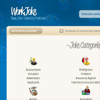
As always, I was limited by the 30 minute time-frame, but I tried to improve upon several of WorkJoke’s features, adding a few design flourishes and a clearer layout that promoted content over wasted space:
WHAT I TRIED TO DO:

Here is a quick comparison between the original design and my 30 minute redesign. Sure, my design could be more polished, but I believe that a lot of the basic elements have been improved upon, creating a more pleasant browsing experience.

You can have the chance to have your website redesigned in next weeks post. All you need to do is leave a comment to this post with your website address and why you think it needs a redesign.
*NOTE: I can only accept sites with English content, as foreign language websites are simply too hard for me to work with.
The Benefits of Getting Your Site Redesigned Include:
So please, leave a comment today for a chance to have your website redesigned next week!
Tom is the founder of PSDFAN. He loves writing tutorials, learning more about design and interacting with the community. On a more interesting note he can also play guitar hero drunk with his teeth.


Do you know the basic tools in Photoshop but feel that your work is still looking average? Join our creative community at FanExtra and get the direction you need to take your work to the next level.


I thought I should point out that it was a bit of a crazy weekend, so I only just got a chance to post this today.
Wow, I love the way you redesigned it
Pretty simple stuff, but really very effective
Kudos!
Been enjoying your redesign section for a while and I believe this one is my favorite. Their site should be conveying fun and the old design didn’t project that at all. Your redesign is spot on. I think the airing out of the categories actually helped more than anything.
Great redesign! What is the font you used for the logo?
Thanks for the kind words guys!
Rob: Thanks, I definitely think that white space often makes all the difference. It just feels easier to browse.
DJ: The logo font is ‘Reklame Script’ which you can download a demo version of here: http://www.dafont.com/reklame-script-demo.font
Well done, so much cleaner
Hi Tom,
Thanks very much for the redesign and thank you that you found time in your crazy weekend. Definitely an improvement from the old version! Wow.
You managed to get the focus on the important stuff which would be a great win for our visitors. I might add a little more color, but I like the clean layout. Color should not be a distraction.
Thanks again!
Erik
I’d love to see what you’d do with my blog http://www.d-lists.com
I’ve been running it for over a year now and feel a new design is needed. I have a design completed but would love to see how you’d update it.
Really nice , please do have a look at my site as well
Hi Tom,
I wanted to check if something went wrong with my e-mail. I didn’t receive the PSD file. Maybe you didn’t have time to sent it yet, but otherwise something went wrong on my side. I got a lot of positive feedback on the redesign. A lot of people found your design a big improvement, so I’d like to implement it.
If needed I will provide you a different address.
With kind regards,
Erik
The background is very cute!
I love your redesigns, but I am always troubled that you do not take into account existing advertising.If this is the site’s business model a designer must honor that first and foremost….methinks…anyways, I am still a psdfan-fan
Erik: I know that we’ve been talking via email, but I thought I’d let everyone else here know that I’ve sent off the .psd for this redesign. Just so you guys don’t think I’m hoarding them for myself .
.
DogBot: Yeah that’s a really good point. I do try to keep advertising when I can, but sometimes I leave it up to the webmaster to fit it back into the redesigned site. I’d certainly bear it in mind in the future redesigns though!