 40 Beautifully Serene High-Definition Wallpapers
 An Analysis of Inspiring Portfolio Designs
 A Look at Modern, Clean Web Design
Have every post delivered to your inbox and get access to hundreds of useful design freebies.
When it comes to web design, less is often more, and you can’t get much more minimal than a website which spans just one, single page. People low on cash, time and content will instantly benefit from the single page trend, such sites being relatively easy to construct and manage.
People with more to burn, however, should not be put off by the perceived simplicity of the single page format. Many of the slick sites below are incredibly impressive, intricate and forward-thinking. Remember, on the web, the size of a single page is potentially infinite. If anything, limiting yourself to a single page stimulates creativity and ingenuity.

A single page site with a superb scrolling layout. Bits of information hang from a rather tall plant, rooted in the contact information below.

Minneapple Pies are ‘Tastier than a 67 Nova’ and so is this website! Large high-res images and a great color scheme set it apart from the rest.

Completely unique! Click on the different faces of the large gemstone which dominates the page to change the site’s background colors.
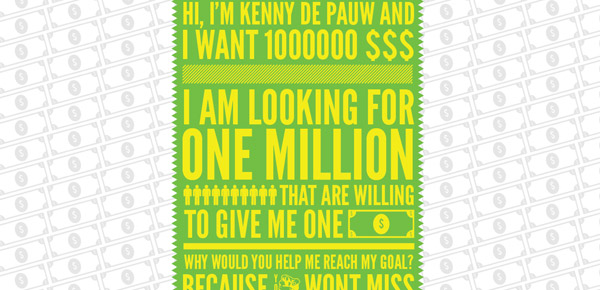
If all you’re doing is begging for money, you probably don’t need more than one page to do it on. I Want One Dollar looks great, but sadly doesn’t seem to be having the desired effect on visitors- only $8 raised so far. Nice try though.

‘What’, ‘Who’, ‘How’ and ‘Where’. All of these questions are answered within a single page thanks to a highly innovative, vertically scrolling layout.

Web developer, Oliver Gosling, knows his stuff. That’s why his personal site looks so good. I particularly like the way the gallery has been integrated so seamlessly.

There’s a lot of information on this single page, but the color-coded, circular links make navigation easy.

Design doesn’t get much more imaginative than this. Past projects are displayed vertically and read like a glossy magazine.

Plenty of white space makes this website a joy to behold. The typography used is excellent too- it’s creative and vibrant.
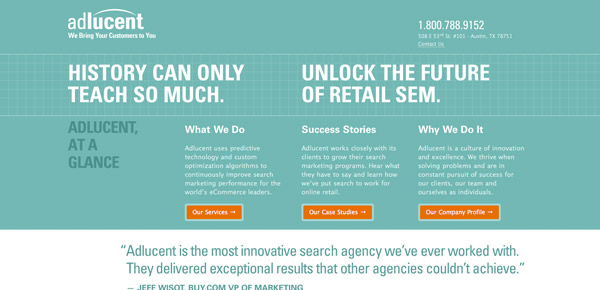
Adlucent’s homepage provides visitors with the minimum amount of information they need, presented in a neat and unfussy way. It makes the site totally uncluttered. Clicking on the tabs reveals the details.

Volll’s site might only be one page in length, but the different sections are so distinct that you almost forget they’re connected. The About section’s in the sky, for example, while Goodies can be found in a subterranean environment inhabited by spacemen and octopi! Check it out for yourself or you’ll have no idea what I’m talking about.

Hot Meteor’s site scrolls in both vertical and horizontal directions with each discipline (web, print, branding) presented on a different level.

The main focus of Pikaboo’s site is a scrolling show-reel in the centre of the page. Click on an image in the reel and a video instantly appears. News, About and Contact information is presented simply, so as not to detract from the proper creative work on show.

Espace’s website is based around an aerial view of a buzzy office space, complete with garden, meeting rooms and bar. It’s a thoroughly unique take on the website background.

His name’s Ben and he ‘loves making websites’. This one-page-wonder is easily achievable for anyone, but looks really polished.

This site centers on a tree- a very tall one at that. The navigation buttons can be found in its branches with previous work descending down the trunk.

Nothing like a funky mascot to differentiate your site from the competition. Justin Tsang’s furry friend sits atop previous projects, an About section and the usual Contact info.

A straightforward color scheme and classic fonts make this horizontally scrolling website a pleasure to behold.

This website is as slick as they come. With tons of white space, it’s so easy to navigate and fun too, thanks to the goldfish you’ll spot along the way.

A handmade-paper-type background and water-color illustrations give this site a distinctly vintage feel. It looks classy and stylish.

A really classic looking site. Chunky tabs make it easy to find exactly what you’re looking for.

This site has a clever layout. The portfolio is ‘hidden’ behind an imaginary fold in the page, set behind a great looking blog.

This website is simplicity at its best. There’s very little going on, making it quick to navigate. Despite a lack of substance, it’s in no way boring.

Like Volll’s site, this one houses its different sections on separate levels, starting at the top with the bright, blue sea and sinking all the way down to the seabed.

Another site with a vintage aesthetic, this time for UK PR agency, Bullet. The navigation bar seems to get in the way a little, but it’s extremely user-friendly.

Blocks of color make this single page site leap from the monitor. Past work can be opened and collapsed at the touch of a button.

Jon Brousseau’s site is little more than a vertical display of his previous work with a very brief introduction. It’s simple, but very effective thanks to its logical layout.

If there’s one thing that New Zealand has got a lot of, it’s sheep. You’ll even find them dotted around the hills which provide the backdrop to this super-cool kiwi site.

On Visualbox, past projects are assembled vertically down a single page. Visitors click on the corresponding tile in the grid at the top to quickly find their favorite.

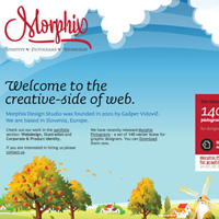
Split on three levels, you’ll find Morphix Design Studio’s homepage between the earth and the clouds, Portfolio in the upper atmosphere and About information underground.
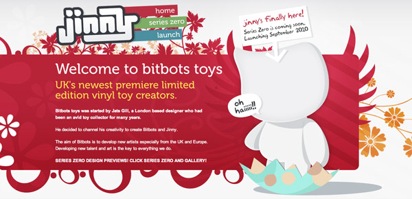
Bitbots makes toys, but not as you know them. They make pricey, vinyl toys so they need an upmarket site to match. They opted for a single-page site to underline their sense of individuality.

The second London based PR agency in this list, Margaret, has a site housed on a single page, but an absolutely massive one! Click on any button in the navigation bar and you’ll be whizzed across its surface.

Call me na?Øve, but I never realized there were companies out there with the sole purpose of photographing bottles! Well, there are and We Shoot Bottles is one of them. Its site is every inch as crisp and clear as its photography.

Hand-drawn fonts and cool photography set this website apart from the rest, not to mention its sophisticated layout and buttons which guide you through the single page.

By setting it among the clouds, Peter Pearson has transformed a rather simple portfolio site into something far more appealing. Dotted lines appear tying each image together as you scroll from one side to the other.

180 Degrees is a site built to honor Rob Gauntlett and James Atkinson, who died whilst mountain climbing in 2009. Incredibly moving and thought-provoking, the site has been exquisitely designed and is highly interactive.

Although I think my cash could be better spent on a more deserving cause, I fully appreciate how well this site inspires donations for two web appers desperate to get to FOWA.

Zach Klein’s companies include Vimeo, CollegeHumor and Busted Tees. Such success speaks for itself, which is why a single page is sufficient for his personal site.

WooConcept’s site is wonderfully uncomplicated. Not relying on gimmicks lets the previous work and client list do the talking.

Made By Giant is a web design and development agency from Seattle. The website is all about clarity. Four simple pages and chunky buttons make finding your way around even easier.
is a writer and designer who currently works at an online store specialising in ink and HP laser cartridges where he reviews hardware and posts on their blog about advertising, art and design.


Do you know the basic tools in Photoshop but feel that your work is still looking average? Join our creative community at FanExtra and get the direction you need to take your work to the next level.


A couple of my favourites:
http://www.mohanbalaji.com/
http://www.charleselena.com.au/
Very good and interresting collection.
Thx
Great very interesting post.
Awesome designs I love Voll and Morphix’s illustrated backgrounds!
It’s great to see personality built into the design. Love the Pikaboo site- interesting!
I love these, they look truly amazing
Thx for putting my website in this list mine is number 4: http://iwantonemilliondollar.com
They all look really great!!
Great collection of single page designs and lots of good sites here. I especially like Orange Label Design and the way they’ve drawn a pixel city with all the people and the ship from Futurama. Thanks for sharing.
Some really nice and interesting sites there. Inspiration to a new web designer. I will definitely take ideas away from this. I like ‘Made By Giant.’ Simplistic with lovely typography and the coloured tabs that get straight to the point with who, what and how.
nice collection
All designs are good,giving some new design ideas .. thank you for posting this!
Zach Klein i love!!!!, Made by GIant works smiles…:-)))
My personal favo is not here, but fyi: http://www.ericsteuten.nl it is.
It is a lovely design, but i especially love the way the work is presented, mch attention to detail.
Nicely compiled selection and very indicative of the current web design trends. Some talented designers out there at the moment!
Some very nice single website designs! thanks for the post!
I agree that these are good examples of slick designs, Orange Label Design really stands out! Thanks.
it’s exactly I’m lookingfor, thanks for your help.
I landed on this page just because I am redesigning my site and want inspiration to check. And these are very good. I like site of Zach Klein.
Thanks for the wonderful list.
Regards,
Prerak.
I like http://2advanced.com/