 Create a Magical Image using Photo Manipulation
 Professional Retouching Tutorial: Using Curves in Photoshop (Part 3)
 Create ‘Bionic Diver’ Using Photo Manipulation
Have every post delivered to your inbox and get access to hundreds of useful design freebies.
It’s been some time since I’ve written a tutorial for PSDFAN, although as I’m sure you’ll agree we’ve had some great guest writers join the team here. It feels great to have the time to write again, and I hope that you enjoy the tutorial. I’ve got several more ideas planned, so will definitely be writing more frequent tutorials from now on!
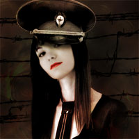
As always, this is the final image that we’ll be creating:

Open up a new document (600X700px) and create a new layer called ‘background’. Select all (option+a) and fill your canvas with black.

Now create a new layer called ‘clouds’. Go to filter>render>clouds.

Now reduce this layer’s opacity to 20%.

Now grab this photo of a girl: http://www.sxc.hu/photo/208780.
Paste her into your document, and then use the pen tool or lasso tool to cut her out from her background.

You can see in her hair where some parts of the original background remain, and this looks pretty bad. We could erase this area, but instead I’m going to use the clone stamp tool to clone parts of her hair to cover up these gaps.
Remember to use the clone stamp tool, hold alt and click on the area you want to clone. Then release alt and click on the area that you want to clone over.

Now with your ‘woman’ layer selected, go to image>adjustments>desaturate, to make her black/white. Then go to image>adjustments>levels and apply the settings shown below. This should give your woman more impact and contrast.

As the woman is the focal point of this piece, I want her looking flawless. Her complexion is a little grainy in the original photo, but don’t worry, we can fix this!
Use the lasso tool to select around her face (excluding the her hair). Then with your selection in place, copy/paste her face to a new layer. Then select her eyes, nose and mouth and delete them from this new layer. What you should be left with is a layer containing her face, minus her eyes, nose and mouth (so just her skin). You can be fairly rough in cutting out these features.
Then go to filter>blur>gaussian blur, and apply a 2.4 strength blur to your face layer. This should blur out any imperfections, and make the woman’s skin look very polished and smooth. This is a simple but effective technique used by many photo retouchers.

Now I want to make the woman look even more polished. I select a 20px white paintbrush, with 0% hardness, and then select it’s mode as ‘linear dodge’. Then I reduce it’s opacity to 5%, and brush over the highlighted areas of the woman, just to really bring out these areas. Then I switch to a black paintbrush, and change my mode to ‘linear burn’. Then I brush over the darker areas of the woman. Finally, I use a small, soft eraser brush to tidy up some of the edges.

Now I select this photo of an army hat and paste it into my composition. I cut it out using the lasso tool, and then go to edit>transform. I used a combination of resizing, rotating and skewing to fit the hat over the woman’s head nicely.


Now I repeat the steps that I used to make the woman more intense, but on my army hat later. I adjust levels, dodge/burn etc…
Finally, to make the two photos blend together better, I use a normal, soft black paintbrush to paint a shadow on the woman’s face that is cast by the hat. This helps bring the two photo elements together.

Now I select a large, soft eraser brush and erase away the bottom of my ‘woman’ layer, letting her gently blend into the background.

Now zoom in and use your lasso tool to select around the woman’s lips. Create a new layer called ‘red lips’, and then fill your selection with red (C10004). Change this layer’s blend mode to ‘overlay’ and reduce it’s opacity to 70%.

To add a final touch to the woman’s hat, I paste in an army medal, and place it in the center. Of course I cut it out, and apply desaturation and the other blending options previously discussed.

I want to add some cool barbed wire to my background, so I paste in this photo. I set it’s blend mode to ‘multiply’ to hide it’s white background. Then I duplicate this layer and flip the duplicate 180 degrees, to add more random barbed wire to the background.

Now download an old paper texture like this one: http://www.sxc.hu/photo/1231637.
Cut it out from it’s original background and paste it into your canvas. Then go to edit>adjustments>desaturate. Use a large, soft erase to erase the edges of the paper, and go to transform>scale, to reduce the height of your paper. Finally, reduce this layer’s opacity to 50%.

Add some text over your paper texture, and reduce this text layer’s
opacity to 75%.

Then, paste in this image of an explosion behind your paper/text layers. Because the image has a solid black background, we can change the layer’s blend mode to ‘screen’ in order to hide it.

Now go to image>adjustments>levels and apply the settings shown below:

Finally reduce this layer’s opacity to 20%.

Finally, I want to add a flame overlay image to give the whole piece more intensity. I paste in the explosion image that I placed behind the text in Step 16, but make sure that it fills the entire canvas. I also don’t desaturate the image this time.

Now I reduce this layer’s opacity to 5%, and change the blend mode to ‘color dodge’.

Finally, I duplicate this layer, increase the opacity to 50%, and change the layer mode blend to ‘overlay’.
That’s the tutorial finished! I hope you’ve enjoyed it and learnt something useful.

Tom is the founder of PSDFAN. He loves writing tutorials, learning more about design and interacting with the community. On a more interesting note he can also play guitar hero drunk with his teeth.


Do you know the basic tools in Photoshop but feel that your work is still looking average? Join our creative community at FanExtra and get the direction you need to take your work to the next level.


great post, would really like to see more tutorials like this if possible with more advanced techniques? i liked this tutorial because of its simplicity and great out come.
Thanks Vim! I do have some more advanced tutorials planned, so I hope that you’ll check back soon.
Very bad tutorial, don’t like it.
Bollhover: Fair enough, but I always appreciate more constructive criticism.
Looks very good. Keep up the good work Tom
you should wrap the shadow of the hat that it fits to the shape of her face
That hat is way off..Wrong angle, Size and lighting. Other than that a great tutorial and some nice tricks. Keep up the great work!
Great stuff!!
Cool idea and everything, but the hat just looks wicked awkward on her. it looks just as you instructed… just stuck on there with a drop shadow applied. other then that i like this.
Thank you so much for taking the time to do these tutorials. I have learn a lot being a beginner, great effect. You also explain very well the steps.
I really like this effekt