 Photo Manipulate a Surreal Underground Scene with a Sleeping, Frozen Beauty
 Creating the Elaborate Photo-Manipulation ‘Envy’
 Members Area Tutorial: Photo Manipulate a Beautiful, Bejeweled Ancient Princess
Have every post delivered to your inbox and get access to hundreds of useful design freebies.
Whilst at PSD.FanExtra we normally offer Photoshop tutorials, this tutorial will show you how to create a print ready trifold menu using Adobe Illustrator. However, it has plenty of professional, useful workflows that will help any designer, and does actually integrate some Photoshop work into the end design.
The source files for this tutorial are available to our FanExtra members community. If you want to access the source files for this tutorial (and all of our tutorials + thousands of other resources) then sign up here.
If you’re already a FanExtra member then you can login here to access the source files.
The organic food industry is a niche market which worth exploring. Today we’ll approach a practical tutorial teaching how to create a beautiful and ready to print trifold brochure in Illustrator. We’ll start from scratch to create our contents with Illustrator. Sometimes we will use the helpful Photoshop working space to manipulate and enhance some of the pictures.
To make it professional and ready to print we’ll cover document settings, proper dimensions, bleed and margins, color space, layout mockup, typography and final printing in pdf format.
The workflow used is thinked about a real clients aimed product so that it can be easily modified to create wide range of communication products such as flyers, advertising, banners and so on.
Let’s start!
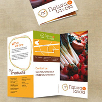
As always, this is the final image that we’ll be creating:

Before working on Illustrator we need to sketch the idea. I’m a big supporter of pencil and paper job and I’m keen of freehand drawing the very first steps of a creative workflow.
Recently digital paper has well replaced the traditional one in some way so that you do not need a scanning device but you can directly have your sketches available on your computer.
Below a quick draft that I did which will be the starting point of the design. There will be an outside front and an inside. The brochure will be folded in three so that we will have three pages front, including cover and back cover, and three inside.
The size is completely up to you. I found that a square size is very elegant but obviously this choice also depends from your printing budget. You have to be aware that uncommon sizes affect the price increasing the costs. The most commond and widely used size for a trifold brochure is the A4, flat in landscape view and folded two times.
In the sketches I’ve already divided the working space in areas that I’ve ideally filled in with the contents so that, before going digital, I’ve already a general idea of what I have do.
As you can see in the front I’ve located all those contents that are “institutional” and that needs for a good communication start, the very classic 5W regarded as basics in information-gathering: Who, What, Where, When and Why with a last addition about How.
When you are writing contents for business communication some of those info are commonly grouped so that we have:

Inside you are going to expand the What concepts by also eventually specifying the How.
In the inside sketches I’ve located the text and the space for images. Images and colors will create a visual separation which needs to make the written contents more attractive and clear.

We will create a single Illustrator document with two artboards to have outside and inside in the same place.
Open Illustrator and go to File > New.
Set: Number of Artboards as 2, Size A4, Orientation Landscape, Bleed 1mm for each side, Color Mode CMYK, Raster Effect 300 dpi.
Bleed is a sort of frame all around the artboard which allows being sure that, while cutting the business card, the printer don’t leave blank paper at the edge. You have to extend all colors and images to cover the bleed area. Check your printer service requirements about bleeding. In addition to that it worth to remind that we’re designing for printing purpose, which means we’ll need to set the document color mode to CMYK with a resolution of 300 dpi.
With all these parameters we can now create our new document.

This is what we get.

I usually start with creating the frame where I’ve to work in by setting guide lines in a new layer so that I can lock it and have all my references always there. I put a guide for each bleed line and for each cutting edge. I also define a safe area.
The safe area is usually a 5 mm area inside the edges all around. When the bleed is cut off you want to be sure that the machine is not going to cut off important elements too, such as logo parts, name or address portions. That’s why you keep all important graphic elements this 5 mm away from the edges.

I also mark the lines with different colors in a separate layer so that, even turning the guides off I’ve always a frame to refer to.


We need to have the lines placed on the second artwork as well.
Select the all of them. If you don’t see the Artboard panel in your working space then selects Artboard in the Window menu and it will appear.
Select the Artboard 2 and go to Edit>Paste in Place.
Same frames will be copied on the Artwork 2

We still need some additional guides, those which refer to the folding line.
Proper folding is critical to the success of your printed materials so pay a lot of attention here! Depending on the printer service the way in which he make the fold may change. Accurate calculation of panel widths, and the proper creation of the file with fold and trim marks that the printer will need to produce the job accurately. Usually we consider the panel that will be folded in the very inside slightly smaller. Obviously this means that you need to create guides in the proper location and reverse them on the opposite side.
This is what we need to finally have:

In order to get these including again a safe area we need to set some lines pixel perfect from the X-value. Us e the line tool, design a vertical line. Since our safe area is signed with the green color then set the line green and make 4 copies of it. Then make some two additional copies and set them black. Duplicate them all again and place them in your template by filling in the X-value as follows:
Outside:
First fold: green 94 – black 97 – green 100 mm
Second fold: green 194 – black 197 – green 200 mm
Inside:
First fold: green 97 – black 100 – green 103 mm
Second fold: green 197- black 200 – green 203 mm

As previously said, this is what you get at the end of the process.

The color palette is one of the key elements of a professional and target focused design project and you need to find the perfect color combination for you.
Different colors bring different meanings, if you’re able to achieve a good balance within your design, then it’ll communicate a stronger message to the reader.
Colors usually associated to the organic industry comes from nature, quiet green, warm orange and yellow, dark brown from the soil. All of them “communicate”, telling their story around natural food and environment. Here below the palette which I’ve selected for this brochure.
As we will see they also come from the logo that has been developed with these same meanings in the mind.

Once you have colors and document well done is time to go ahead and define a mockup of the areas. By following our very first freehand sketches this is what we have in the outside:

Let’s go on with the real layout set up now. Open the logo and bring it in place with a simple drag and drop inside Illustrator.
Eventually resize it proportionally by using the Scaling tool to make it suitable for the space that you have allocated for it. Rename the layer as “Logo”.
Bear in mind to always keep your layers tidy! This will be helpful when you will open the file again and you need to immediately locate different details.
Lock the Logo layer so that you are not going to select and move it for accident. By keeping different elements on different layers, you can also take advantage from locking feature to select more easily only what you need to select or move.

Create a new layer and name it “Front cover visual”. Select the rectangle tool and draw a rectangle which will cover the entire front.

Drag and drop the Vegetables Market image on the same layer

We can see how the image is bigger than our area. To crop the image appropriately we have to apply a clipping mask on it. This is very useful to crop large image without actually cropping them really since we only show a portion of them by covering all the rest. This technique can obviously be used with all kind of shape.
In this case we have a standard rectangle. So select the image, click on the right mouse button and select Arrange>Send to back option from the menu.

The image will shift to back and now you have the rectangle on top.

Select both and go to Object>Clipping Mask>Make

The photo is now framed in a group with the shape.

The panel 6 is that will be exactly the back of our brochure and where we have decided to place all those elements which regards the “Where” we are and how to get in contact with us. Repeating the logo here too could be a good idea to create a direct visual connection between the brand and places and contacts.
Star by creating a new layer called “Outside Bg” and divide the panel in different areas.
Select the rectangle tool and draw three rectangles of different sizes and colors.

Copy the logo here and place it on the top within the green rectangle. I’ve used here a slightly different version of it, all in white except for the orange point, to make it pop up better from the background.
Before editing the logo ALWAYS refer to the Company Manual Image policies about the logo proper usage.
The logo actually represents the Company “as it is” and you can’t modify it as you want. Check company guidelines and follow them to avoid a big waste of time in seeing your work refused!

The map here is not designed to be accurate. The point is allowing people to recognize places and let them reach you wherever you are.
For this reason mark and make places recognizable by adding few meaningful details (a school, a park or something else close to the commercial activity).
Create a new layer and name it as “Map”. Use the Pen Tool to draw main and secondary streets, mark them differently by using different stroke size.


As said this map should show recognizable places. It needs to populate the map by adding street names.
In this case, and for all the comp creation, I’ve decided to use the Comfortaa free font. I think that is roundness could be particularly suitable for the clean communication which we want to obtain.
Pick the brown color and set the font size 9 pt. Rotate then the label with the Free Transform tool. Repeat this step for all street labels.


By selecting the Round Tool create a round shape, filled with orange and brown border to mark the shop positions.


In the brown area now we are going to add the markets’ address.
Pick the white color, set Comfortaa font size as 12pt for the title and 9pt for the text.


To highlight that the two addresses refer to two different places add a vertical line as divider.


To complete the general details also add the website and e-mail address information bigger and your credits as designer here smaller and vertically rotated.


We have now the front and the back cover ready.
To complete the outside of our brochure, by following our mockup, we still have to add Who and What information.
A visual link among logo and company information is useful to strength the content meaning and create a relation to the brand. It could be a good idea creating something which has a family feeling with the logo to frame the area to fill in with the Who We Are content.
As per the What, we will add an overview list of the products, assigning the more complete information about the activity to the inside of the brochure.
Let’s start to create the frame for the Who We Are area.
Select the Rounded Rectangle Tool and do just a click inside the artboard. A new window will open where you can set size and corner radius.
Set these parameters as shown below.

Set the stroke color green

Keep the rectangle selected and go to Effect>Distort & Transform>Free Distort

Move the handles as shown.

Duplicate the shape and play with rotations and colors to reach an effect as that here below.

Set the Character style and start to type your header by changing the size to make it more interesting

Select the Type Tool and draw a text area. Fill it in with your text by setting font size 11pt and line height 14pt.

Create a new title which says “Our Products”.
Draw an orange background using the rectangle tool as already seen.

We want a list of products divided in two columns so create a text area then go to Type > Area Type Options.
A new dialogue window will open.

Set columns number 2 and adjust gutter between columns if you want it set differently. You can also have a preview. Click Ok.

Fill the text area in with your product list. The Outside of the brochure is now complete let’s move to the inside.

Since we have text and pictures to place it could be a good idea creating the background first and then adapt the contents to the main scheme.
Create a new layer and call it “Inside Bg”.
With the rectangular tool draw some rectangular areas and fill them with different colors. Choose the lighter one and move it on the top. It will be the background for our texts.


We need now to check our photos and make some adjustments before importing them in Illustrator so let’s move on Photoshop to arrange these changes.
Open the Salad Dish image in Photoshop. The photo comes with a black background that is not suitable for our brochure but that fortunately is easy to remove in a non-disruptive way using layer masks.

Firstly duplicate layer and add a new one filled in white just beneath the background copy.

Select the Magic Wand Tool and click on the black area to widely select it.

Go to Select>Inverse.

With your selection active click the Refine Edges button a new window will open.

Here below you can find the settings which I’ve applied to the image.

With your refined selection click on Add Layer mask icon

The mask is applied. The black areas are hidden whereas the white areas are still visible.
Refine the mask with the brush black/white by hiding/showing further details.

As you can see by disabling the mask you still have the background there if you need it for some other reasons.
Save the file as .psd and move to Illustrator again.

Select all the photos and place them inside Illustrator workspace with a simple drag and drop.
Resize them accordingly by using the Free Transform tool

We have the frame for our text now. Let’s add some key points of the offered service in bigger and visible size as they are a kind of headlines.
Also mark some words that you want to highlight with a different stronger color.


Play with sizes and colors wisely.

As we have already seen let’s add a type area and mange some of the options so that we will get our text distributed in two columns.


Set the font size 11pt and line height 16pt. A good proportion between font size and line height is important to keep the readability of the text.

With a quick overview of the inside we can see that the white area around the Salad Dish photo still miss of something to make it more catchy. Fortunately we still have the .psd file and we can manage the image to add further details.
Open the Salad Dish .psd file in Photoshop again.
Create a new layer above the white background and bring the Old Wood texture 2 inside.

Duplicate the layer and merge them to full fill the background.

We need know to make the composition more real. We can create an effect of reality adding a shadow area just beneath the dish with the Burning Tool. Again we can take advantage from using a non-disruptive technique.
Select the Burn Tool, load the Ink Brush Set in your brush presets and select the Ink Brush 09.
Set Range Midtones and Exposure 24%

Create a new layer clicking on the new layer icon and keeping the ALT key pressed. A new dialog window appears.
Set layer mode as Overlay and flag the Fill with Overlay-neutral color (50% gray) checkbox.

A new neutral layer appears above the texture one. Start to paint with the burn brush around the dish.
Compare the results.

Much better isn’t it?
We have almost done. Go back to Illustrator for final adjustment and printing set up.
In Illustrator, until they are linked and not embedded, you can easily replace images by updating their link.
To display the panel, choose Window > Links. Each linked file and embedded file is identified by the original file name.
Select the image which you want to replace then click the Go To Link button.


Until now we have worked with our images just linked. This allows keeping the Illustrator document’s file size down and allows the placed artwork to be updated or changed as necessary. By the way to provide the file properly to the printer we need know to embed them in the file, as well as converting text in outlines and expand all the strokes.
Embedding images, outlining text and expanding objects should only be done when you are done with the comp and no further changes will be made. Once you do that the elements can’t be changed anymore.
I strongly suggest you doing a copy and working on it.
Check that all linked images have a resolution of 300 dpi and CMYK space color.
Go to Window > Links to open your Links palette. Select all images to embed. In the links palette, click on the arrow in the upper-right corner, select “Embed Image”.

Select all text and go to Type>Create Outline. Once the outlines are created the text is not editable.
In the same way select all lines and objects and from the Object menu select Expand. We used them particularly in the map building.
Now we are ready to save our trifold in pdf to be printed. Go to File > Save As and choose pdf.
Flag the All Printer’s Marks checkbox and control that the Summary doesn’t have any negative report.
Save PDF.

You can view the final outcome below. I hope that you enjoyed this tutorial and would love to hear your feedback on the techniques and outcome.

The source files for this tutorial are available to our FanExtra members community. If you want to access the source files for this tutorial (and all of our tutorials + thousands of other resources) then sign up here.
If you’re already a FanExtra member then you can login here to access the source files.

Ester Liquori is a graphic designer from Italy, passionate for creating clean, modern identities, logotypes and websites. She runs her design blog Ester Liquori Design Blog (http://esterliquoridesign.blogspot.com) where she posts freebies, inspiration, tutorials etc. She is also an avid photographer and traveler and posts some pics from all over the World in her photoblog 365PhotoPaths


Do you know the basic tools in Photoshop but feel that your work is still looking average? Join our creative community at FanExtra and get the direction you need to take your work to the next level.


muy bueno tu tuto!! me encantaron las imágenes tan frescas. Muchas gracias por tu tiempo. S
aludos desde Argentina
WOW.. I am a FAN.. really really really GREAT and fantastic. I salute you.. Super duper great..
Thanks Mark! Really glad you enjoyed this tutorial .
.
How do you create bullet points? Thanks.
Awesome tutorial, thank you! You helped me a lot. I know how to do everything I want in AI/PS but I had a lot of doubts about the process for a correct printing (bleed, save area, embedding images…). Thanks!
This is really really really good tutorial!!!
How do you come up with 97mm 100mm and 100mm for your guides when 11 inches is only 279.4mm?
Thanks, I’m new to creating tri-folds.