
 Create a Psychedelic Alternate Reality Using Photoshop Actions
 Design a Creative RSS Icon in 15 Simple Steps
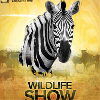 Design a Professional Wildlife TV Show Poster
Have every post delivered to your inbox and get access to hundreds of useful design freebies.
As always, this is the final image that we’ll be creating:

Create a new document (600X700px).
Paste in a rough looking texture. I chose one of the ‘color fog’ textures available right here at PSDFAN. You can download the entire texture set here: Colored Fog Texture Set. Stretch your texture to fit your canvas perfectly, and then call this layer ‘background texture’.

Now go to image>adjustments>hue/saturation. Reduce this layer’s saturation to -80.

Now go to image>adjustments>levels and apply the settings shown below. Reduce the layer’s opacity to around 20%.


Now paste in a photo of some clouds, and place them at the top of your canvas. Remove the original sky background using the pen tool (or magic wand tool if it’s a solid color). This leaves only the cloud. Then duplicate this layer, and go to edit>rotate>rotate 180 degrees. Move this rotated cloud to the bottom of your canvas. Then merge these two layers together, and call the merged layer ‘clouds’.

Now change your ‘clouds’ layer’s blend mode to ‘hard light’. Then duplicate this hard light layer and merge the two layers together. Reduce the opacity of this merged layer to 85%. Then go to image>adjustments>desaturate to grayscale the layer.

Now select a texture from our Concrete Textures Set and paste it onto a new top layer.
Then change this layer’s blend mode to ‘multiply’ and reduce it’s opacity to 20%. Go to image>adjustments>hue/saturation and reduce your saturation to -85. If you feel that it’s necessary, go to filter>sharpen>sharpen, just to really bring out the details of the texture.


Now create a new layer called ‘color gradient overlay’. Drag a linear gradient down vertically across your canvas. You can see the gradient that I used below. Then change this layer’s blend mode to ‘soft light’.


Now create a new layer called ‘gradient fade’. Use your rectangular marquee selection tool to create a thin, rectangular selection. Then fill this selection with a white to transparent linear gradient (going across the narrow width of the selection). Then change this layer’s blend mode to ‘overlay’. Go to edit>transform>rotate and rotate the gradient to fit nicely across the top clouds in your canvas.

Now duplicate this layer twice, moving each duplicate to a different part of your canvas, and rotating it, to make the gradients positioning appear random. Finally, merge all of your ‘gradient fade’ layers together, and use a large, soft eraser brush at a low opacity to erase their harsh edges (letting the end of each shape fade naturally into the main background).

Now paste in an image of a girl jumping. This image was quite time-consuming to cut out, but it’s worth spending the extra time to get a good cut out. You can use either the lasso tool or pen tool to cut out your woman.

Go to image>adjustments>levels and apply the settings shown below:

Now go to image>adjustments>color balance and apply the settings shown below. This should help your woman blend better with your background.


Now go to image>adjustments>hue/saturation and reduce your woman’s saturation to -25.

Now cut out a photo of a bird wing, and paste this over your woman, joining the wing to her back. I also rotated the wing to make the angle more realistic, and went to filter>sharpen>sharpen to bring out the detail of the wing, as the original photo was a little blurred.

Now use your eraser brush, and smudge brush, to gently blend the wing into the woman’s back. Then reduce your wing layer’s opacity to 0%, and use your lasso tool to cut away parts of the wing that are overlapping the woman’s hair. Then, with your hair selection in place, bring the wing layer’s opacity back up to 100%, and hit delete. This will give the impression that the woman’s hair is in front of the wing.

Now go to image>adjustments>levels and apply the settings shown below. This will make the wings more intense.


Go to image>adjustments>color balance and apply the settings shown below:


Now duplicate your wing layer, and move the duplicate below your ‘woman’ layer. Go to edit>transform>rotate and rotate it so that it appears to be behind/beneath your original wing. Then go to image>adjustments>brightness/contrast and reduce your brightness to -60, and your contrast to -40.

Now select your original wing layer and go to blending options. Apply a subtle drop shadow (settings below), in order to help give your piece depth.


Now paste in a photo of a feather. In this example, the feather has a plain black background. There is far too much detail in the feather to cut it out using the magic wand, or pen tools, so we must use the color range tool.
First hide all layers apart from your feather layer. Then go to select>color range. And choose ‘reds’ and your color range. This will select only the red parts of your layer (i.e.: your feather).
Now hit ‘OK’ and then copy/paste your selection onto a new layer called ‘feather’. I wanted to make my feather slightly more bold, so I duplicated this layer, and merged it down with the original.


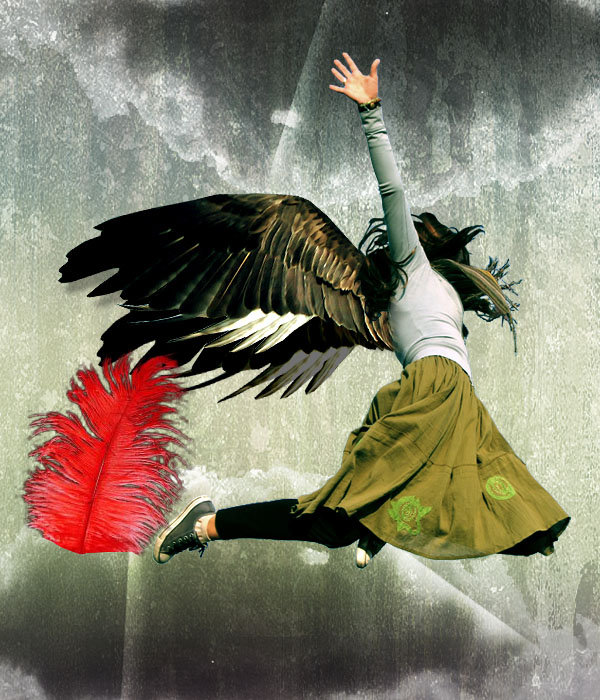
The feather is obviously the wrong color to match the rest of our piece, so I go to image>adjustments>hue/saturation and apply the settings below:

Then I go to image>adjustments>levels and apply the settings below:

To finish up, duplicate your feather layer MANY times, and resize/rotate each feather, to give the impression that feathers are falling from the wings. To create a cool perspective, make the feathers that are nearer to you much larger, and apply a gaussian blur effect. Apply a lesser blur to those feathers in the ‘mid range’ of perspective, and no blur to the smaller feathers that are nearest to the angels wings.
You can view the final outcome below. I hope that you enjoyed this tutorial and would love to hear your feedback on the techniques and outcome.

Tom is the founder of PSDFAN. He loves writing tutorials, learning more about design and interacting with the community. On a more interesting note he can also play guitar hero drunk with his teeth.


Do you know the basic tools in Photoshop but feel that your work is still looking average? Join our creative community at FanExtra and get the direction you need to take your work to the next level.


Beaut of a tutorial! Good job
meh.
Ah, I thought I recognized the background as the colored fog texture… The angle of the wings is perfect in relation to the person and you’ve blended them terrifically.
I think the feathers should be above her though, unless she’s falling up!
Another Great tutorial, thanks.
Thanks a lot guys
Btw Adam: Good point about the feathers lol, hadn’t thought of that
She or he looks lie rising up in a strange way:) but i like this tutorial good job
thanks!
several versions here:
http://genelocklin.deviantart.com/gallery/
my favorite:
http://genelocklin.deviantart.com/art/Fallen-Final-127223625
i reversed the focus on mine.
[...] Photo Manipulate a Falling Angel – Learn how to combine several photos to create a dramatic ‘fallen angel’ scene. [...]
Probably should have given credit to the first person who created a tutorial like this:
http://psd.tutsplus.com/tutorials/photo-effects-tutorials/create-a-dynamic-scene-with-a-fallen-angel-theme-psd-plus-tutorial/
Hi T. I do read PSDTUTS sometimes, but I’d honestly never seen that article. It does have a similar result, and I really love the effects they have going on there, but it wasn’t actually inspiration for my piece.
Interesting effect, enjoy the textures.
Thanks.
Good job thank you.
hmm… so the feathers are falling faster then the angel…. how intresting…
woow , cool and beatufull !!
great !!
I agree with Tommy … The feathers are in a little bit wrong orientation …………… Any way the presentation is good … Nice sharing
Nice Tutooooo Thanksss
OF course, all fanextra posts are quite awesome.
Very nice Post! Really love it your post! thank you very much for your Information
l want to be able do this bec looks very good.
Beaut of a tutorial! Good job
Nice creativity
Thank you very much this very good tutorial, I made this picture with it:
http://www.demonbonnie.hu/galeria.php?kat=53
Very nice and helpful posting
Excellent tutorial! Certainly apply the concepts discussed in other ideas. Thank you very much!
Thanks for sharing your info! The texture is amazing!
Congrats.
Excellent tutorial! Certainly apply the concepts discussed in other ideas.
Thank you very much!
Angels are bright still, kewl article
Keep them coming… you do such a great job at such Concepts
intersting effect..thanks for sharing
wow!it’s amazing!thanks so much!
great job! thanks for sharing.
Thanks. Nice job.
very nice and helpful
wooow, I love it!
nice job, my friend xD
Great image one of my favorites i have written a tut with the same theme http://www.psd-dude.com/tutorials/photoshop.aspx?t=beautiful-fallen-angel hope u like it!
I ve visit that tutorial too… more or less the same, except this one is the original
great work, this will make me a real artist, thanks
Absolutely awesome!!!
very nice and helpful,Thanks for the article. I liked reading it
hmm… so the feathers are falling faster then the angel…. how intresting…
Thanks for sharing your info! The texture is amazing!
Congrats.
Excellent tutorial! Certainly apply the concepts discussed in other ideas.
Thank you very much!
Absolutely great, and extremely well-written. Thanks for sharing your talent and providing so much helpful info!
Nice resource. Good to see an alternative to the usual suspects of smashing / noupe etc.
osam job
wonderful, I’m speechless now! thx for share
This is awesome Tom, a good, detailed walk through, thank you.
Great tutorial, lot of fairly simple steps to make a really nice final result!
Great tutorial. What is more beautiful, white wing or black wing for this design?
Wow, that’s nice….
nice shop thanks.
That was a great tutorial. You break it down so well even I feel I could do it!
HI:
First hide all layers apart from your feather layer. Then go to select>color range. And choose ‘reds’ and your color range. This will select only the red parts of your layer (i.e.: your feather).
Thanks for this photos shop. They are very nice.
This is what I call awesome.Thank you so much for sharing this post.I will definitely visit your site again.
Nice tutorial
Wow, that’s nice….
it looks great tanx… u are really good on editing
Thx for tutorial
Used this tut today to make a killer poster, most excellent. Thanks!!
You’re great in design. Thanks for sharing this good tutorial.
hi there my name is Noroz Mayar I am a web and graphic designer, i like your work , tutorial is fantastic and the work great, thumbs up man..
what’s the color for the gradient? would you like to give the code for the color please?
Excellent tutorial