Week 42: Capitol Church of God
This week I will be redesigning: Capitol Church of God.

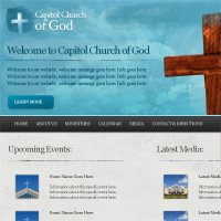
In the space of 5 minutes I can identify some of the key strengths and weaknesses of this design, and sketch out a mockup.
STRENGTHS:
- The design follows a fairly standard layout structure, which isn’t confusing for the viewer.
- The site uses relevant imagery, so you know what it’s about fairly quickly.
- All relevant content is there, and there isn’t too much obsolete content. It’s more the design that makes things feel busy, but the content is actually kept to a nice minimum of the essentials.
WEAKNESSES:
- The menu is absolutely tiny and feels hidden away. The twitter logo is larger than the entire navigation area! This makes the site hard to navigate.
- The images/photos used may be relevant, but many of them feel corporate, impersonal and cheesy.
- There is simply too much going on a visual level. Everything seems to clash. There is a huge variety of shapes, patterns and colors, and none of it really fits together.
- Continuing from my last point, there is no continuity with the typography in this design. Most of the typography has a very 90s feel to it (not helped by the color backdrops), and the use of bold, italics, and varying colors feels totally random. The result is a lack of order in this design, which is a contributing factor to throwing off a pleasant user experience.
My Redesign
As always, I was limited by the 30 minute time-frame, but I tried to improve upon several of Capitol Church of God’s features, adding a few design flourishes and a clearer layout that promoted content over wasted space:
MY AIMS FOR THE REDESIGN:
- I created a much more prominent menu area, making the site easier to browse.
- I created visual elements that worked better together, rather than clashing. This included a more refined color palette, and more relevant, stylish typography.
- I integrated lots of design flourishes, including a subtle grungy feel (involving plenty of brushes, textures etc…) in order to provide a more personal feel for the site, rather than an impersonal corporate image, that isn’t really relevant to their audience.
- I retained the basic layout structure, but made it far cleaner and easier to browse. The eye is drawn more naturally down the page, due to a clear visual hierarchy, and better organization of content.

Before/After:
Here is a quick comparison between the original design and my 30 minute redesign. Sure, my design could be more polished, but I believe that a lot of the basic elements have been improved upon, creating a more pleasant browsing experience.

How and Why To Enter Redesign Saturdays
You can have the chance to have your website redesigned in next weeks post. All you need to do is leave a comment to this post with your website address and why you think it needs a redesign.
The Benefits of Getting Your Site Redesigned Include:
- Most obviously – a FREE redesign job!
- Your website gets exposure to PSDFAN’s thousands of readers
- You understand how to improve your website. This isn’t just a redesign, it’s a lesson in design principles.
- You will get emailed the .psd of your redesign and can do whatever you want with it!
NOTE: I can only accept sites with English content, as foreign language websites are simply too hard for me to work with.
So please, leave a comment today for a chance to have your website redesigned next week!

About the Author:
Tom is the founder of PSDFAN. He loves writing tutorials, learning more about design and interacting with the community. On a more interesting note he can also play guitar hero drunk with his teeth.
Related Posts
 30 Minute Redesign: Week 12 Vote
 30 Minute Redesign: Cheap Sunbed Creams
 30 Minute Redesign: Rogue Aviator


Ahhhh, I love it. It feels way more put together and polished. I can’t wait to try to put it to good use. You are awesome even with a 30 minute time restraint. I’ll be awaiting the psd. And I also have something else to tell you but I’ll just reply to your email with that.
I’m really glad you liked it! I was struggling at the start with this design, but I’m really happy with the result. I’m just emailing across the .psd, so I’ll discuss via email with you .
.
Great redesign Tom! All of them were great.. I especially liked the contrast between the background clouds and the Cross. Blue and brown don’t normally go well together, but you made it work. And the saturation/detail looks good. I think you should redesign this site: (http://www.mgocsmamerica.com/). Someone was talking to me about this church organization (MGOCSM) and showed me their website and I told him about you and PSDFan. He said after seeing your redesigns he needs to do one.. I was wondering if you could redesign that site.. I’m curious to see the outcome. Thanks! Jibz
Thanks Jibin! Yeah, I really wanted to push that contrast for the cross image. It was achieved through tweaking the photo’s settings a bit, but also applying some subtle lighting effects behind the cross to really make it pop.
I’ll happily include your suggested website in this Thursday’s poll. Thanks for spreading the word about PSDFAN .
.
Hi Tom,
This is definitely your best makeover here so far.
It’s a complete transformation already.
Thanks Trisha! It’s a pretty drastic change yeah, more of a ‘design’ than a ‘redesign’.
Hi tom,
Goog job, i like the header.
Cheers xpmatrix! I had a lot of fun with the header. It was good to play around with some watercolor effects there.
Tom, an excellent redesign. Nice a simple, not overloaded with graphics, clear and easy navigation. A fantastic job, well done.
Thanks Nick! I did want to keep this design slightly grungy, but not overwhelming. I’m glad you liked it.
This is just a brilliant piece of design; it’s expressive, but keeps a beautiful, clear arrangement to everything at the same time.
I’m working on a project for a church at the moment and it looks like I need to STEP UP. :p
Beautiful, beautiful redesign. The colors work together so well. The site is warm and welcoming, which is what any church wants. Well done!
Great job! The site looks more organized and the design and colors look so much better. I designed my church website, but it needs a redesign also.
I’m still learning from you, but I’m trying to achieve my goals. I certainly enjoy reading everything that is posted on your website.Keep the posts coming. I liked it!