
 30 Minute Redesign – Suggestions Needed!
Have every post delivered to your inbox and get access to hundreds of useful design freebies.
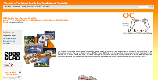
This week I will be redesigning: OC Deaf.
In the space of 5 minutes I can identify some of the key strengths and weaknesses of this design, and sketch out a mockup.
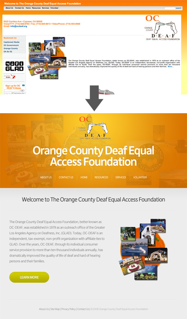
As always, I was limited by the 30 minute time-frame, but I tried to improve upon several of OC Deaf’s features, adding a few design flourishes and a clearer layout that promoted content over wasted space:

Here is a quick comparison between the original design and my 30 minute redesign. Sure, my design could be more polished, but I believe that a lot of the basic elements have been improved upon, creating a more pleasant browsing experience.
You can have the chance to have your website redesigned in next weeks post. All you need to do is leave a comment to this post with your website address and why you think it needs a redesign.
NOTE: I can only accept sites with English content, as foreign language websites are simply too hard for me to work with.
So please, leave a comment today for a chance to have your website redesigned next week!
Tom is the founder of PSDFAN. He loves writing tutorials, learning more about design and interacting with the community. On a more interesting note he can also play guitar hero drunk with his teeth.


Do you know the basic tools in Photoshop but feel that your work is still looking average? Join our creative community at FanExtra and get the direction you need to take your work to the next level.


Very nice!
Bright coloured websites can sometimes look just too much, but this site, although using orange is really nice and a vast improvement on the original. The header is clear and precise and really draws the eye which is what you want when first looking at a webpage. The only thing is that once you scroll down the content area is lacking a bit so I think it would need more attention to this as its not just about getting people onto your website but keeping them there. I think that with the time limit though this is a really good start!
Thanks a lot guys! I agree the bottom area is a little bare, but it was just so cluttered in the original I had to try and strip it down. I’m sure if this design was used as a new template they could integrate a little more content into the homepage though.