
 30 Minute Redesign: Week 19 Vote
 30 Minute Redesign: Out of Box Pakistan
 30 Minute Redesign: D-Lists
Have every post delivered to your inbox and get access to hundreds of useful design freebies.

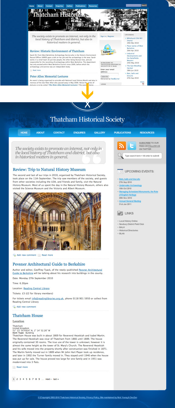
In the space of 5 minutes I can identify some of the key strengths and weaknesses of this design, and sketch out a mockup.
STRENGTHS:
I actually like this original design a lot. There are limited things I would change. Here are my favorite aspects of the current design:
WEAKNESSES:
As always, I was limited by the 30 minute time-frame, but I tried to improve upon several of Thatcham Historical Society’s features, adding a few design flourishes and a clearer layout that promoted content over wasted space:
WHAT I TRIED TO DO:

Here is a quick comparison between the original design and my 30 minute redesign. Sure, my design could be more polished, but I believe that a lot of the basic elements have been improved upon, creating a more pleasant browsing experience.
You can have the chance to have your website redesigned in next weeks post. All you need to do is leave a comment to this post with your website address and why you think it needs a redesign.
*NOTE: I can only accept sites with English content, as foreign language websites are simply too hard for me to work with.
The Benefits of Getting Your Site Redesigned Include:
So please, leave a comment today for a chance to have your website redesigned next week!
Tom is the founder of PSDFAN. He loves writing tutorials, learning more about design and interacting with the community. On a more interesting note he can also play guitar hero drunk with his teeth.


Do you know the basic tools in Photoshop but feel that your work is still looking average? Join our creative community at FanExtra and get the direction you need to take your work to the next level.


Tom,
Thank you so much for that, it looks fantastic. Some simple changes that we would jsut not have thought of, but ones that have made a huge difference. The header text with the image in the background looks so much better and having the RSS and twitter icons stand out is far better than what we currently have.
The change from 3 columns to 2 also makes a world of difference, more space but also as you say clearer.
We are certainly going to get our website re-worked to use the new design and can’t wait to get started coding it.
Once again, a BIG thank you…
THS: I’m so happy you like the redesign Your website was both a pleasure to work with and a challenge. I really do like your current design, so it was hard to find ways to improve it further. It would be great if you managed to integrate some aspects of the redesign though, I hope you’ll let me know if you manage to. I’ll be emailing across your .psd later today.
Very nice redesign, love the subtle changes, that gives clarity to the content
Very nice redesign Tom
Very nicely done. A all around good site.
Indeed a great redesign. Like the simplicity and reducing the 2 columns to one make complete sense in this case.
Very nice work..!!!
A good redesign, there is a lot of content but in the layout that has been added it doesn’t look as scary to start scanning through. I particularly like the header and the top navigation as it really makes a different to the site but isn’t too overwhelming. Again another good redesign.
Congratulations THS, you have a new and improved web design in just 30 minutes. I like where the header menu is in place right now, for me it’s just more easy to navigate with. Social media icons, upcoming events, and links looked more organized as well. Hope to see the design up on your site soon!
This is your best makeover yet! I really love how you took a decent site and made it look much more professional.
Great redesign there and would like my site also redesigened
Thanks
@RNEL, thank you. And yes you will see the design on the site. It will take a while though, we are giving the entire site an overhaul. Some of the content needs correcting, some new/updated features, etc. so going to do it all together rather than bits and pieces.
@Trisha, I learn from every redesign Tom does, however, I would agree I do learn more when a good site is redesigned, simply because it is harder to see what could be improved.
Hi tom, can you redesign my site??
hi
nice redesign.
Wow, thanks for all the great comments guys . I’m glad that this redesign proved so popular. I can’t wait to see it go live!
[...] 30 Minute Redesign: Thatcham Historical Society [...]
The redesign is a vast improvement over the original design. The whole layout is much cleaner and nicer to look at. I really like the header as it adds a nice touch to the website and makes the page look more inviting to users.
Great redesign there and would like my site also redesigened
Thanks
Tom,
Just to let you know, we ahve re-launched our website using the theme you designed, with one or two minor changes. We are looking to release all the code for this and a tutorial on what we did. Will contact you on email to sort out any specifics and let you have a copy of everything.
Regards,
Nick