 Daily Image Inspiration #35
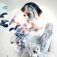 Daily Image Inspiration #32 (+Weekend Lineup)
Have every post delivered to your inbox and get access to hundreds of useful design freebies.
It would seem that photographic website backgrounds are becoming more and more popular these days, to the point of being a major design trend. Today we look at the pros and cons of large, photographic backgrounds and some great real-life examples:
Some of the pros of a photographic website background include:
The pros are all well and good, but there are some negative points to consider if you’re thinking about using a photographic background for your website:
The following examples are all great ways to integrate a photographic background into a website. I’ve outlined my thoughts on each one:

This scenic landscape background is really engaging. The photo appears to be HDR, making it really ‘pop’. The energy of the swimmers and the waves provides a nice energetic contrast to the clean, calm website layout.

The large flag photo background to this site is very relevant to the political theme, and provides a nice splash of color. The lack of detail in the photo makes the main part of the website really stand out.

The large photographic background of a woman indulging in a cup of coffee is very sensual. The focus on her eyes and the dark background fits well with the rich theme of the site.

This background image is very emotive. The man walking through a field feels somehow spiritual, and the fade to an intense black background is very intense. The perspective and foreground blurring makes this site feel very real and palpable.

This photographic background is obvious relevant to the restaurant theme. The close-up shot of the food instantly inspires an appetite, and the checked table cloth like background to the left smoothly transitions the content area into the photo.

This website is so minimal that the photo background really pops. Particularly on a wide monitor this photo background feels like you’re actually gazing out at a beautiful view. Very effective!

The background design of this website instantly helps showcase the product and its features/endorsers. Whilst it makes readability somewhat difficult it’s still very effective at portraying the site’s purpose as quickly as possible.

I love how this photo background is positioned. It’s done so that the viewer gets the Point-of-View placement of a dining customer looking down at their plate. This effect is helped by the foreground blurring and view out onto the rest of the restaurant. This is actually far more effective than a regular shot of just the food. This point of view technique makes the viewer get a sense of what it would be like to eat at the restaurant.

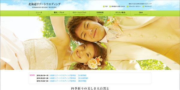
Because of the size of this photographic background it feels very panoramic. The website elements (content areas etc) blend in with this main focus very smoothly, through a variety of grungy fades/borders. The rotating background images provide a view of the highlights of the resort, in a kind of ‘virtual tour’ experience.

The Parachute Journalists make themselves the main focus of the website, which is something you’d expect from band promotion. The central focus of the site is then the band, and viewers are encouraged to check out their music at the top of the site.
This website is clearly capturing a very happy theme and the large, bright photographic background fits perfectly with this. Combined with the colorful palette and fun, clean design it’s very effective.

Another restaurant website, you can see why photographic backgrounds are so popular within the industry. This website provides a lovely overview of the restaurant interior, allowing content to be readable through use of a semi-transparent black content area.

This background is perfect as it not only provides a nice, grungy background design, but it instantly showcases the company’s products. Interestingly the typography on the shirt in the photo matches that of the website, showing a smooth transition from the online presence to the physical product.
‘Made Good Typography’ by Clideone

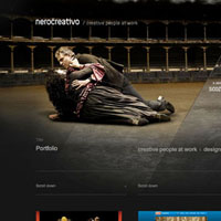
Nero Design uses a theatrical photographic background to create a very dramatic backdrop for their site. The intense lighting and emotive characters add a lot of passion into this website.

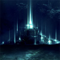
Hurtta provides a layered effect, by combining a central photo slideshow with a wider background image. As a result we get the feeling of perspective/distance, as well as an overwhelming sensation of what the company do.

The warm photographic rotating backgrounds of this site fit perfectly with the warm color-scheme of the wider design. Overall this warmth accentuates the cosy feeling implied by the company, and associates them with home comforts.
Tom is the founder of PSDFAN. He loves writing tutorials, learning more about design and interacting with the community. On a more interesting note he can also play guitar hero drunk with his teeth.


Do you know the basic tools in Photoshop but feel that your work is still looking average? Join our creative community at FanExtra and get the direction you need to take your work to the next level.


Awesome sites! Really great article.
Thanks Ceane!
Nice one – a big fan of BG imagery used right. Check out http://www.formtroopers.com – it just works.
Some really nice sites and I like how they all use nice photos to grab the attention of the viewers. I think that using big photos on websites stands out more and if they get the right balance of text and imagery then they will attract more people to the site.
If I may be pedantic for a moment . . .
“The background design of this website instantly helps showcase the product and it’s features/endorsers.” (it’s = it is)
Which means this actually says :
“The background design of this website instantly helps showcase the product and (it is) features/endorsers.”
Always enjoy the posts, though, keep it up!
You really think the scrolling issue is still relevant? The concept of the fold is pretty dead at this point as far as web design is concerned. I wouldn’t put that as a con at all.
dON: Thanks for pointing that out, all fixed . Embarrassing considering I’m an English graduate!
RustyEight: Personally I do think it’s still relevant, but I’ll admit that it comes down to personal taste. I’d say particularly for business orientated websites it’s more useful to display vital text and calls to action above the fold rather than just a large photo (if it’s alone).
RustyEight – it is relevant to a point. Firstly, if the photo takes up the entire viewport and does not hint at further textual content, it may appear that there is nothing else on the page. ‘The fold’ isn’t a problem provided there are clues to the user that there is something ‘down there.’ Take them on a journey through your content. Secondly, a large image that pushes textual content far down the page will hinder your SEO efforts.
An obvious downside to using large photos is the bandwidth required, I’m not sure why that wasn’t mentioned.
On another point, I think most of the examples here use nice photography and implement it fairly well, but the Romapa example should be a ‘how not to do it’ case – that text isn’t readable at all!
I liked some of the websites in this showcase, and I’ve been considering doing something similar for a future project (seriously, this way of using photography would be ideal) but in this particular project, I would have to come up with a timeless design. This way of using photography has become a trend, which isn’t timeless in my mind.
tanx…
I can really see some of the appeal with using photography backgrounds, but I can also see its drawbacks. I think that it can’t always work but applied to certain websites like for example the ones above can really pay off. I will definitely consider photographic backgrounds more as an option for my website designs in the future.
Photography backgrounds looks great, but can be a distraction when you see high resolution images, When i see a glossy background i tend to stare more at that, i agree with Oliver i there was a balance between text and imagery then i would not be much of a distraction.
Tom would you happen to know how to implement background images like the ones in your showcase? so that they retain quality when expanded, if you do that would be great tutorial.
Great article!
I like what you guys are up too. Such intelligent job and reporting! Keep up the fantastic works guys I have incorporated you guys to my own blogroll. In my opinion it will improve the value of my own webpage :]
thanks for this usefull info.