 Create a Textured Wooden Text Effect Using Photoshop’s 3D Capabilities
 Create an Abstract Sea on Land Illusion
 Create an Advanced Reflective Clear Layer Style in Photoshop
Have every post delivered to your inbox and get access to hundreds of useful design freebies.
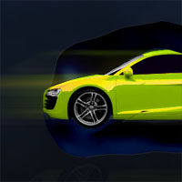
This is the final image that we’ll be creating:

Open up a new document, 600X600px. Create a new layer called ‘background’ and select filter>render>clouds.

Go to image>adjustments>brightness/contrast and lower the brightness to -100 and the contrast to -75. Then go to the layer’s blending options and apply a gradient overlay effect ranging from 080F1A to 162A4B. Set the blend mode of the gradient to ‘overlay’ and make it’s opacity 90%. The outcome should look like the image below:

Paste a photo of a cool looking car into the center of your image. Cut it out from it’s background using the magic wand tool or lasso tool (whichever you prefer) and be sure not to leave any harsh edges. I had to go in with the lasso tool and cut away very thin remains of my white background so that it blended better with my dark image background.

Now I want to change the color/appearance of my car, so I go to image>adjustments>hue/saturation and then increase the hue by 73, the saturation by 65 and reduce the lightness by -18 to achieve the effect below:

This is looking better, but obviously the window is wrong. I want a dark window, and so using the lasso tool select around my window shape. Then I go to image>adjustments>brightness/contrast and decrease the brightness to -100 and the contrast to -75.

Now to give the car a little more contrast and shadow I select the wheels and headlights and reduce the brightness to -35 and up the contrast to +15. To select the wheels I use my elliptical marquee tool and drag my cursor out from the center of each wheel whilst holding shift+alt (this creates a perfect circle).

Now paste in a photo of a man’s torso (without clothes).

Now cut out the arms from the man using the lasso tool and resize/rotate them to fit nicely around the car. It should ideally look like the arms are hugging the car. Be sure to delete the parts of the arms overlapping near the front of the car, but leave the hands/wrists in tact near the back so that they are overlapping the vehicle.

Now desaturate your arm layers and reduce the brightness/contrast of the bottom arm so that it’s lighting matches the top arm better (before it was far too light as the man was being lit from one side in the original photo).

Now go to image>adjustments>color balance for your arm layers and for shadows/midtones/highlights make it around 0 on the Cyan/Red level, around +25 on the Magenta/Green level and around +40 on the Yellow/Blue level. You’ll need to play around with these figures a little but this is a rough guide. Make sure ‘Preserve Luminosity’ is checked.

Now we want these arms to be a bit more subtle, and not obviously arms at first glance. I go to brightness/contrast adjustments and reduce the brightness to -75 for each layer, and then the contrast to -25.

Now I select the layer containing my top arm and use a large, soft eraser brush to brush away most of the hand, letting it slowly fade into the car instead of looking too obvious and imposing.

Just to make my car photo a little sharper I select it’s layer and reduce the brightness by 12 and up the contrast by 5.

Now I duplicate my car photo layer and move the duplicate layer above the original and my arm photo layers. I go to filter>blur>motion blur and use a horizontal blur applied at 355px in strength.

I go back to my original car layer and using the magic wand tool select the area around my car image. Then I invert my selection to be selecting my car. Then I go to my motion blurred car layer and hit delete, deleting the part of the blur that covers my car, and leaving the blur either side.

To make the edges of my arms stick out a little more I apply a 1px light blue drop shadow (10% opacity) to my bottom area to emphasize this bottom edge. Then to achieve the same effect with the top edge of the top arm I apply a 1px light blue inner shadow (10% opacity).

Now I duplicate my original car layer and go to edit>transform>flip vertical. I move the flipped car image down near the bottom of my image and using edit>distort drag out the bottom corners of my image to create a kind of perspective.

I then reduce this layer’s opacity to 4% and using a layer mask (reveal all) drag a black to white gradient downwards to fade away the bottom part of the image.

To finish off I apply some text to the top of my image and in the layer’s blending options apply a light blue outer glow (opacity: 20, spread: 10, size: 21).
As always please let me know what you thought of this tutorial and I’d be happy to explain anything about it personally ![]()

Tom is the founder of PSDFAN. He loves writing tutorials, learning more about design and interacting with the community. On a more interesting note he can also play guitar hero drunk with his teeth.


Do you know the basic tools in Photoshop but feel that your work is still looking average? Join our creative community at FanExtra and get the direction you need to take your work to the next level.


wow.Just another great tutorial.I love the way you write the tutorials . simple and clear. Thanks a bunch
thanks twopo I try to make the tutorials as simple as possible for everyone.
Some of the effects were almost cool – but the end result is somewhat lacking. You can’t really even tell what the arms are, the text doesn’t really match, and the colors on the car are too blown out to be sleek looking.
Thanks for your honesty Brad. I agree with some of your points, and the arms definitely could have been made more obvious. I hope that you’ll check out some of my other tutorials.
I agree with brad it seems like a horrible tutorial (no offence) But if you continue to put out tutorials like that you will get like no readers
Point taken, hopefully you guys will enjoy the tut I’ll be posting today more than this one then
I agree, i’m new to the site and so far very impressed. This post is a big let down. The arms don’t resemble anything but smoke and look creepy now that I know what they are and the car is waay too oversaturated. Not a preofeesional looking advert but keep up the good work i’ll be checking back
Thanks for commenting William. I’m glad that you’ve been enjoying the site, and hope that you’ll continue enjoying the newer tutorials that I’ve put out. I agree that this tutorial is probably the worse, but I’m learning as well as you guys. I’ll do my best to put out the best that I can.
Sadly, I do have to agree with most of the comments.
The arms do seem a little “creepy” now that I know what they are.
At first I did indeed think they were just a ‘smoky…”guard”‘ since the picture was ‘Safety’.
I agree with Brad also about the text, it does seem just a little out of place.
Maybe if you have the *.psd you could try applying the “Motion Blur” to the text also, or change the color to match the photo a bit more.
If you do have the *.psd, would you mind sending it to me so I could play around with it a bit and add my suggestions/thoughts into it? If you’d rather not, that’s completely understandable also!
As always though, it is a nice tutorial to learn stuff, and nonetheless, a great tutorial site!
Thanks Wolfie. I agree too, it’s sadly not one of my favorites (especially since I’ve hopefully improved in my later posts). Nevertheless hopefully it shows some kind of progress… I’m afraid that .psd files won’t be available until I launch the PSDFAN membership service in the next month or so. I’ll be sure to notify you though!
Even though this is not one of your best, it still has techniques that are nice to learn, so it’s never a total waste!
I’d love to be able to get a hold of your *.psd’s and be able to look through to learn even more to further my knowledge.
The only thing with that is people can then easily rip you off, which it’s always nice to think that people won’t, but it happens.
Notifying me would be greatly appreciated!
=/ interesting techniques, but i don’t really like the outcome.
But you know your other Tutorials rule
You could go into more detail
when i 1st saw the photo of the man, i wondered what that’s doing on this tutorial. what a creative mind you have you have used the hands to crab the car and make the advert.
I do agree with others saying this is a BIG let down!
But the important thing is you’re sharing. Thanks to that..
Well we all start somewhere right? And practice makes perfect. Just don’t give up.
If you’re new to these kind of stuff, better not put words like ‘professional’ in titles =)
Again thanks for sharing this to other people anyway
-yasid
worst tutorial ever… sorry but the final art really you think is good!?