
 Members Area Tutorial: Create a Cat in a Magical Pond Scene Photo Manipulation
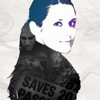 Create a High Contrast, Artistic Portrait
 Create a Stylized Photo Montage from Scratch
Have every post delivered to your inbox and get access to hundreds of useful design freebies.
This is the final image that we’ll be creating:

Start off my selecting some of your designs, and open them all up in Photoshop. Then create a new document (200X120px) in size. Paste one of your designs into this new document and fit a nice looking area of the design into the available canvas space. Then create a new 200X120px document and repeat with a second design. Repeat this step until you have a sufficient number of images to represent your work.

I chose to go with 9 examples of my work in the end. Now I need to place these images in an exact grid. To do this I just did some simple equations:
My grid is going to be 3X3 images, and therefore will be 600px wide and 360px high. But I also want 20px between each image, and so must add 40px to my height/width. So I open up a new document (640X400px) and begin pasting in my images.
However, rather than use my judgement to place each image I want to make it exact. I paste in my first thumbnail image and then make sure that the object is selected. Then I go to edit>transform>scale. I don’t want to scale my image, but selecting scale brings up a useful menu above my document. You can see from the image below that as well as having scaling options, I’m also given options for the placement of my object on the X and Y axis of my canvas. To place this first image in the very top left of my canvas I simply specific 100px on the X axis, and 60px on the Y axis. I must specify the position where I want my image to start (0px from the canvas edge) plus half of my objects width (100px is half of the 200px thumbnail width), otherwise my object will be positioned incorrectly.

Now I place my other 8 thumbnail images. To go over placement again I’ll discuss how I placed my second image (the top row, second column). I worked out that I want my image to start 20px to the right of my first image, which would be 200px+20px (220px). Therefore for my X axis I type in 320px (adding half of my objects width to the 220px value). For my Y axis I specify 60px again, as I just want my object to be positioned right at the top of my canvas.
I use this technique to place all of my other thumbnail images.

Now merge all of your thumbnail layers together, and then go to edit>transform>perspective and alter your images perspective so that it looks like the image below:

Now go to edit>transform>scale. Look again at that menu that comes up. Next to the X and Y axis settings are width/height settings. Simply change the width from 100% to 50%, and your image should now have a nice perspective to it.

Now go to image>canvas size and expand your canvas downwards by 100px. Then move your thumbnails over to near the left edge of your canvas. Finally, create a layer beneath your thumbnail layer called ‘background’ and fill it with a dark color that compliments the colors in your thumbnails (I went for dark purple).

Now apply an outer glow blending option to your thumbnail layer. (settings shown below).

Now duplicate your thumbnail layer and go to edit>transform>flip vertical. Then use your edit>transform>distort tool to fit the duplicate into a mirrored reflection of the original. This took me a fair bit of time as it can be difficult to match up the corners of each thumbnail exactly, whilst retaining accurate perspective. Once you’re happy with the result hide the outer glow effect on this duplicate layer.

Now reduce the reflection layer’s opacity to 30%. Apply a layer mask by going to layer>add layer mask>reveal all. Then drag a black to transparent gradient from the right of your reflection to the left, to fade it into the background.

Now create a new layer above your background layer and below your thumbnail layers called ‘clouds’. Go to filter>render>clouds and then reduce your cloud layer’s opacity to 25%. Then use a large, soft eraser to erase away most of the clouds, leaving the most intense clouds at the far end of your thumbnails.

Now create a new layer above your ‘clouds’ layer called ‘lights’. Use a very large, soft paintbrush to mark colored brush marks at the end of your thumbnail grid. Make several marks using different colored brushes and then set this layer’s blend mode to ‘overlay’ and it’s opacity to 30%.

Create a new layer above your thumbnails layer called ‘light lines’. Use your path tool to draw a long, waving path line around your thumbnail images. Then with a 1px white paintbrush selected, right click on the path line and click ‘stroke path’. This should give you a 1px line winding around your thumbnail.

Now select your thumbnails layer and click somewhere on your background using the magic wand tool. This should select the area around your thumbnails. To select your thumbnails just go to select>inverse, which should invert your selection. Then return to your ‘light lines’ layer and hit delete. This should leave white lines only going behind your thumbnails, not in front of them.

Now apply an outer glow effect to your light lines layer (settings below):

Reduce your light lines layer opacity to 15%.

Now paste in an image of a person, making sure to find a photo where they are facing roughly in the direction that your thumbnails are positioned. I went with this image, and cut out the woman using the lasso tool: http://www.sxc.hu/photo/1088997. The woman in this photo was already in shadow, but if your person isn’t then darken them a bit, as this fits with the light source coming from the thumbnail images.

Now duplicate your woman layer and create a shadow, using the exact same techniques as you did for the reflection of the thumbnails (flip vertical, then distort). Then move this duplicate layer beneath the original, reduce the layer opacity to 30% and apply a black color overlay.

To finish things off add some text and use a soft eraser brush to erase away the end of the shadow, so that it appears to fade into the background.

Tom is the founder of PSDFAN. He loves writing tutorials, learning more about design and interacting with the community. On a more interesting note he can also play guitar hero drunk with his teeth.


Do you know the basic tools in Photoshop but feel that your work is still looking average? Join our creative community at FanExtra and get the direction you need to take your work to the next level.


what exactly are the “light lines” for? are they supposed to be wires or part of a support structure?
ok i know this doesn’t belong here but where in the world did the comment “script” find my avatar? i haven’t used that for ages and i don’t appear to have an account with this site.
The light lines were originally going to be wires, but were then used just as a lighting effect, as well as giving a little more overall structure to the image.
Your avatar is showing up as part of gravatars, the system used for comments here. You must have a gravatar account with the email you specified.
This is an interesting idea … I just might try it out.
thanks great tutorial there
Thanks guys
another wonderful creative tutorial.. love it
interesting concept & nice tutorial Tom Thanx!
Fantastic creation!
Nice idea but I think the glowing lines could be improved a bit. Otherwise real nice!
Hmmm….very nice. Reminds me of PicLens/CoolIris!
Very good Tom, really loved it.
That is an awesome idea. I bet this will show up on a lot of portfolios, now.
Yep. Gonna have to try this one. Nicely done.
yeah, this i really a very good idea and the tutorial very plausible. I also think the light lines could have been done better, but it doesn’t really matter.
Now I only have one problem, I have no work which i could place in the thumbnails xD
I’m really glad everyone enjoyed it
I really liked this. I’m new to photoshop and still finding my feet with it. Tuts like this are very helpful.:)
Hi, I like the style but the shadow is WRONG. Is has to point vertically down!!!!
Yeah, this is a pretty good tutorial, thanks!
I suggest, instead of drawing the random lines, to do the Pen Tool & Stroke Path, as it creates a nice effect. But anyway, nice tutorial, ty.
Awesome!!!! I love it.
GREAT JOB
Creative Idea!!!
Thats really good, love it
Awesomeeeeeeee !!
Thanks for sharing this nice post.
Brilliant… used 9 images as well. Next I’m going to play with 5 in a checkerboard pattern with one large image in the background of the grid. Well written.