
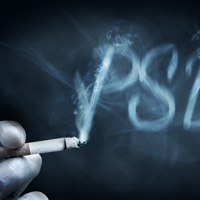
 Create a Smoke Text Effect Using Photoshop’s Non-Destructive Tools
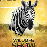 Design a Professional Wildlife TV Show Poster
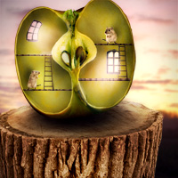 Photo Manipulate a Surreal Apple Habitat Scene
Have every post delivered to your inbox and get access to hundreds of useful design freebies.
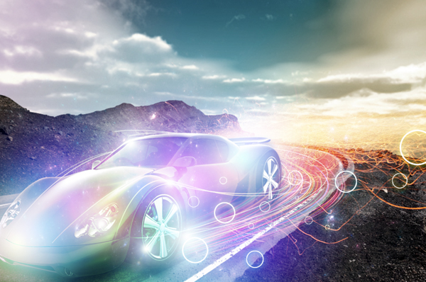
Today we will be creating a composition that blends together various stock images to create a cohesive scene. In addition, we will be using some cool Photoshop tricks to add light effects to the design. Many of these techniques can be applied to your own unique designs – so let’s get started!
This tutorial is in part inspired by Pete Harrison’s awesome composition ‘Super Highway’. Check out his portfolio here.
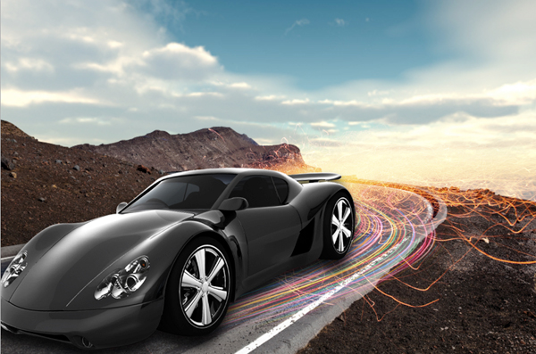
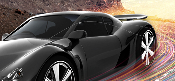
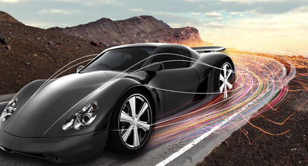
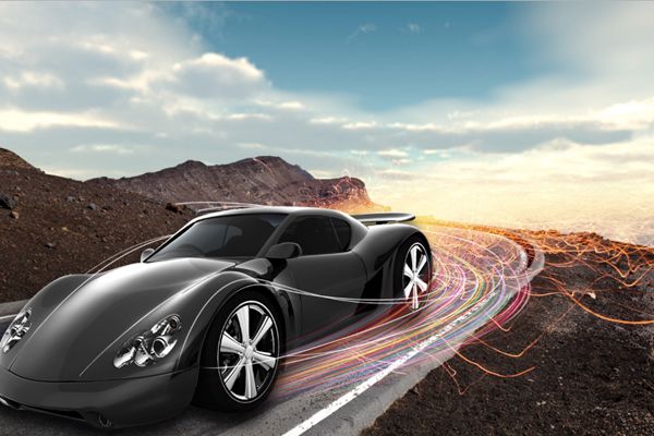
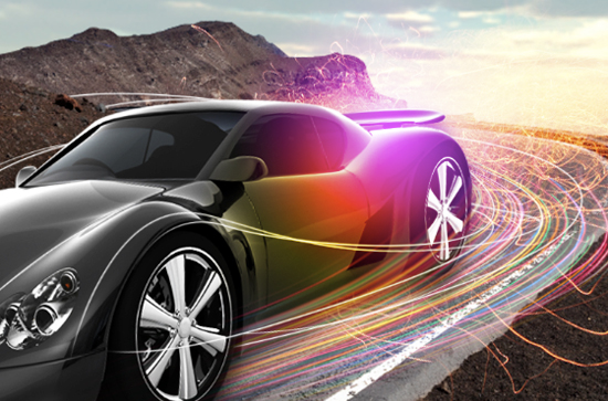
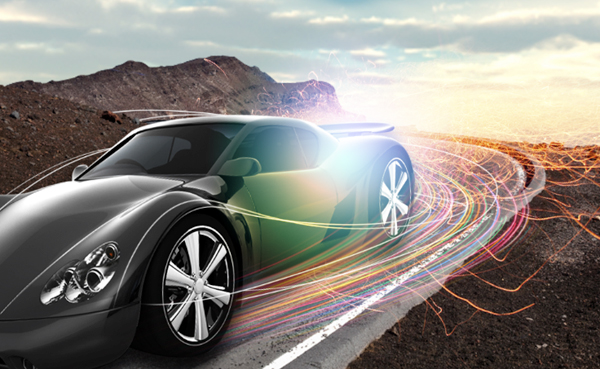
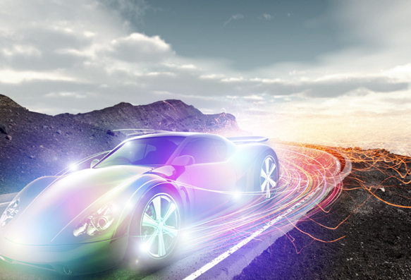
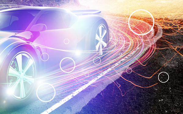
Here is a preview of the image that we are going to be creating:
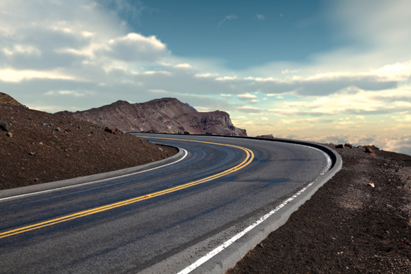
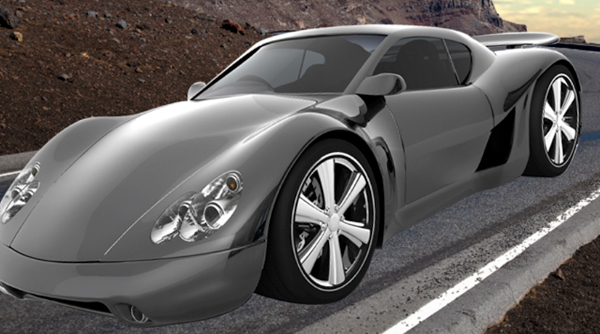
Before we get into the design and start blending things together we will need to do a bit of prep work to get us started. Open the image of the winding road in the mountains from the resources folder. You can use a similar image if you would like but make sure that the perspective matches closely to the other images (like the car) that you want to use in your design.
Double click on the ‘Background’ layer that appears with a small lock icon next to it in the Layers Palette.

You will be prompted with a dialog box asking for you to name the layer – You can call it ‘Background’ again or leave it blank, it isn’t too important.
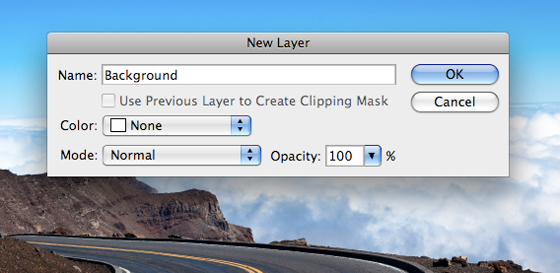
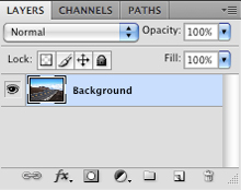
Once you have entered something in the field you can press the Enter Key or simply click OK from the dialog box. Now your layer should look like this:
Now we can modify or manipulate this layer.
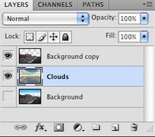
Press Command+J while the Background Layer is selected in your Layers Palette to duplicate the layer. Alternatively, you could also just drag this layer down to the New Layer icon at the bottom of the palette. Once you have done that you can turn the visibility of the original layer off so that your Layers Palette looks like the image shown below:

What we are going to do next is remove the sky from the image so that we can place our own background into our design. To do this we will zoom in closely to our image and switch over to our Pen Tool (P) so that we can create a path. Follow along the edges of the mountains with the pen and this should go by fairly quickly depending on your level of comfort with the tool.
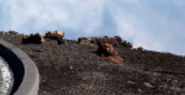
Once you have traced around the sky, simply close the path and then click anywhere along your path while holding down the Control Key and you should see a dropdown menu where you want to choose ‘Make Selection’ as shown here:

You should now see the marching ants that will indicate the area of the image that is currently selected. Press the Delete Key and it should remove all of the sky, revealing the transparent background below.

You can toggle the visibility of the original layer on and off to see the difference.
Next, go to the Image Menu and select ‘Image Size’ as shown here:
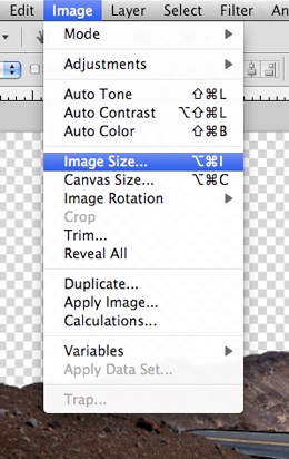
We want to give ourselves the option of using this image as a desktop wallpaper so let’s make it about 1280 pixels wide. You don’t have to modify the height of the document as long as you have ‘Constrain Proportions’ checked off in the dialog box. You can go a bit larger with the dimensions, but depending on the resolution of the image you are using you don’t want to run the risk of pixelating it too much.

Open the image of the dramatic clouds from the resources folder and import it into your document. Place the layer just below your winding road layer. You may have to scale it up a bit, or scale it down by using the Free Transform Command (Command/Ctrl+T) and dragging the image by one of the corners while holding the Shift Key.
When you are happy with the size and positioning of the sky background press the Enter Key to apply the changes.
Next we will open the image of the car and isolate it from its background using the same method we used in Step 3 earlier on.
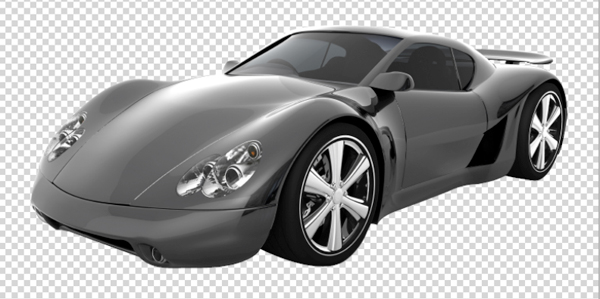
Once you have removed the background from the car image you can import it into your document. Place it at the top of your Layers Palette and use the Free Transform Command (Command/Ctrl+T) to rotate and scale the image accordingly so that it fits nicely into the piece.

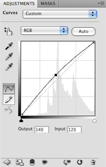
With the car layer selected, press Command/Ctrl+M to bring up the Curves Adjustment Dialog Box and apply a curve that looks like this:
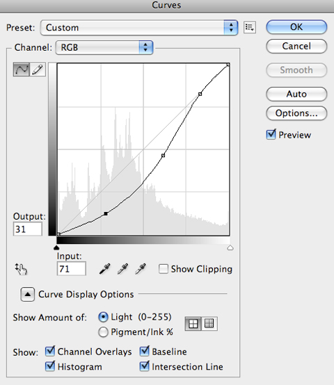
The image below shows the car without the adjustment applied:
And this image shows the car with the adjustment:

As you can see from the screenshots, this makes quite a difference and really helps to improve the realism of the image.
Next we are going to add a Curves Adjustment to the clouds in the background, but we are going to go about it in a different way. This is another method for applying adjustments. Click on the small white/black icon at the bottom of the Layers Palette and it will bring up a menu as shown below:

Choose ‘Curves’ from the menu and once the dialog box appears, set the curve so that it resembles the image below:
By adding an Adjustment Layer this way, it will maintain the quality of the image rather than having a gradual quality loss, which is what can happen when applying an adjustment directly to the image. The difference is that now everything below this Curves Adjustment Layer will be affected and we also have the option of using the mask to remove or add the effect to the design however we would like.
So far we have worked on placing our images and we have begun to blend them using Adjustment Layers. Something we will need to do in order to maintain the realism we are trying to achieve is to apply a shadow underneath the car. Double click on the car layer to bring up the Layer Styles Dialog Box and apply a Drop Shadow with the settings shown below:

Once you have set the appropriate values press the Enter Key to apply the changes. You should now have something like this:

We will now import the image of the fireworks from the resources folder and once you have it in your document, place it below the car layer and change the Blending Mode to Screen.

With your fireworks layer highlighted/selected, click the Layer Mask icon from the bottom of your palette as shown here:

Switch to your Brush Tool (B) and with a large round brush selected, paint with a solid black color into the Layer Mask of the layer containing your fireworks. The goal here is to brush out most of the streaks at the top of the image as well as the part of the image that is under the front of the car. You should now have something like this:

To enhance the lights coming from underneath the car we have another image of some more colorful streaks of light that we will open and bring into our document. Change the Blending Mode of this layer to Screen and do a Free Transform (Command/Ctrl+T) and then click on the image while holding the Control Key to bring up a menu with various transform options. We want to use ‘Warp’ to create more of a swooping motion with the lights as shown here:
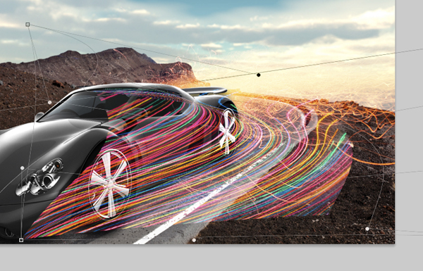
You may have to warp it a couple of times, but play around and you will get some interesting shapes. Once you find something you like, move this layer below the car layer and apply a Layer Mask using the same step as before to brush out some of the colorful lights.
Make another selection from the original colorful lights image and import it into your document. From here we will set the Blending Mode to Screen once again and use the warp option to modify the shape of the lights. Place this layer on top of the car layer so that it appears to be in the front, and mask out some of the lights on the front tire so that it looks like this:

When painting into the Layer Mask, use a soft brush at a low opacity when working around the wheels. This will give it a slightly blurred look which would be accurate for a car moving at high speeds.
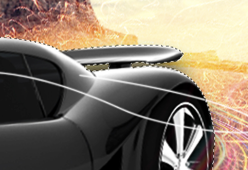
Switch to your Brush Tool (B) and select a 2 pixel hard round brush. Once you have done that, create a new layer at the top of your palette and then switch to your Pen Tool (P).
Zoom in closely to the car and using the pen, begin to trace some flowing lines that follow the shape of the car as shown here:
Once you have drawn a path that is looking pretty natural, hold the Control Key and click anywhere along the path to reveal a dropdown menu. From this menu you will want to choose ‘Stroke Path’ as seen below:

Next you should see another dialog box appear where it gives you the option to ‘Simulate Pressure’ but we do not want this checked off for this particular task. What this will do is make the line thinner or taper off near the end of the lines, but for now we want it to be an even stroke from one end of the line to the other.
Hold the Control Key again anywhere along the path and select ‘Delete Path’ to get rid of the path we made, only leaving the stroke.

Make sure that the stroke layer is highlighted in your Layers Palette and click on the Layer Mask icon along the bottom row of icons shown here:
This will add a mask to our stroke layer enabling us to have more control over its appearance. With your stroke layer still highlighted, hold the Command (or Control Key on Windows) and click on the thumbnail of the car on the ‘Car’ layer.
Doing this sill activate the selection around the car or any other object that you do this with. You should still have your top-most layer highlighted so now, switch over to your Brush Tool (B) and with a solid black brush, begin to paint into this layers Layer Mask where you want it to be hidden.
This is a technique that we will be using in the next couple of steps. Before we create any new paths or strokes we will have to remember to set our brush to the type of line we want to create beforehand.
Continue to create new layers and create paths with the Pen Tool before applying the brush stroke and deleting the path. When you add a Layer Mask to your brush stroke you can lower the opacity or softness of the brush to create a smoother and more gradual fade like I have done here near the wheel:

Remember, when you create a new path and stroke with the brush, you will want a thinner white brush for thin lines, but when you paint into the Layer Mask you will probably want a larger black brush. You will be doing a bit of back and forth with the Brush Tool (B) but there are a few simple shortcuts that will make it a lot easier for you.
The [ and ] brackets will vary the size of your brush so this is always good to be able to tap a key a few times rather than manually changing the size.
If you tap the D Key on your keyboard you will automatically reset your default black and white colors.
Using the actual number keys on your keyboard will set the opacity of your brush in increments of ten. For example, pressing the 5 Key will set your brush to 50% opacity.
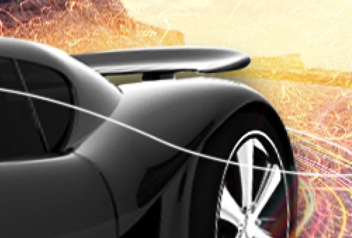
Keep experimenting with creating different paths both in front of the car and behind it. We don’t want to overdo it, but a few whispy lines can go a long way.
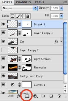
After spending some time trying different things out I have come to a point where I am happy with the number of curving lines that are in the composition. There are about ten different paths so in order to clean things up a bit I will select my top stroke layer, then hold the Shift Key and select the bottom stroke layer, and then press Command/Ctrl+G to put them into a Group Folder.
Next, create a new layer at the top of your Layers Palette and switch over to your Gradient Tool (G). Set it to a Radial Gradient that fades from solid to transparent as shown here:

For the color, we will be using a shade of magenta – #D304FF.

Click your mouse and drag outwards on your new layer to create the gradient. Change the Blending Mode of this layer to Screen and place it towards the rear tire of the car as shown below:

Create another new layer and make another Radial Gradient, this time using a bright yellow color such as #FADE06 and set the Blending Mode to Overlay. Place this layer above the magenta gradient that we created in the previous step.
Select another new color – Here I am using #04FFE4, which is a vibrant cyan color. Create a third Radial Gradient above the other two and set it’s Blending Mode to Screen to create a cool blending effect as seen here:
Continue the process of creating new layers with Radial Gradients set to Screen using various colors from the light streaks. It’s good to experiment and pay attention to how the colors are effected when they are mixed together.

After covering most of the car with varied gradients in different colors, you will begin to get a cool, chameleon looking paint job that shines with lights. There is no specific order that the colors need to be placed. Playing around at this point is crucial for getting those happy accidents that can sometimes lead to a breakthrough in your design.

Select your Background layer in the Layers Palette so that it appears highlighted. Next, click on the black and white icon along the bottom row of icons in your palette and choose ‘Hue/Saturation’ from the list that appears.

Once the settings for the Adjustment Layer appear, move the middle Saturation slider over to the left until it’s set to about -56. We want to desaturate the image a bit, but not completely here so that most of the focus remains on the car.

By doing this we are helping to keep a strong focal point because if we leave the background and foreground bright and saturated, they will compete with one another and it will become difficult to maintain a hierarchy of elements throughout the design.
Create a new layer and what we want to do now is add some flares so create a Lens Flare from the Filter>Renders Menu and set the flare’s Blending Mode to Screen.

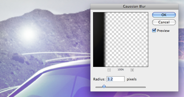
Next, go back to the Filter Menu, but this time choose ‘Blur>Gaussian Blur’ and apply an effect of about 3.2 pixels before pressing the Enter Key to apply the changes.
Press Command/Ctrl+J to duplicate the flares and place them in a few different spots on the car. You may also wish to use the Free Transform Command to play with the scale of the flares – make some smaller than others and vary the sizes.
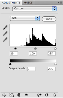
Select the top layer in your Layers Palette and then select the Adjustment Layer icon at the bottom row of icons. Select ‘Levels’ from the list that appears. This will apply a Levels Adjustment Layer that will affect every layer beneath it.

Move the left slider in so that it’s set to 15.

Once you have applied the settings you should have something like this:

Next we want to select the clouds layer towards the bottom of the Layers Palette and then once again select the black and white Adjustment Layer icon. Select ‘Levels’ from the list once it appears.

Apply the following settings by bringing in the left slider in order to darken up the clouds and add contrast.
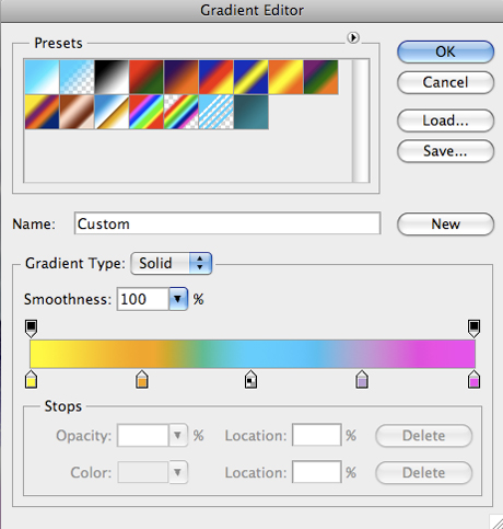
Create a new layer just above the clouds layer and switch over to your Gradient Tool. With your gradient set to Linear, add five colors to the palette that cover the range of colors used in the rest of the image. Use some vibrant colors that will go from yellow to orange to blue and then to a magenta color as shown here:
Click in the bottom right hand corner and drag upwards and to the left to create the gradient. Set the Blending Mode of the gradient layer to Color and reduce the opacity to about 35%.

By doing this we are adding hints of color into the sky that reflect the palette that is used on the car.

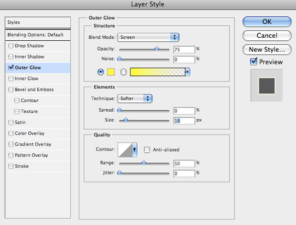
To add a bit more detail to our image I am thinking that incorporating some geometric shapes would add something nice. All I am going to do here is create a few white loops that are sort of scattered around the car as though they are coming off of it.
All you need to do to create one of these loops is to make a circular selection with the Elliptical Marquee Tool (M) and fill it with solid white. Once you have done that, go to the Select Menu and choose Modify>Contract. Contract the shape by about 4 pixels and hit the delete key so you are just left with a stroke.
Double click on one of the loop shape layers to bring up the Layer Styles and apply an outer glow using the color #F9FF00. Apply the settings shown below:
Hold the Control Key and click on the small ‘FX’ icon on the shape layer and when the menu appears we want to choose ‘Copy Layer Style’ to copy the glow effect.
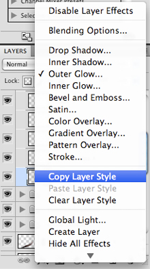
Next, click on your other loop layers while holding the Control Key and when the menu appears select ‘Paste Layer Style’ to apply the same effect.

You can change the colors of the glow here by modifying the glow effect of the individual shapes if you choose.
Open the nebula stock image from the resources folder and import it into your document. Make sure that it’s at the top of the Layers Palette, just underneath the Adjustment Layer and change the Blending Mode to Screen as shown here:

I have also added a Layer Mask like we did in the earlier steps to paint out the nebula in the sky so that it’s only around the car. This adds a bit of an interesting texture and additional lights that are a nice addition to our image.
Before finishing this piece up I have decided to remove a few of the flares so that you can see a bit more detail in the car and the light streaks as well. Once you have done that and are happy with the composition, be sure to save your work and enjoy the results! Thanks for following along and I hope you have enjoyed this weeks tutorial.
You can view the final outcome below. I hope that you enjoyed this tutorial and would love to hear your feedback on the techniques and outcome.

Eric is a Graphic Designer, specializing in Print and Web Design. He's a graduate of the New England Institute of Art in Boston and has over 4 years of professional and freelance work experience. He lives in Brooklyn, New York working as a Graphic Designer and he has been featured in Advanced Photoshop Magazine, The Art of Fashion Art Exhibit and Artists In The Station Art Exhibit. Visit Eric's portfolio at ericvasquez.net.


Do you know the basic tools in Photoshop but feel that your work is still looking average? Join our creative community at FanExtra and get the direction you need to take your work to the next level.


Really liking the soft lighting effects on this one Eric!
Thanks Tom! You know I am a big fan of colors and light effects, I am always trying to find new ways to create and use them in my designs! I very rarely use the Lens Flare for these types of effects, but I think they worked out here.
The final is really nice.. but i dont like the circles. you may not need to use them
amazing tutorial, and best of all is that we supply the resources to do it ourselves ….
Hey guys – thanks for your comments!
I am really glad that you enjoyed the tutorial and especially the end result.
@ Childmonster – In this case I was trying to think of a way that I could reinforce the motion of the piece when I implemented the circles. I understand that art is subjective in nature and not everyone will always agree with my design choices and I am thankful to have feedback as it will help me to improve in the future.
@ Jorge32 – Thanks for your feedback as well! I try (most of the time) to keep the elements simple so that they can be easily found if one doesn’t wish to use a stock photography site where they need credits to buy images.
Very nice Tutorial, like the colors^^
Hey, I noticed for the bubbles you used the circular marquee tool and then used the contract command to create the stroke. Alternatively, you can put a stroke on the elliptical marquee and set the “fill” under the opacity to zero. It’s a short step that still keeps all the previous info if you want to change it without making a new marquee.
Good tip DangerDanyeur!
Wonderful work from you..First i thought why you want to replace the sky, but when i saw the final effect it was amazing, sky adds more important to subject and its good. I can find some extra lighting on the car, it will be good if you would have reduced it..Never mind..thats wonderful tutorial.
Thanks so much for your feedback guys!
@ Deepetch – At first I didn’t think I wanted to replace the sky but I figured it would add a more dramatic effect and also another layer of depth that would add to the impact.
Originally I had also used more lighting but did take some away to try and bring balance, but to your point I probably got a little light happy here
woooowwww amazing tutorial thank u.
Oh god I love your tutorial. I wish I could work on it. But sadly that the stock image aren’t free.What a pity T_T
wwo nice tutorial
Very nice Tutorial
how can i download the source file..? need to buy the photo..?
The source file is available via our members area.
hey i can’t get it
after using pentool>makeslection>delete
and when i press delete the background leaves white itz not removed what to do
awesome
Wow! I am completely impressed By your work!!!
Great job!
Weldon!
Nice tutorial. Like the softlighting effect!
om man tis cool speedy
One Thing to Say What A Beauty.
Awesome Tutorial.
Very nice tutorial thank you so much i love it…..:)
Superb
Great tut, thank you. What Photoshop version did you use for it? There is an app for such fiery lines called flame painter. It’s a nice online toy. B)