Week 68: Church Doctor
This week I will be redesigning: Church Doctor.
In the space of 5 minutes I can identify some of the key strengths and weaknesses of this design, and sketch out a mockup.
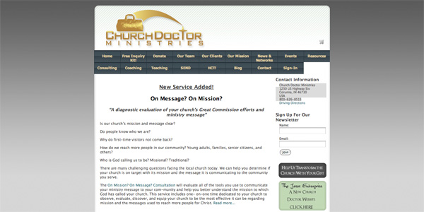
STRENGTHS:
- The site includes a welcome paragraph which goes some way to explaining the purpose of the company.
- The typography is generally legible, including the menu which is easy to read.
- The layout is clean and professional, using clear, strong colors.
- The site utilizes several call to action buttons, which help to engage the user.
WEAKNESSES:
- The navigation menu uses far too many items, which makes the site confusing to browse. Many of the links feel irrelevant, or not totally necessary. Furthermore all links are given equal precedence, despite some clearly having more importance than others.
- The welcome text is legible, but too long, and not engaging enough. The text is small, and doesn’t encourage visitors to actually reader it. A larger, more engaging headline is needed.
- There doesn’t seem to be much of a visual hierarchy to the website. I’m not sure where I should be looking, and my eye darts all over the site.
- The site lacks any real imagery. Without images it feels too text heavy and it’s difficult to establish a visual theme for the site.
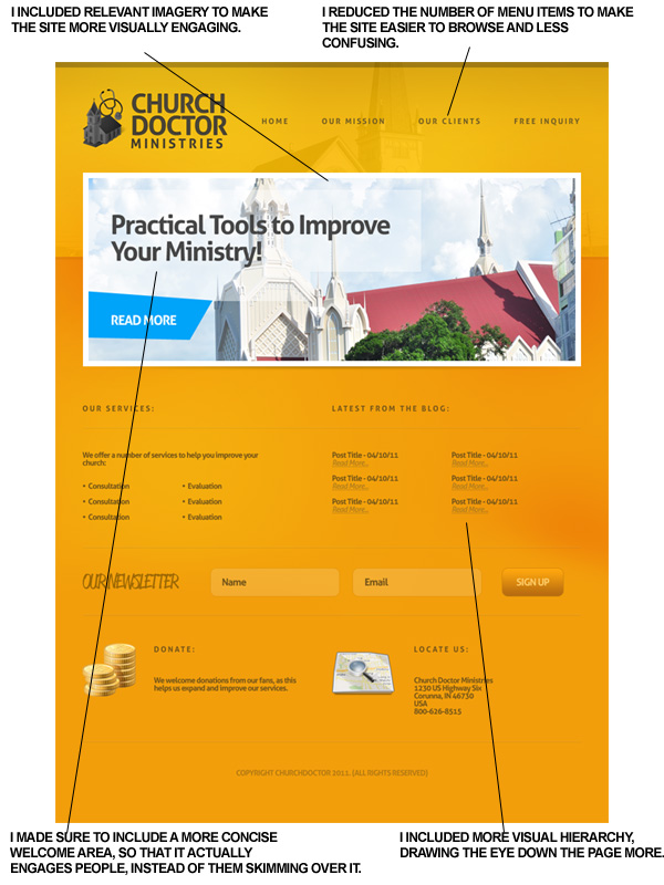
My Redesign
As always, I was limited by the 30 minute time-frame, but I tried to improve upon several of Church Doctor’s features, adding a few design flourishes and a clearer layout that promoted content over wasted space:
MY AIMS FOR THE REDESIGN:
- I vastly reduced the number of menu items. These don’t need to be final, but I would recommend greatly reducing the number of menu links.
- I used a more concise welcome area, and clearly laid out the purpose of the company in bullet points. This helps engage the visitor more, rather than simply skimming over text.
- I included relevant imagery, making the site more visually engaging.
- I established a much more clear visual hierarchy, drawing the users eye down the page.
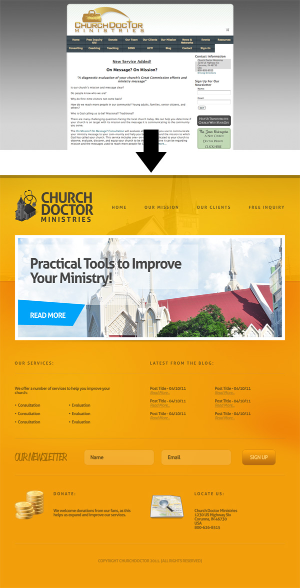
Before/After:
Here is a quick comparison between the original design and my 30 minute redesign. Sure, my design could be more polished, but I believe that a lot of the basic elements have been improved upon, creating a more pleasant browsing experience.
How and Why To Enter 30 Minute Redesigns
You can have the chance to have your website redesigned in next weeks post. All you need to do is leave a comment to this post with your website address and why you think it needs a redesign.
The Benefits of Getting Your Site Redesigned Include:
- Most obviously – a FREE redesign job!
- Your website gets exposure to PSDFAN’s thousands of readers
- You understand how to improve your website. This isn’t just a redesign, it’s a lesson in design principles.
- You will get emailed the .psd of your redesign and can do whatever you want with it!
NOTE: I can only accept sites with English content, as foreign language websites are simply too hard for me to work with.
So please, leave a comment today for a chance to have your website redesigned next week!

About the Author:
Tom is the founder of PSDFAN. He loves writing tutorials, learning more about design and interacting with the community. On a more interesting note he can also play guitar hero drunk with his teeth.
Related Posts
 30 Minute Redesign: Week 55 Vote
 30 Minute Redesign: Artis Lane
 30 Minute Redesign: Free IPhone Wallpapers


A much improved redesign! I think that the yellow in the redesign for me is personally a little too much and although I am not against it being used I think that the whole website becoming that colour is a little too much. The layout is much better and so much easier to navigate your way through when you are looking through it.
OK devil’s advocate here; Aesthetically improved – like the logo, easier to interpret and a more current font choice but I’m not sure about the contrast between your dark yellow background and the text. Turn that to greyscale and its not that readable.
Also grouping of information is limited and it is harder to see low frequency information (navigation, newsletter info, main headings) so I think needs some more thought about chunking of info so that it is easier to see more defined areas on the page. More contrast, either by size or colour of backgrounds to certain areas, needed for easier usability for me.
Let’s see a redesign of my friend Ace’s website about his book at http://therogueaviator.com