 30 Minute Redesign: Week 41 Vote
 30 Minute Redesign #78: Chiagu
Have every post delivered to your inbox and get access to hundreds of useful design freebies.
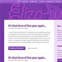
This week I will be redesigning: Eliza Web.
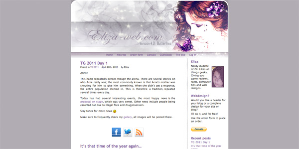
In the space of 5 minutes I can identify some of the key strengths and weaknesses of this design, and sketch out a mockup.
As always, I was limited by the 30 minute time-frame, but I tried to improve upon several of Eliza Web features, adding a few design flourishes and a clearer layout that promoted content over wasted space:
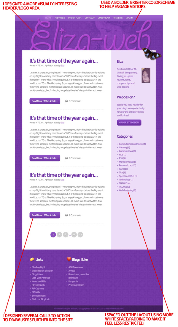
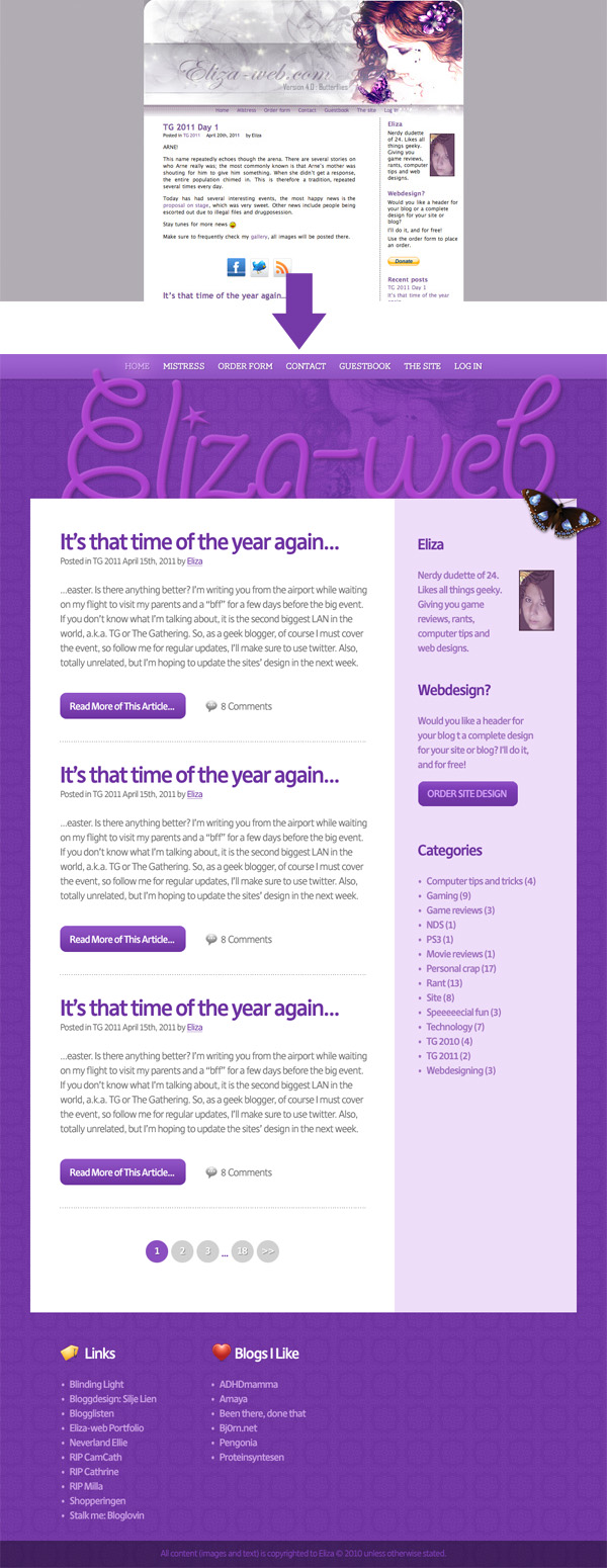
Here is a quick comparison between the original design and my 30 minute redesign. Sure, my design could be more polished, but I believe that a lot of the basic elements have been improved upon, creating a more pleasant browsing experience.
You can have the chance to have your website redesigned in next weeks post. All you need to do is leave a comment to this post with your website address and why you think it needs a redesign.
NOTE: I can only accept sites with English content, as foreign language websites are simply too hard for me to work with.
So please, leave a comment today for a chance to have your website redesigned next week!
Tom is the founder of PSDFAN. He loves writing tutorials, learning more about design and interacting with the community. On a more interesting note he can also play guitar hero drunk with his teeth.


Do you know the basic tools in Photoshop but feel that your work is still looking average? Join our creative community at FanExtra and get the direction you need to take your work to the next level.


http://www.designpointer.com
Would love a redesign and for a fresh new feel.
Thanks for the suggestion Michael
My website: http://www.techexplorer.in
Great job with Eliza Web, especially when you were restricted by a 30 minute time frame. I would like to have a redesign of my technology blog, TechExplorer.in. It designed like most tech blogs ought to be. I’d like to make it more appealing, spontaneous and lively. I’d like to see how experts like you would redesign it.
Thanks
Thanks for the suggestion Jal. I actually quite like your current design, but I’d love to try and improve it.
I’ve been following your “30 minute redesign” series for some time, and in most cases I’m surprised how good the redesigned sites look. Not this time, though. You are right with all the structural elements and they have improved a lot in your redesign (bold headlines, calls to action, clearer guidance for the eyes etc.). But I think the site’s main image looked better before and the new color scheme is too bold/primitive/massive. It lacks some subtlety and air. The color is too massive and dominating. The new logo looks like a school kid drawing, so that doesn’t convince me either.
However, you can’t always get it right – and not for everybody
Thanks for the series anyway, very inspiring!
Thanks for the constructive criticism Markus. Personally I thought the logo suited the site theme, but obviously tastes differ. I do appreciate constructive comments though, even if you’re not a fan of the final design.
Hi tom after i look on all your design, all are in 2 column, so do you prefer simplicity?
I do think 2 columns generally work better, but I don’t have anything against 3 column layouts. I would only advise using 3 columns if the quantity of content warrants it. In this case, 3 columns would be pointless as there simply wasn’t enough content.
Personally I thought the redesign was an improvement, but I do see what you mean about it being a little flat.
Great idea, I love the fact 30 minutes allows you to concentrate on making the most of the core functionality. Thanks
it does look better !
Great idea, love the fact 30 minutes ….too…
Great idea, love the fact 30 minutes ….too…