
 30 Minute Redesign – Suggestions Needed!
 30 Minute Redesign #94: Advance Tech
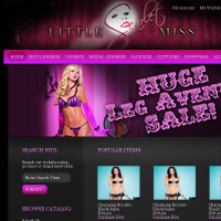 30 Minute Redesign: Little Miss Scarlet
Have every post delivered to your inbox and get access to hundreds of useful design freebies.

In the space of 5 minutes I can identify some of the key strengths and weaknesses of this design, and sketch out a mockup.
STRENGTHS:
WEAKNESSES:
As always, I was limited by the 30 minute time-frame, but I tried to improve upon several of Zoneziwoh’s features, adding a few design flourishes and a clearer layout that promoted content over wasted space:
WHAT I TRIED TO DO:

Here is a quick comparison between the original design and my 30 minute redesign. Sure, my design could be more polished, but I believe that a lot of the basic elements have been improved upon, creating a more pleasant browsing experience.

You can have the chance to have your website redesigned in next weeks post. All you need to do is leave a comment to this post with your website address and why you think it needs a redesign.
The Benefits of Getting Your Site Redesigned Include:
So please, leave a comment today for a chance to have your website redesigned next week!
Tom is the founder of PSDFAN. He loves writing tutorials, learning more about design and interacting with the community. On a more interesting note he can also play guitar hero drunk with his teeth.


Do you know the basic tools in Photoshop but feel that your work is still looking average? Join our creative community at FanExtra and get the direction you need to take your work to the next level.


Thanks Tom , I am overwhelmed by the Redesign. Its so wonderful – a complete overhaul and giving the content a new impetus. Thanks for the comments.
A much more appropriate website, I definitely prefer the design without as much black and a clearer layout, people want to find what they need instantly or they loose interest, this is a much easier way of looking for things than in the previous design.
The redesign is much cleaner and without the black the content is easier to read. The green helps the make the page stand out and visitors to the site will be able to find what they are looking for easily.
Twopo: I’m so glad you liked the redesign . As you’ve probably seen I’ve emailed you the original files. It was a really fun site to work on, and wish you the best with your show!
Stephanie/Oliver: Thanks for your comments, that’s definitely what I was going for.
hi
I like the new design too. Am not a fan of black websites, and the new one is so cool to the eyes too.
I liked the new design, it is cool but I do not like the new colors too much, I mean the change is a little bit extreme, maybe you could’ve considered to keep the dark color scheme idea, I do not like to use dark colors in my websites but I have seen beautiful dark websites designs. I would like to see you working more in dark colors designs, most of the redesigns I have seen are always light color schemes. Well it is just my opinion, with this I am not trying to say I did not like it. Hope you know what I meant my English is messed up!
Great redesign there and Great stuff you are doing here . I was introduced to this site through the zoneziwoh site and will also want to propose my site for redesign
Thanks
Hi Tom,
Well done. The lighter color scheme it’s way better than before.
I would like to enter the next week poll:
http://www.citium.com.br
Cheers
Thanks Tom . I got the files and will code it to a wordpress theme.
please consider http://digitalprintingservice.net/
cheers,
I spent some decent time to do design for http://www.downloadmixtapes.org and I would be very curious to see what could you come up with, if you decide to give it a shot.
Regards from Serbia