Have every post delivered to your inbox and get access to hundreds of useful design freebies.
If you’re thinking of creating a brochure for your finance-related business in Adobe Photoshop, this is the tutorial you need. In this tutorial, you will learn the key steps in Adobe Photoshop that will help you achieve the look appropriate for your business at the same time one that keeps with the times. Your final brochure will be print ready using professional print specifications. Let’s begin.
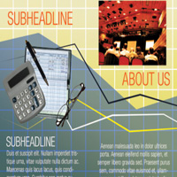
As always, this is the final image we’ll be creating:


Before we design the brochure, you will first have to know how to create a grid pattern. To do this, we will create a working Photoshop document (shortcut CTRL+N). The size of this document depends on how big or small your grid squares should be. If you want grid lines that are 200 pixels by 200 pixels then when we create a new document in Photoshop we set it as such. Do not forget to also use a high resolution value of at least 300ppi, a printing standard.
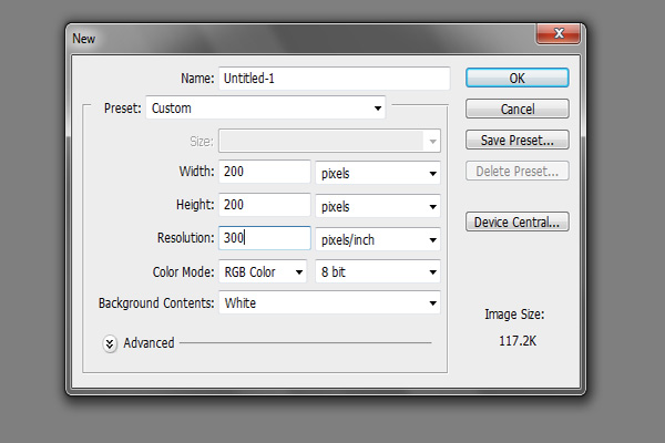
Once the new document is open, double click on the background layer in the layers panel. A window will appear telling you that you are creating a new layer. Simple click on OK. This will then unlock the background layer for us.

Now, double click again on this layer. This time, the Layer styles window should appear. Click on the option for Stroke on the left hand styles checkboxes. Once you click on the name, you can adjust the stroke style attributes. Make sure you change the position to CENTER. Then, set the size of the stroke to the size you want for your grid lines. For this example, we are using a 2 pixel value. You can make it as thick or as thin as you want it to be.

Now, we will define a pattern, based on our document here. Just go to Edit > Define Pattern

Then, on the small window that opens, name your new pattern appropriately. In this example, we are naming it ‘Grid Lines 200′ to describe the lines as being approximately 200px apart. Note that you can of course define any sized grid pattern that you want. Just press ok once you are finished naming the grid pattern. This will then be available for us layer. (Save your document if you ever want to tweak your gird lines.)

Great! Now we move on to the real job of designing the brochure. The first step is to create a new document with specifications required when printing brochures. This all depends on what kind of brochure you are creating. In this tutorial, our goal is to create a trifold brochure. So to start with, we will use these dimensions and document settings.
a. Width: 14 inches
b. Height: 8.5 inches
c. Resolution: 300ppi
d. Color Mode: CMYK

Before we start headlong into the design, first we need to setup the guidelines, margins and folds. Our first move here is divide the whole document into 3. To do this we shall create two guidelines. Go to View > New Guide In the window that opens set a vertical guideline that is 4.65 inches away from the left side of our document.
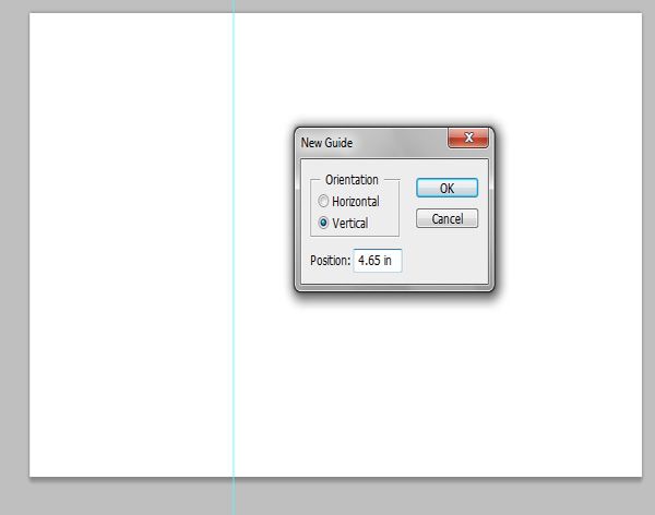
Once done, we set the other fold guideline at 9.35 inches from the left. This divides our design into 3 distinct panels. This is the basic format of a trifold brochure. If this is the front, then the panels from left to right are, the flap, the back cover and the front cover. If this is the inner or back side of the brochure, then from left to right they are, the left panel, the center panel and of course the right panel. Just see the images below for reference.

Great! Now just add the other necessary margins using the same procedure as the first one. Here are the other margin guidelines that you must set.
a. Left Margin: Vertical – 0.25 inches
b. Right Margin: Vertical – 13.75 inches
c. Top Margin: Horizontal – 0.25 inches
d. Bottom Margin: Horizontal – 8.25 inches
e. Left Fold 1: Vertical – 4.525 inches
f. Left Fold 2: Vertical – 4.775 inches
g. Right Fold 1: Vertical – 9.225 inches
h. Right Fold 2: Vertical – 9.475 inches

Great! That finishes our initial brochure setup procedure. Now it is time to start with the design. First we will work on our main background. Press CTRL+SHIFT+N to create a new layer. Fill this with a white color using the Paint Bucket tool. Then, go to Edit > Fill. In the window that opens, use ‘pattern’ for the contents, and use the custom pattern that we created earlier.

The grid should then be rendered. If it is too large or too small, you can either repeat the process of defining the pattern above in a smaller scale, or just resizing the new layer to how it needs to be (CTRL+T transform). Once set, go to Select > Color Range. In the color range window, reduce the fuzziness to 0 and then click on a WHITE area of your grid.

Once the whites are selected, press CTRL+SHIFT+I to invert the selection into the grid. Then, press CTRL+J to cut and copy the grid into another new layer. Erase the original layer. Then we have only the grid lines only as our main brochure feature, with the white boxed turned transparent because of our cut and copy. We have turned off the visibility of the background here just for you to see what happened.

Now, we start adding colors. The first move is to use the gradient color tool. We use it to add a seamless color transition for the background. Just set two theme colors, one as the foreground and one as the background and then use the gradient color tool to add the color background effect.

Now, we will turn the grid white. To do this, hold the CTRL key and click on the thumbnail image of the grid layer. This will select the area of the grid. Now use the brush tool and just paint the whole grid white.

Next, press CTRL+SHIFT+I to invert our selection. This now selects the square areas of the grid. Create a new layer by pressing CTRL+SHIFT+N. Name this grid colors.

Then, we use the paint bucket tool to color the boxes in different shades of your theme color. IN our case it is green. Make sure you randomize the colors a bit, but keep the lighter hues on top, getting darker on the bottom. Once you are done with the color randomization, press CTRL+D to deselect the squares.

Then, change the blend mode of our layer to ‘Overlay’. Also reduce the opacity to 40%. This will blend our color blocks to our original gradient color layer. Once done, it is a good idea to save this document as you can use this for both front and back designs with just a few adjustments.

Now, create another new layer by pressing CTRL+SHIFT+N. Then, using the polygonal lasso tool, inscribe a graph shape across our design. Note that you should shape this polygon in a way that looks like a graph.

Then, use the gradient tool to add a gradient color to our polygon shape. Just set your theme colors as the foreground and background

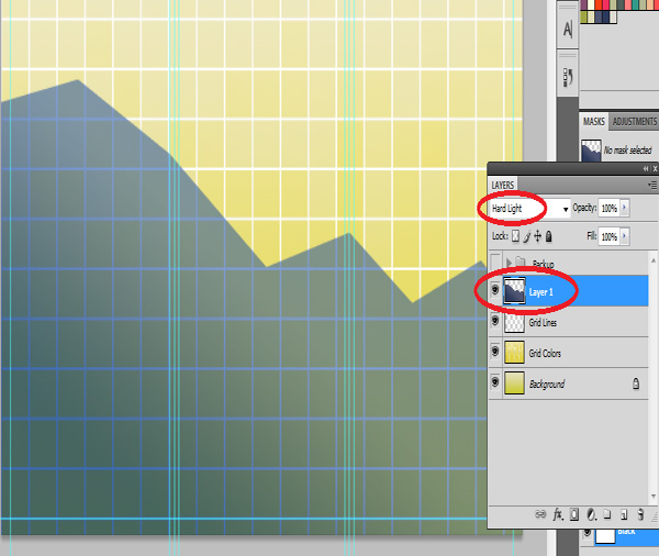
Then, we change the blend mode of our graph layer to ‘Hard Light’.
We will now add an extra line effect to our design. Start with the pen tool. Select it from the tools panel, and click on several points creating a trail line along the lines of the graph layer. Make sure as well that you clicked on the ìcreate pathsî option for your pen tool in the options bar above.

Now, go for the brush tool. Right click on the canvass and then set a 5 pixel, 100% hardness round brush.

Create a new layer again by pressing CTRL+SHIFT+N. Set a theme color as your background. Then, select the pen tool again and right click on the path we created. In the context menu that opens select the option to ‘Stroke Path’.

This gives us a nice line across our graph.
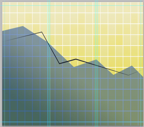
Repeat the process several times with different line colors.

Great! Now it is time to add our text. Just use the text tool of course to type in the content. We use contrasting font colors depending on the background.

Then we insert in images for the brochure. This finishes our front cover!

Then, using the same tricks and effects, we create the back part of our brochure design. That finishes our guide for creating a finance graph inspired brochure. Congratulations!

The source files for this tutorial are available to our FanExtra members community. If you want to access the source files for this tutorial (and all of our tutorials + thousands of other resources) then sign up here.
If you’re already a FanExtra member then you can login here to access the source files.
Irene Thompson is a graphic designer. She's addicted to Photoshop for a long time and been focusing in the area of print designs. She works at PrintPlace, a trusted online printing company that offers high quality printed marketing materials. Design and print brochures at PrintPlace.com at a lower price and reach out with them through facebook.
Do you know the basic tools in Photoshop but feel that your work is still looking average? Join our creative community at FanExtra and get the direction you need to take your work to the next level.
Wow ,Its really superb,very useful sharing.
Nicely written. Now a person with a limited knowledge of photo shop would be able to do so. great