 Photo Manipulate a Complex Surrogate Scene
 Design a Sleek Valentine’s Day Card
 Photo Manipulate a Magical Shoe House Scene
Have every post delivered to your inbox and get access to hundreds of useful design freebies.
These are the photos that I’ve used for this tutorial.
http://www.sxc.hu/photo/1107722
http://www.sxc.hu/photo/1124484
Burnt Paper
http://www.sxc.hu/photo/501004
http://www.sxc.hu/photo/106059
http://www.sxc.hu/photo/1133977
http://www.sxc.hu/photo/731511
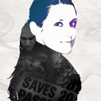
This is the final that we’ll be creating:

Create a new document (600X600px) and paste in an image of an old paper texture. Call this layer ‘paper texture’.

Now go to image>adjustments>hue/saturation and reduce the saturation to -60, and increase the lightness to +80. This should give you a nice looking washed out background.

Now paste in a portrait photo of a woman into the center of your canvas. Be sure to cut out the woman from her original background using the lasso or pen tool selection tools. Name this layer ‘woman photo’.

Now go to image>adjustments>desaturate, to grayscale your photo. Then go to image>adjustments>brightness/contrast and increase the contrast to +85.

Next I paste in an image of some burnt paper. Resize the paper so that the edge of the burn fits with the edge of your woman’s torso. I reduced my layer opacity on the burn layer in order to judge where these edges were.

Now use your magic wand tool at 50 tolerance and click on the white part of your burnt paper image. Then go to select>inverse. This should select the dark part of the burn. Then create a new layer called ‘burnt paper outline’ and fill this selection with black. You can see the resulting shape below. After this is done use your lasso tool to cut away and fill in parts of the woman’s torso to fit with this burnt paper edge.


Now select the dark parts of your image (the shadows of your woman and the black burnt paper outline). To do this go to select>color range. Then select ‘shadows’ from the drop down list, and set selection mode to ‘selection’. Finally increase ‘fuzziness’ to 200. Hit OK, and this should select the dark parts of your image (which are shown up as white in the preview box).

Now with your selection in place go to select>save selection and save it as ‘mask selection woman’. Create a new top layer called ‘gradient overlay’. Then deselect. Now select a large paintbrush (100px), and set hardness to 0%. Then choose a nice bright/obvious color (I went with red) and paint over your woman’s facial features and parts of her hair.

Now we want to apply a layer mask in order to fit the red paintbrush marks over the dark parts of the woman’s face/hair. To do this go to select>load and load your previous selection (‘mask selection woman’). Then with your selection in place go to layer>add layer mask>reveal selection. You can see the result of this below:

Now right click on your paintbrush layer and go to ‘blending options’. Apply a gradient overlay, with using the settings shown below. This should turn your red overlay into a nice gradient transition, giving a spot of color to your woman’s face.

Now reduce the opacity of your paintbrush layer to 70% to make the coloring more subtle.

Now paste in a photo of a newspaper headline over the woman’s body. Use the same technique of loading the selection and applying a layer mask to fit the photo properly to your woman’s shape.


Now change the layer’s blend mode to ‘hard light’ and reduce it’s opacity to 90%. Also use a large, soft eraser brush to erase away the edge of the newspaper, as the photo cut off the top unnaturally. Erasing the top edge subtly should also give the newspaper image some depth.

Now repeat these steps and add more photos over the woman’s body/hair. For the other photos keep the layer’s blending mode’s at ‘normal’, as you only want the bold newspaper headline to be a really harsh light.
To blend the images nicely together do 3 things:
Reduce their layer opacities to around 40%
Erase their edges using a large, soft eraser brush
Desaturate them.

Now I want to improve the gradient color overlay over the woman’s face/hair. I change the light green part of the gradient to a reasonably dark blue, and then use my paintbrush to paint in a little more over the edges of the woman’s hair, so as to extend my gradient overlay effect.

Now merge your burn paper edge with your woman photo layer. Reduce the merged layer’s opacity to 87%. This should make your image look overall more subtle.

Now create a new layer above your newspaper image layer and use a large, soft black paintbrush (30% opacity) and paint in a subtle shadow, making the newspaper get darker near it’s bottom. Then apply the selection/masking techniques shown earlier to fit the shadow to the woman’s body.

To finish off I add some nice details, including the Swirl 2 Brush from QBrushes and a handwritten style heading using the free font Dirty and Classic
Obviously much more can be done with these techniques and you can come up with some really complicated compositions. However, hopefully this tutorial taught you some cool techniques for you use in your own designs!

Tom is the founder of PSDFAN. He loves writing tutorials, learning more about design and interacting with the community. On a more interesting note he can also play guitar hero drunk with his teeth.


Do you know the basic tools in Photoshop but feel that your work is still looking average? Join our creative community at FanExtra and get the direction you need to take your work to the next level.


Oh men. Thanks for your effort but please change your slogan… –> “Quality”
I think your tutorial is nothing new…
ahaha you do it! nice nice, in the resting to see how raw was my tecnique ^^
i’ll take ispiration
Thanks Vincenzo.
Nachtmeister: Sorry you didn’t enjoy the tutorial all that much. I personally hadn’t seen a tutorial like this one (and I’ve seen quite a lot), but I hope that you’ll check back to see the host of new tutorials I have planned.
hey …its a very nice trick..i loved it…thanx
Thanks a lot Tom. Can you please make your next tuts easy-to-understand for newbies ?
Hi Dollar, thanks for commenting. I always try to do a few tutorial aimed at newbies, but I would be happy to try and help you follow the harder ones. Is there anything in this tutorial that you particularly struggled with?
Thanks for replying . I did not understand 5,6,12 steps.
I hope you will create next tuts easy-to-understand as well as good one
Nice tutorial, simple and effect…well laid out
[...] Create a High Contrast Artistic Portrait [...]
Thanks Matthew, I appreciate the kind words
Awesome you used a burnt texture of mine it your tut, made my day!
Thanks Max, I had a look at the full set on Flickr, it’s really great! I’m sure I’ll get to use more of the images in future tuts.
great post. It’s so interesting to see the progression of great art.
nice work thanks…
http://www.joyoge.com/story.php?title=create-a-high-contrast-artistic-portrait
Dollar: Apologies, your reply got caught in my spam filter for some reason. It looks like you need to learn about selection techniques and masking techniques. I can recommend these two articles for you:
http://www.tutorial9.net/photoshop/the-selection-tools/
http://graphicssoft.about.com/gi/dynamic/offsite.htm?zi=1/XJ/Ya&sdn=graphicssoft&cdn=compute&tm=13&f=10&tt=14&bt=0&bts=0&zu=http%3A//www.macworld.com/1999/06/create/graphics1.html
I hope this helps, and I’ll consider doing a very basic tutorial in the near future.
Nice Girl! =)
Thank you for interesting tutorial!
No problem ROM, thanks for commenting.
Thanks again Tom. That links helped me
Wonderful tutorial!! I’ll definitely be trying this one out….i love this sort of thing
Thanks for commenting guys, I’m glad you like it
DesignNerd: Drop me a link with your finished result if you like, or add it to the PSDFAN Flickr Group.
This is great! Cant wait to try it!!!
yOU RUINED THE BEAUTIFUL GIRL IMAGE
Yes He did.. nothing new just old stuff..
Hey, thanks for this tutorial. It really helped a lot especially for newbie like me. Thanks very much!
Hey Tom, I’d suggest you ignore the folks who aren’t grateful for what you do – and pay attention to the classy ones who say thank you!
Hey TokyoTerri. Thanks so much for the kind words, that really means a lot. I know that everything I write won’t be perfect, but I can only try my best to write the best content I can. Comments like yours make it all worthwhile
man was genious
Hey Tom it was a nice tutorial although I did a few problems understanding the masking technique I’m working from both a pc and a mac and tried it on both..Can you help please? Thanks.
Thanks for commenting Clarice. Could you let me know exactly where you struggled and I’ll try and help.
Tom I struggled with steps 7 and 8 I believe. When I select the dark parts of my image it only selects the hair and not the face so when i go to save selection and create a new gradient layer the color does not apply and when it does apply after i select her face I don’t achieve the same result. if you would like to email me some tips you can reach me at cuttke@citci.com Thanks for the tutorial
Did this and It came out awesome.
http://i9.photobucket.com/albums/a52/ThatGuy_82/Cdkevin.jpg
Wow that is awesome Melvin! Great work
HI Tom, a very nice one!Thank you so much.
~ Have shooted a photo of mine in black shirt..cant wait to try in next minute!
cheers!
Nice tutorial. Will try them for sure!
is this tutorial to be done in illustrator or photoshop?
lovelovelove this tutorial. very easy to follow and really useful technique.
thanks tom!
wow thanks it helped me a lot ^__
^
I’m stuck at step 7. So far, I’ve faced several obtables (for ex. step 5 and 6) that I managed to overcome after trying several tools. I think this tut is really nice but It implies basic knowledge. I think there should be some boxes on the side for beginners because it can get frustrating when you don’t how to finish this artistic portrait!
Wish one day, I’ll manage it!
nice tips. thanks for your help. i tried to do the same. although it didnt turn out to be as good as yours but its a good effort for an amateur like me
Thank you, even if a little old this tutorial creates a great effect.
thanx a lot mate..really helpful though i realise that the choice of photo affects the outcome to a great extent..
I loved this tutorial, it was a little confusing at some parts but the overall finished product is so cool looking.
Here is what I did with it, http://may6572.deviantart.com/art/London-244598024
Pretty cool outcome! I really like the colors you used .
.
Hi Tom!
I tried your toturial, and ended out with this:
http://sneakysoundsyst.deviantart.com/art/I-have-a-dream-263791023
I hope you like it
Nice work Kareem, I just left you a deviantart comment .
.
Hi Tom
I like Ur tutorial even i tried it but some steps i couldnt understand…. means how to take old texture paper and burnt paper????????
This is truly a great art-portrait! Very inspirational.
Soft woman vs. hard man (he looks like Matt Johnson from The The)
Was wondering if it’s feasible using PSE 11?