
 Create An Epic Fantasy Based Ancient Battleground
 Master a Professional Photo Retouching Workflow
 Complete Guide to Photo Sharpening in Photoshop
Have every post delivered to your inbox and get access to hundreds of useful design freebies.
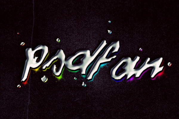
Today we’re going to learn how to recreate the text effect used on Daft Punk’s album ‘Discovery’. It’s a great piece of art, and this tutorial is written as a tribute to a truly great band, as well as an impressive piece of art.
As always, this is the final image that we’ll be creating:
Download the first texture from today’s Texture Thursday: Black.
Paste this into a new document, and resize your document to be 600px wide.

Now create a hue/saturation adjustment layer.
Hue/Saturation Adjustment Layer Settings:
Hue: 0
Saturation: 0
Lightness: -80

Now create a new layer called ‘radial gradient’. Create a white to transparent radial gradient in the center of your canvas.
Then change this layer’s blend mode to ‘overlay’.


Now go to filter>render>clouds to render some clouds.
Call this layer ‘clouds’. Then reduce it’s opacity to 30% and change it’s blend mode to ‘overlay’.


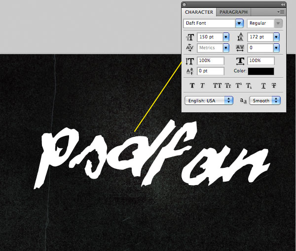
Now download this great daft punk font.
Type out some text in the center of your canvas, making sure to use white text. Then go to edit>transform>rotate and rotate your text by 5 degrees.
My Font Settings:
Font Face: Daft Font
Size: 150pt
Kerning: 0
Color: ffffff (white)
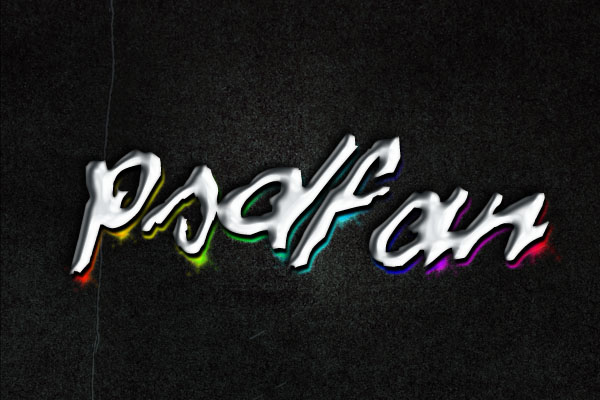
Now we want to add a chrome-type effect to our text. Luckily we can achieve this via a combination of layer styles! Go to blending options for your text layer, and apply a drop shadow, inner glow, bevel and emboss and satin blending option:
Drop Shadow Settings:
Color: Black (000000)
Blend Mode: Multiply
Opacity: 100%
Angle: -30
Distance: 5px
Spread: 0%
Size: 10px
Inner Glow Settings:
Blend Mode: Normal
Opacity: 70%
Color: Black (000000)
Choke: 0%
Size: 4px
Range: 50%
Jitter: 0%
Bevel and Emboss Settings:
Style: Inner Bevel
Technique: Smooth
Depth: 20%
Direction: Down
Size: 10px
Soften: 0px
Angle: -30
Altitude: 25 degrees
Contour: Gloss Contour (anti-aliased)
Highlight Mode: Screen (white – 100% opacity)
Shadow Mode: Multiply (030a0e – 80% opacity).
Satin Settings
Blend Mode: Multiply
Color: 06293f
Opacity: 10%
Angle: -125 degrees
Distance: 10px
Size: 20px
Contour: Gloss contour (invert)


Now duplicate your text layer, and move the duplicate beneath the original in your layers palette.
Then right click on your layer and click ‘remove all layer styles’. Now apply a color overlay blending option (black).
Then use your keyboard cursors to shift this layer 3px down and 3px to the right.
This creates an artificial drop shadow. However, the shadow is a little harsh at the moment. To fix this, go to filter>blur>gaussian blur, and apply a subtle 1px gaussian blur.
Color Overlay Settings:
Color: Black (000000)
Overlay: 100%


Now duplicate your shadows layer, moving it below the original. Move it 3px right and 3px down so that it’s visible.
Again, clear all current layer styles, and then apply an outer glow, inner glow and gradient overlay effect.
Outer Glow Settings:
Blend Mode: Overlay
Opacity: 100%
Color: ffffff
Spread: 2%
Size: 5px
Inner Glow Settings:
Blend Mode: Overlay
Opacity: 100%
Color: ffffff
Choke: 0%
Size: 5px
Gradient Overlay Settings:
Blend Mode: Normal
Opacity: 100%
Gradient: Default rainbow gradient available in gradients panel
Style: Linear
Angle: 180 degrees


Now with your lighting layer selected go to layer>apply layer mask>reveal all. Then use a medium sized black paintbrush to mask off various areas of your lighting. You want to particularly mask off the top parts of your letters, and the edges should fade out nicely:

Create a new layer just above your lighting text layer, but below your drop shadow text layer. Call this layer ‘stars’.
Now download this great brush set 1000 stars.
Grab a suitable star brush from the set, and start applying star marks over the edges of your text lighting. To match your star color to each part of the lit area simply use your eye-dropper tool.
Then hit option+e to merge this large down with your lighting layer.

Now create a new layer called ‘lighting highlights’. Create a series of small radial gradients (white to transparent) over certain areas of your lighting colors. Then change this layer’s blend mode to ‘overlay’, and reduce it’s opacity to 50%.

Now create a new layer above all of your previous layers called ‘splatter effect’.
Create a series of circles around your text using your elliptical marquee tool. Make sure that all of these circles are filled with white.

Now go to filter>distort>ripple. Apply a ripple of 100% strength. This will make all of your white circles a more natural, random shape:


Now copy/paste the layer styles from your main text layer onto your ‘splatter effect’ layer. This should give your splatters a chrome effect. If needed reduce the strength of your bevel effect:

Now use the technique that you used previously to create a lighting effect for your splatters. Duplicate your splatter layer, move it below the original, and then copy/paste the layer styles from your text lighting layer:

Now apply a gradient overlay adjustment layer, choosing the default rainbow gradient that you used on your lighting effects.
Then reduce this layer’s opacity to 5%.


Now apply a final levels adjustment layer just to add more impact to your image:
Levels Adjustment Layer Settings:
15 / 1.00 / 250

Finally, I chose to touch up my text a little bit more.
Select your text layer and go to filter>artistic>plastic wrap.
Plastic Wrap Settings:
Highlight Strength: 20
Detail: 15
Smoothness: 15

You can view the final outcome below. I hope that you enjoyed this tutorial and would love to hear your feedback on the techniques and outcome.

Tom is the founder of PSDFAN. He loves writing tutorials, learning more about design and interacting with the community. On a more interesting note he can also play guitar hero drunk with his teeth.


Do you know the basic tools in Photoshop but feel that your work is still looking average? Join our creative community at FanExtra and get the direction you need to take your work to the next level.


creative text effect you designing in this tutorial.
Very good tutorial. I will try do my new logo like this.
It is Interesting to see the Detailed Tutorial of Daft Punk Inspired Text effect. Thanks for sharing this Useful and New Idea.
It is Interesting to see the idea of Daft Punk Album. I think the Designers should try new things like this so that they avoid boredom on their website
Simple and very beautiful effect. I like it Thank you very much!
Very neat and easy way to make understand……………..well done !
Wow that is really brilliant art to create this type of thing…..
a little abstract
This tut is inaccurate. The text layer settings are wrong. I had to play with the bevel and emboss option to increase the size in the setting, and I also had to fix the drop shadow. I am on a pc though, so that could make a difference.
Hey deafside. Did you use the exact same font size/face. If not then the bevel settings will vary.
hi,
its at step 10 adding the star sprays which I cannot do.
I have my layers in the right order yet when I go to add the spray stars nothing happens, I cannot any spray effect at all … is it my PS settings ?? or my masking layer ??
Im a newbie to PS so any help would be great
Thanks !
All you are doing here is applying a Photoshop brush as you at any other time. As long as your brush settings are correct, your layer is visible, and your brush area isn’t being obscured or masked off this shouldn’t be a problem. Let me know if you’re still struggling.
Oh okay thats cool, yeah I used a different font because my high school won’t allow deviant art. But yeah great tut otherwise
can someone give me the psd file download link
thanks
a great tutorial but i’m a learner
Thanks Rahul! .psd files are only available through our FanExtra members area though: http://fanextra.com
Creative text effect also shared on my website
Thanks For Tutorial
Great tutorial and I am loving the effect achieved, but I get stuck at step 13, it will not let me select Distort at all, it is grayed out.
Hi Sean,
From what I can guess you may have no created a new layer for step 12. If this is the case ensure that you white shapes are on a new layer, and then you should be able to distort this layer no problem. Also ensure that your layer is active, visible, and not a vector layer (it should be rasterized). I hope this helps and let me know if you need further assistance.
Okay, I get that this is like. Photoshop 7 or something. But do you not think that it should be specified?…… You know photoshop let alone any technology updates two times a year or so…. commands will not be the same…. Atleat specify your version…. Thank you………………… And honestly thank you for the tutorial. <3. But with the progression of technology i've always come to terms with dating my version of software or ide ect. Just routine.. But don't take me for a jerk plz xDDD thank you for tutorial! It doesn't seem so accurate on CS6. Thank you!
Hi Blivz, this is an older tutorial on our site but I will try to always specify the version of Photoshop used for future tuts.
Very nice tutorial! i loved the techniques in this one
Is there a windows version tutorial? Because I’m a noob with PS and I can’t do some of the steps :/
great stuff
here’s mine.
https://fbcdn-sphotos-e-a.akamaihd.net/hphotos-ak-prn2/1380372_386872544775490_1430902120_n.jpg
Nice outcome Jid, thanks so much for sharing!