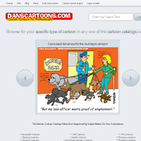
Week 40: Dan’s Cartoons
This week I will be redesigning: Dan’s Cartoons.

In the space of 5 minutes I can identify some of the key strengths and weaknesses of this design, and sketch out a mockup.
STRENGTHS:
- The logo feels very relevant, using a bold, cartoony style.
- The daily cartoon is fairly prominently placed.
- The website maintains a bright color-scheme, and is generally simple and clean.
WEAKNESSES:
- The welcome/info paragraph isn’t engaging. The text is too small, and much of it seems obsolete. Ultimately this just disengages the user, rather than helping them. The website could be explained in a much more succinct fashion.
- The cartoon should be the most prominent aspect of the page, yet it is currently pushed down by the intro text and large Google adsense area. This is a crucial mistake as a lot of people won’t bother to scroll down, and so will miss out on your key content.
- The typography is too varied. Rather than use one set of fonts/styles (or two max) each area of text seems completely different. Particularly the text for the categories at the bottom of the page is really hard to read, and feels badly laid out.
- I found it quite hard to find specific cartoons quickly and easily. The site lacks a clear search feature.
My Redesign
As always, I was limited by the 30 minute time-frame, but I tried to improve upon several of Dan’s Cartoons features, adding a few design flourishes and a clearer layout that promoted content over wasted space:
MY AIMS FOR THE REDESIGN:
- Created a more unified feel, using cohesive typography, colors and styles throughout the design.
- Made the daily cartoon much more prominent, reducing scrolling to reach it. This is essential as it’s what should help drag users further into exploring your website.
- I added some clear buttons to encourage people to browse past cartoons easily, which should increase your pageviews and cartoon exposure.
- I stuck with a minimal design in order to promote the cartoons and other important content.

Before/After:
Here is a quick comparison between the original design and my 30 minute redesign. Sure, my design could be more polished, but I believe that a lot of the basic elements have been improved upon, creating a more pleasant browsing experience.

How and Why To Enter Redesign Saturdays
You can have the chance to have your website redesigned in next weeks post. All you need to do is leave a comment to this post with your website address and why you think it needs a redesign.
The Benefits of Getting Your Site Redesigned Include:
- Most obviously – a FREE redesign job!
- Your website gets exposure to PSDFAN’s thousands of readers
- You understand how to improve your website. This isn’t just a redesign, it’s a lesson in design principles.
- You will get emailed the .psd of your redesign and can do whatever you want with it!
NOTE: I can only accept sites with English content, as foreign language websites are simply too hard for me to work with.
So please, leave a comment today for a chance to have your website redesigned next week!

About the Author:
Tom is the founder of PSDFAN. He loves writing tutorials, learning more about design and interacting with the community. On a more interesting note he can also play guitar hero drunk with his teeth.
Related Posts
 30 Minute Redesign – Suggestions Needed!
 30 Minute Redesign #74: 86 Inventory
 30 Inspiring Examples of Perspective in Photography


I would gladly have a redesign for this website I made, I mean, I was the one who designed it, and I am open with it being redesigned , and also for me to correct weaknesses in it
thank you ^_^
and also I was not thinking of a more efficient typography for it when I was doing it,sorry
Hi Rafael. I’d be happy to review your website, but I can’t see that you posted a link? Please let me know the URL and I’ll try and include it in next week’s poll.
Hi tom, allow me to submit my blog again to get your redesign hope i’m lucky this time
Absolutely fine! I’ll be sure to include it in Thursday’s poll.
Hi, Tom.
Your redesign several times greater than the original. Seen the hand of the wizard.
I would like to join the queue for your beautiful redesign. I understand that my blog is not English, but I do hope that you will help me make it better. This blog is about web development. Here I post various interesting and useful things for webmasters and web developers. I would like to somehow visually separate content, navigation, statistics and advertising. Want to make a blog more comfortable for guests. Now I use a ready free template that I have completed.
In any case – thanks for the reply.
Thanks! I can’t actually see a website specified for your comment though? Please let me know which website you’d like to suggest for a redesign.
Hi again. I filled in the field of Web site to comment, but surely you do not see it. Here’s my blog: http://den.girnyk.com. Called “Notes of a Web Developer (Various useful information)”.
Thanks Great-Antique! I’m not sure what is happening with the website comment field, I’ll get my developers to fix that. As for your website, whilst I’d love to be able to redesign it, I might have to stick to my rule of no non-English sites. It’s just too tricky for me to work out what is going on, and would undermine the redesign process if I were guessing. (for example: I can’t really establish a visual hierarchy if I don’t know which content is most important). I hope that you understand!
I did an English page (only one article) http://den.girnyk.com/blog.html. Maybe you can help me to correctly place building blocks for a better perception of the visitor? Now all the ads in one place. How best to group the blocks that advertising does not interfere with navigation? Can be done several columns in the sidebar? I would be grateful for any advice.
That’s perfect! Thanks, I’ll include that page in tomorrows poll .
.
Excellent redesign – well done!
Cheers Mike!
Hi Tom,
Great job!
Awesome how you can do this is just 30 minutes!
Greetings,
Erik
Cheers Eric! I won’t lie, it’s pretty tough to meet the 30 min deadlines sometimes, but it’s always good fun .
.
Tom,
You nail your work everytime!
I think you’ll find our site ‘race centric’ when in reality we want to focus on our events as being an affordable ‘family fun’ night out and great group/employee team building opportunity. I can’t wait to see your visual and structure enhancements if we win. Keep in mind we will be expanding into multiple cities around the world so the site layout needs to 1st hook the new user and inform them what ‘Arena Racing is & why attend’, and then deliver city specific information.
Sit is built on .net.
Thanks for sharing all your work and lessons with the world!
Thanks for the support Chris! If you’d like a redesign for your site you’ll actually need to leave a comment to todays redesign post, as your comment missed the poll this Thursday.
Hi, Tom. There is another proposal for the redesign. This site is a German rock band Dreamtide http://www.helge-at-home.de/. How do you see yourself – it would be nice to redesign this site. So if you have time and no other offers – you can do this.
Thanks for the suggestion. You’ll need to post this as a comment to todays redesign though, as your comment comes after this weeks poll.