
 30 Appealing and Well-Designed Business Cards
 The Ultimate Collection Of Photoshop Actions To Spice Up Your Photos
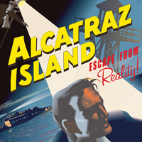 Inspiring Retro Design Projects
Have every post delivered to your inbox and get access to hundreds of useful design freebies.
Today we take a look at some of the best and newest portfolio website designs.
We’ll look over each design, analyzing what is effective, and looking at how the designers use the conventions of portfolio design to push their work and content.

Portfolio Do Guilherme combines a pale, grungy background with a very large, bold illustration. This creates plenty of contrast and impact. The typography is subtle, blending nicely with the washed out background design. The navigation draws the users eye through use of super-bright menu tabs, which provide the most color at the top of this design.

Emily White Smith’s portfolio is really unique. The use of a large textured background creates a lot of detail and color. The content is presented in one of the most unique ways I’ve ever seen, being contained in a central ‘water drop’ shape. This breaks conventional square/grid layouts and really captures the users imagination.

LunaMedia uses a very professional, monochromatic design. The limited, subdued colors allow the user to really focus on their content without distraction. The design is simple, yet not under-whelming due to the stylish typography variations. The link color shows the only remotely bright colors in this design, and so instantly draw the visitor’s eye.

Harrison Mann uses a classic element of dark webdesign, whereby the very dark background fore-fronts their work. The black background ensures that the photos and website-designs displayed really pop. Similarly, the sleek and simple logo design and refined menu seem elegant, and impactful against the dark backdrop.

ForeverHeavy integrates a cool interactive logo into their design, which really helps showcase their creativity. If you want to see what I mean then visit their website and hover over their logo. In addition to this they combine a subdued color-scheme with expert typography and padding. This layout feels balanced, utilizing white space to make sure that all content is highly readable and presented in an attractive manner.

Trent Walton uses some awesome design features to construct this hugely appealing website design. A huge, colorful headline is combined with a large, sketched illustration. In addition to this Trent uses a lot of white space and padding to allow users to easily distinguish his menu items. Large headlines are also uses to add impact and legibility.

CG Inspired uses a large, interactive featured client area to give their homepage a lot of impact. The 3d animation of the area is combined with an in-set design style, whereby the featured designs appear to be emerging out of a constructed stand. In addition to this eye-catching main area the company uses a dark headline area to draw the users as, as well as large, attractive headline text.

Michal Ptaszynski uses a colorful website background, combined with a fun, bright illustration to create a lively, appealing mood for his potential clients. The combination of plenty of padding, light typography, and a coherent color-scheme enhance this appealing atmosphere.

Made by Creature uses a highly creative, colorful logo to immediately draw the users eye. This is combined with a big featured work area, whereby some photographic elements break from the traditional grid system, making the layout seem more fluid and unique. Splashes of color amongst the typography helps maintain a bright, fun design.

Thomas Bishop uses a very light, sketchy layout to promote his creativity. However, amongst the doodles and washed out backgrounds he integrates dark, bold typography to give a lot of impact. The combination means that he can evoke a sense of creativity, yet also one of order, organization and calm.

Hugs for Monsters has a very prominent center-piece on their homepage, a hugely creative illustration. This is key to displaying their talent and skills as designers, as utilizes the principle ‘A picture speaks a thousand words’. In addition to this center-piece the hand-sketched typography and grainy, paper-like background emphasize this firms creativity.

Chriswi uses a subtly textured background to add a sense of detail to this otherwise simple design. The cute illustration and awesome typography makes this a really fun design to browse, and the bright color-scheme helps accentuate this.

Nemesis Design is a great example of the grungy web design trend. The combination of textured backgrounds, brush effects, light effects and grungy typography means that this is one messy design! However, due to the careful placement and balance of all these elements the design is also coherent, legible and attractive.
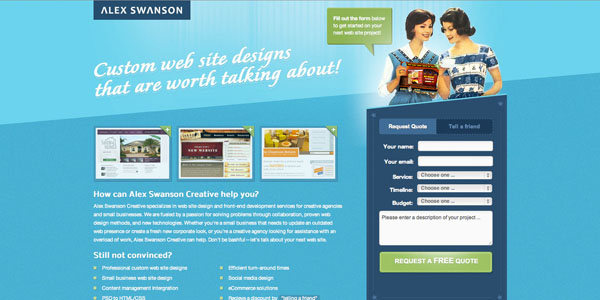
Alex Swanson has opted for a retro feeling design. This is achieved by the use of the retro illustration in the top right, but also by the unusually slanted layout dividers, as well as the retro, slanted text headings. He combines these retro elements with clean, professional, bright modern elements, making his website truly unique!

Lindsey Grande has a hugely clean web design. The sleek edges and bright color-scheme makes this design very appealing. There is also a large, colorful heading, and artistic central logo. The color-scheme is very coherent throughout the site, combining attractive shades of blue and green that are very complimentary.
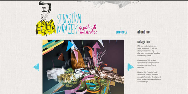
Sebastian Mrazek uses a grungy header illustration, and textured background to infer creativity and a grungy design style. The artist’s work is given a lot of prominence, and the surrounding content is minimal, in order to keep attention on the featured works.

Lee Driscoll’s homepage feels very interactive, with a lot of live social media feeds, and an awesome moving cloud background animation. The colorful, playful design uses illustrative details and fun typography in order to keep the website very personal-feeling, rather than hard or corporate.
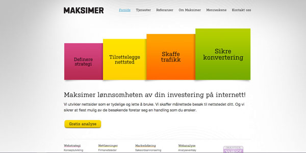
Maksimers design is very clean, yet uses a bar graph illustration to really draw the users eye. The bright colors and subtle gradients create an attractive center-piece. The light background, and dark, legible typography make the website look very professional and engaging.

Talita Pagini uses a very bright color-scheme to immediately grab the visitor’s attention. The header uses an attractive bokeh style design, combined with illustrated clothing tags to comprise the menu. The addition of textured content areas and subtle typographic drop-shadows makes this a very effective design.

Chris Kaufman has a great looking website. The paint-effect background combined with various texture effects means that the backdrop to his content is really rich. The creative menu typography helps set his style apart, and the large featured work area is engaging and prominent.
Tom is the founder of PSDFAN. He loves writing tutorials, learning more about design and interacting with the community. On a more interesting note he can also play guitar hero drunk with his teeth.


Do you know the basic tools in Photoshop but feel that your work is still looking average? Join our creative community at FanExtra and get the direction you need to take your work to the next level.


Thanks for including my site in this list! LOVE all of the other sites.
Great collection! Varied styles and some nice art. Makes it hard to wait until ours is done!
Hey guys, thanks for the feature
Some really inspiring portfolio designs, I think that is really important to get the right feel of your site as it represents you as a practitioner and your style of work, so if someone likes your site and the style of it and it reflects your work they are more likely to keep on looking. Hugs for Monsters has some nice illustrations as soon as your on the page so it makes me want to look more at the work.
Very interesting to see how they differently put their work online.
So much different way to do it. Really inspiring!
Thanks again for an incredibly inspiring selection!
Hi Tom,
I`d just like to say a big thank you for featuring our website, and also for thinking that it`s worthy of inclusion amongst the other great websites which you have shown.
Kindest Regards
Richard
Some really nice sites here! I love posts like these for inspiration.
Very interesting to see how they differently put their work online.
Nice and inspiring article.
Very happy to see my web-site featured here! It took me AGES to design it. I wanted something really grunge cos remind me of graffiti art, something I really liked in the past.
I like “CG Inspired”, it looks clean and professional but fun.
Really cool designs like the different types
thanks for the share
Really great collection!
Thanks for including my website in the list, I really appreciate your analysis about my design
That’s a really nice list of great designs! Think I can get some good inspiration out of this list!
Hey guys, thanks for the feature
Good morning to you. Many thanks for sharing this excellent posting. There is no doubt that your site is a valuable resource for many. Keep up the great work.