
 Create an Awesome Illustration Using Custom Brushes
 Members Area Tutorial: Design a Super Creative Box Packaging Template
 Members Area Tutorial: Create the Surreal Photo Manipulation ‘Twisting Water’
Have every post delivered to your inbox and get access to hundreds of useful design freebies.
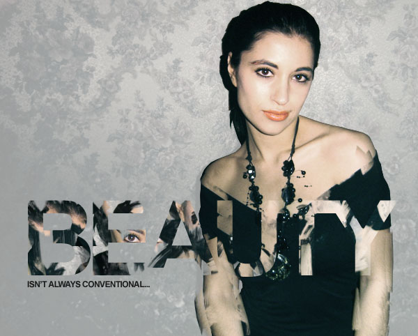
This is the final image that we will be creating:

This following images are used in the making of this tutorial:
http://www.sxc.hu/photo/931896
Start by opening up your photo of a female model. As you can see, it’s incredibly different from our final outcome. This tutorial will focus heavily on manipulating/improving your photos.

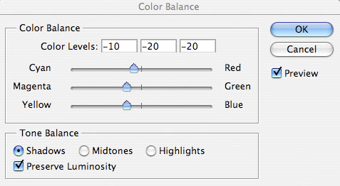
Currently the photo is looking far too red. To fix this go to image>adjustments>color balance, and apply the settings shown below:


Now cut out your woman from the background. Use whatever tool you prefer for this step, but personally I work quickest with the lasso tool (many people prefer the pen tool). Either way, cut around your woman, and then hit copy+paste to paste your selection onto a new layer.
The image below shows your new isolated woman layer, with your original photo layer hidden.

Now we want to make our main background a light gray color. To do this, select your original photo layer and go to image>adjustments>hue/saturation. Reduce your saturation to -80 and increase your lightness to +60. This will not effect how your woman looks, as she has been isolated on a new top layer.


I noticed that the arms of the woman are looking a little greener than her shoulder and face, and therefore apply another set of color balance adjustments to just her arms. To do this, select around her arms, and with your selection in place go to image>adjustments>color balance. The fact that your selection is active when making these color adjustments will mean that only data inside your selection will be affected.


Now select your woman layer and select around her eyes, lips and eyebrows, pasting each onto a new layer. Then merged together all of these seperate layers, leaving with one layer containing all of these facial details. Below you can see the data of this layer identified, as I have hidden the ‘woman’ layer, but left this new layer and my desatured background layer visible.

Now select your ‘woman’ layer and go to image>adjustments>hue/saturation. Reduce your saturation to -50. You can see the result of doing this below.


Now to give some more intensity to your photo. Duplicate your ‘woman’ layer and chance the duplicates blend mode to ‘hard light’. Then reduce this layer’s opacity to 20% and merge it down with your original ‘woman’ layer (option+e). Then duplicate your facial details layer and set the blend mode to ‘hard light’. This time reduce the opacity of this layer to 50%, and again, merge down with your original layer. This should not only give your overall photo more intensity, but make your facial details more prominent than the rest of the photo. This is important as we want them to attract more attention.

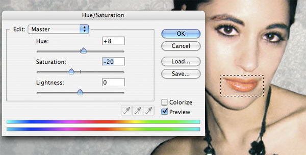
I wasn’t totally happy with the color of the woman’s lips, so I select my facial details layer, and select around her lips using the rectangular marquee tool. Then go to go hue/saturation settings and apply the settings shown below:
Now go to layer>flatten image. Once your layers have been flattened, select this flat image and hit ‘copy’. Then go to your history palette and undo the layer flattening action. Then, once you have all of your original layers back in tact, past your copied image as a new top layer.
The image below shows my layers palette, and explains this step more clearly:

Now type some very large text on a new top layer. I went with Arial (bold), size 150pt, -100 kerning. You can use any color you want for your text.

Now the creative bit! Select your ‘flat image’ layer, and grab your clone stamp tool.
Notice that once you have selected your clone stamp tool you can select a brush to use with the tool. I selected a watercolor brush set, and used most of the brushes from the set in this step. You can find many good watercolor brush sets online, or simply use a rough default brush in Photoshop.
Hide your text layer, and then begin cloning parts of your flattened image, pasting the cloned data in the areas where your text is positioned. You want to make this as messy as possible, by cloning parts of your image furthest away from this area. For instance, try cloning parts of your woman’s face and hair and pasting them over her body.
Remember: To use the clone stamp tool simply alt+click on the area of your image that you want to clone, then release alt and click to paste in the cloned data.
You want to paste cloned data over most of the areas where you text is positioned, so in this case we need to paste in this cloned data over the woman’s chest, and also out to her right, over our light gray background. To make this technique most effective, try pasting darker data over the light background, and lighter data over the woman’s dark top.
You can see my results below:

Now go to your layers palette and option+click on your text layer to select all data on this layer. Once you have a selection in the shape of your text, hide your text layer and return to your flattened image layer (containing all your clone stamp tool work). Then, with your selection still active go to layer>apply layer mask>reveal selection.


Now go to blending options for your flattened/masked layer and apply a gradient overlay. Set your gradients angle to 0 degrees, and choose a gradient ranging from transparent to white. Then change the gradients blend mode to ‘overlay’ and reduce it’s opacity to 50%. This will give a little more impact to your text.


Now return to your original ‘woman’ layer. Duplicate it. Then select your clone stamp tool and begin cloning areas of the bottom part of the woman. Be sure to clone parts of her, and then paste the cloned data a few pixels to the side of the original area. This will create a very dismantled look.
By applying this technique only to the bottom half of your woman photo you give the impression of the woman dismantling gradually, and the effect combines nicely with your text.

To help my composition I add a quick tagline below my main text. I use Arial again, size 12pt font.
Now select the smudge tool, and set it’s strength to 100%, size to 1px. Start by selecting your flattened/masked layer, and create very grungy, rough 1px lines all over your text by smudging data within this layer.
Then select your duplicated woman layer (the one with cloned arm parts), and repeat this technique. Smudge out rough lines from the woman’s hair, to create a mass of dark, grungy looking lines.

Now download this great free Splatter Brush Set. Make sure that you’re on your duplicated woman layer (the layer we’ve just been smudging her hair on), and then apply brushes from this brush set at random next to her head. You want to try and be quite messy with this.

Now create a new layer called ‘highlight’ above your duplicated woman layer. Make one large, soft, yellow brush mark overlapping parts of her hair and the ink splatters next to her head. Then alt+click on your duplicate woman layer in your layers palette, and with your highlight layer still selected go to layer>apply layer mask>reveal selection. Then reduce your highlight layer’s opacity to 60%.


Now create a new layer just above your light gray background layer called ‘radial gradient’. Drag out a white to transparent gradient from the center of your canvas. Then reduce this layer’s opacity to 35%.

To finish up I just added a few low opacity watercolor brush marks over my piece.

Tom is the founder of PSDFAN. He loves writing tutorials, learning more about design and interacting with the community. On a more interesting note he can also play guitar hero drunk with his teeth.


Do you know the basic tools in Photoshop but feel that your work is still looking average? Join our creative community at FanExtra and get the direction you need to take your work to the next level.


Once again a wonderful tut! Keep up the awesome work!
Very creative and enjoyable. I like the use of the clone stamp tool to create a pattern inside a text mask – I’d have never thought of that.
Great job as usual.
Thanks a lot guys, I’m glad that you enjoyed the tutorial
I really like the type treatment, fantastic.
amazing tut u get…the steps are so easy and good final result
thanx
Thanks! I’m glad that you found it easy to follow.
Looks very nice. keep up the good work
Thanks Grafpedia!
Nice tutorial.
Gretings from Croatia
Wow very good but i think something is lacking here
Hey! )
)
Thanks for this great tutorial. I followed it and I made something similar (different but with your glare in it
Here it is: http://sdt.si/learning/tamara1.jpg
Hope you like it.
Cheers
Hey Matic, that’s awesome! I love how grungy you went with it, really nice work!
Amazing tutorial..thank you…
I think that those tutoriais are a excellent idea. Because I have been learned very nice things that i usually in my jobs. Congratulations for that.
Hey!
Thanks for this great tuttorial. I followed it and made this:
http://matic.sdt.si/2009/06/12/twitter-photoshop/
Thanks again and keep the good work!
Greets,
Matic
wow so simple yet effective, cheers for that
hmmmm, realy nice and very simple way
Thanks for this – looks great
hey, thanks for the awesome tutorial
i posted my version on my blog
http://photoshop-pinups.blogspot.com/2009/11/create-fashion-ad.html
Great work yaar!!!!Excellent………..
This is a great tutorial, and the finished product looks even better! Well done.
nice one , tho the text freaks me out a little due to here eye is E , but overall loads to learn
that is awesome.. i will try on this one.. thanks
Excelente tutorial, me gusto mucho y no se imaginan la belleza de imagen que hice.
Muchas gracias por compartir
great job done, thanks a lot for you to prepare that.
Great tutorial Tom! I especially like the use of gradient overlays which give a really subtle touch to the ‘Beauty’ text. Some simple but solid photoshop concepts for all the noobs out there
Its great work that you doing. I’m in love with it.
the are very good work so very very thanks
beautiful fashion poster design, amazing idea for advert.
gr8 work…
I love this. Arty edgy graphics fashion print orientatied web pic. More please!
good work and i like it.
I just stumble upon your blog post while I was looking for some tutorial for a poster this was perfect. Thanks for sharing this post and I like the way you gave effect to the hair using splattered brush.
i really enjoyed creating this pic, i learnt it from here thanks john
Nice Work……Keep up the good work……..
I really love tutorials. It’s the best thing to learn a new software instead of reading a manual and try to learn all features. Great stuff.
Hi Tom,
Im stuck on step 11. Im using photoshop CS3 and it will not let me text:S I just wanted to simply type in Beauty but it doesn’t show up but the text shows up on the layer. Any ideas? Im so close to completing this as I know the picture will turn out amazing thanks to you:)
Joseph: I’m really not sure what could be causing your text not to show up. The only thing I can think is that perhaps your layer’s fill opacity is down, or perhaps you’ve encountered some problems with masking. Let me know if you work it out.
Hi Tom
Thank you for replying so quick. I will have a play around with it and see if it will work. funnily enough..its only applying to that specific document as when I open up a new project text works perfectly fine.
Hi Tom,
I figured it out:)
It turns out for some strange reason my resolution was set to 1 so i followed these instructions and it worked perfectly fine as text showed up properly:
“If you see the text in the layer in the palette, but not on the image, go through this checklist…
1) You could have your image resolution set so stinking low you just can’t see the text! Go to the Image pulldown menu –> Image Size and see what the resolution is set for. If it’s something like 5, that’s definitely your problem. You need to reset the resolution, but before you do, unclick the box that says resample image so that you don’t resize the picture. Set it to at least 72 pixels per inch. Photoshop will then rescale the type so it looks the same as it did before, so you will need to go and set the type size for a normal size.”
Im gonna start this tutorial again from the beginning and give it my best shot:)
Hi Tom again,
I was just wondering how do you get that watercolor brush set you used on step 12? i have photoshop cs3.
Wonderful detailed tutorial, with a stunning result. Who’d think Arial could look so cool!
Very good tutorial, just what i was looking for in phoroshop.
Thanks for this. keep up the good work
Wow! I this is really cool. Nice work.
Thanks John
Good work,
I personally liked it up to step 17.
Wow this is awesome! I’m so inspired right now! you the man thanks so much!
I am having trouble with step number 13. It says: “Then, with your selection still active go to layer>apply layer mask>reveal selection.”…and I dont have these menu options in my cs5. any ideas to what I need to do?
Hi Keith, in CS5 I think it should be layer>layer mask>reveal all. Let me know if this works
got it…thanks!
Great post. Thank you! We found it very usefull
very nice post. I really like this keep up the great work
Awesome tutorial
thankyou for sharing
Wow..you are really good..
Which version of photoshop did you use to make this? I’m using the same color balance settings as you are but my picture turns out different in steps 3 and 4.
Good job. I particularly like the clone stamp tool that you’ve used to create the pattern inside the text mask, very creative!
Fantasic result.love it, but could you do the same with cs6.if you have it..
Absolutely!
great stp-by-step example Tom, thanks
Wow..you are really good.. Great way of presenting the steps and making it look so simple